Project Naptha 24 April 2014
So, well, this kinda finally launched.
So, well, this kinda finally launched.
I’ve actually had this post fermenting in my blog’s draft folder since at least September, but I never actually got around to finishing the post. And now that Google’s enabling the new swipe-to-go-back by default on the dev channel versions of Chrome OS, it finally feels like the right time to post. As in, I feel like posting things right when they’re soon to be absolutely useless (Which, you might recall, was the case with my Google Wave client, which started selling on the App Store the day Google announced that Wave would be phased out and eventually shut down).
So, a few months ago, I finished my update to the Swipe Gesture extension, which featured a rather significant redesign. It supported multiple gesture directions and a fancy animated element to indicate the direction of the gesture.
Here’s an extension which I actually released some time back, but never got around to writing a blog post for. Part of the reason was that the early reviews didn’t quite pan out, in large part due to not working. But I was using my Chromebook and I somehow felt a vague longing for some kind of multitouch gesture, and remembered that I had made this little extension (which I had disabled for some reason). Anyway, this is as appropriate a time as any to formally announce it to my probably remarkably small blog readership.
There is, however a tad bit of difficulty representing the function of it in pictures because really, it doesn’t have a big UI. It makes hardware more useful, and in its idealized form, should have no interface. But of course, we don’t live in a place where apps are perfectly idealized and either way, Apple has plenty of nice pretty pictures of people swiping fingers to the right.
I really fell in love with the Macbook multitouch gestures, almost at first sight. They just seemed so natural and so beautiful that I sort of felt that that was like the epitome of design or HCI perfection. And from that point, any time I used a laptop which wasn’t made by Apple (or even the ones which were made by Apple but were stuck in the barbaric ages preceding the inclusion of the glass multitouch pad, where its invention might have produced a scene like this), I felt thoroughly disgusted.
Flipping through the Chromium OS design papers, there is one page dedicated specifically to cool multitouch gestures which could be used. And as far as I’m aware the Samsung Series 5 550 (the new chromebook) is the only device which supports these gestures (thus far), and even then it’s only pinch to zoom and forward/back (three finger). All the other Chromebook users have been left out.
Another cool thing about the implementation is that it uses a certain webkitDirectionInvertedFromDevice property of the mousewheel events, which gives you a boolean value about whether or not the platform you’re on has some magical direction inversion like on OS X Lion or if you’ve enabled “simple scrolling” on Chrome OS. But this might not have been a good idea since swipe directions too are sort of inverted on those platforms naturally as well, so it might be better to _not _compensate for it.
Anyway, the implementation is actually quite simple. The current version doesn’t even break the 40 line mark, because all it does it it listens for mousewheel events on every page (via a content script), and it calculates the current acceleration. If that acceleration ever passes a certain threshold, it triggers a forward or back action. Right now, the threshold is preconfigured based on my own testing on a Samsung Series 5 (note, not 550) chromebook. But for people with other devices, I’m working on a second version which will be slightly more Apple-esque in its implementation.
 Screenshot from 2012-07-06 09:05:34
This is probably a horrible time to think of writing an online text editor. The “market”, if you can call it that, is virtually saturated with worthy contenders and (figuratively) every day is marked by the entrance of some other text editor to the already crowded space. Part of the problem is that now, web based text editing components are actually pretty awesome. Ace and CodeMirror work really quite well and each have associated with them some very formidable integrated development environments, referring to Cloud9 and LightTable, respectively (albeit there are quite a few others, these seem to be probably the most funded). And at Google I/O 2012, they announced the new Chrome Packaged Apps, which expose new functionality (most relevant being the ability to open and save files from the local disk and operating offline by default), and their sample apps include no less than two text editors.
Nevertheless, I’ve always pined (probably an exaggeration) for the opportunity to indulge in something as meta as writing a text editor which I could use as a text editor for the text editor (which is, if you did not notice, that text editor). It’s probably the pinnacle of dogfooding (probably nice coming after a streak of making extensions that I never actually use). But this doesn’t really go anywhere in terms of explaining why I’m doing this rather than using someone else’s rather better developed text editor package. It really comes down to this chrome app which I was quite a fan of almost a year ago, called SourceKit. SourceKit is a text editor which runs in Chrome that synced with Dropbox. The version which was distributed on the Chrome Web Store never supported offline, which is sort of sad because that’s the one feature I really wanted. The other source of inspiration was Streamie, the real time node based twitter client which had an absolutely phenomenal scheme for contributing. You just needed to fork the repo on github and all your commits would be visible live on your own subdomain of the site.
Also, in the mean time, I had discovered this pretty awesome text editor (no, it’s not VI or Emacs, because I’m not nearly cool enough or dedicated enough to approach that steep precipice of a learning curve) called Sublime Text 2. I have a pretty good picture now of what exactly I want from a text editor based on that (actually, I don’t know if this is just some delusion which has manifested in my mind because I probably thought the same way about gedit and krita and komodo and aptana and notepad2 and notepad++ and dreamweaver before that).
The real drive to creating that text editor happened in the week before I was scheduled to attend Google I/O 2012. I knew I’d be in some situations lacking Internet, and I felt like writing words or code or something in that time. So in a few days I hacked together this text editor which had a vague resemblance to Sublime Text. It was based on Ace, like SourceKit before it, but obviously a newer version with a whole bunch of syntax and themes included. It used a modified version of the Dropbox component from SourceKit (it was changed moderately to accommodate Dropbox API 2.0 and to deal with binary things like array buffers and blobs). And I added a little heads-up-menu-esque file and command picker, quite reminiscent of Sublime Text (and to a lesser extent Ubuntu Unity).
And then I headed for the airplane having not actually used it much in practice hoping to be super productive while using it, which you could have probably been able to tell by the beginning of this sentence wouldn’t pan out. The first (quite major) flaw which I encountered was some bug which would end up wiping out any file that I tried to edit, and left me with a gaping chasm in my hard drive (this is a metaphor, because my Chromebook is solid state). I just hope nothing of value was lost, but it remains quite likely that it was the otherwise.
I had no real system for testing out changes to my own extension, and I was too paralyzed of the fear of deleting my own extension to try changing it. So the end result was that the entire duration passed with me hardly doing anything productive on the project, or using it for any productive means in itself. All that happened was my discovery that everyone is working on a text editor right now and I should probably quit right then and there and work on something perhaps more novel or productive. But I came back and fixed it and did some more on it, and I’m finally at the point at which I feel comfortable using it for some mostly useless things, like writing a blog post inside the project’s readme about the project itself.
Welcome to CloudFall. Yeah, I’m aware how dumb it sounds, but the fact that the new James Bond movie is going to be called Skyfall essentially demolishes any hope of using that name. But rather than using this as a vindication of how cool that name would be and abandoning it for some novel name, I’m just going to contrive something in a similar vain, hence the current working name. But rather than spending the first few lines complaining about the name of the product, I should probably lay down what exactly this project aims to be. It’s a text editor, not a terribly glamorous concept, I know, and this is especially not a terribly great time to start. This is hardly the first text editor, and certainly will not be the last (until this either never finishes or the world actually does end by the end of this year). It’s not the most full featured, but I guess it does need to have something which distinguishes it.
The main feature is largely inherited from SourceKit, which is the ability to sync with Dropbox. And instead of editing “live” off of Dropbox’s servers, it really is more of a sync. It’s built around Chrome’s FileSystem API, so it has its own sandboxed imaginary folder where it sticks all the files. Every time a file is loaded, it’s first downloaded onto its spot on the imaginary folder and subsequent edits get sent to both the local copy and the server. This architecture, in theory, means it probably won’t inadvertently overwrite, corrupt or delete your important data in the advent of some syncing issues. It keeps track of the latest synced revisions and tells Dropbox’s API that information so that it won’t try overwriting a newer version from elsewhere and It’ll somewhat gracefully save to a different file in such a circumstance (though that routine can hardly be declared well tested, so beware of complications). It should in that way retain very close to full functionality while offline, since just about everything it does is entirely offline (including the compilation of CoffeeScript and LESS, which is explained later on).
Built into the extension are a few of the tiny tweaks that I have installed on Sublime Text which I find fairly useful. For instance, the app includes a copy of the CoffeeScript and LESS compilers, and so whenever you are editing one of those types of files in the text editor, it’ll automatically compile and save it into the same directory whenever you hit the save key. That’s actually pretty useful because it gives CoffeeScript back that REPL (almost certainly a malapropism, but I’m not too familiar with developer work-cycle jargon, so please excuse that grievous offense) dynamic that JS developers are so familiar with. And to aid that sort of work, it can preview your files “live”, even offline. While it can’t open and edit binary files like pictures, it can still download and display them fine.
For writing walls of text which don’t really need syntax highlighting (I wonder if someone has a package on mainstream text editors that syntax highlights free form English grammar, sort of like giving people synesthesia for no real reason), it includes a word count widget. Also, because I feel like encouraging unhealthy behavior, right next to the word count is an indication of your current typing speed. I’m pretty sure someone could go into some moral discussion into why it’s a completely detrimental addition to create something which displays how quickly the author is typing because it encourages a mindset which doesn’t focus on creating the most concise or effective means of delivery for some message, but rather promotes meaningless verbosity. But sometimes I would imagine using this for school assignments and the ilk, and maybe it would be nice to know when I’m reaching my designated quota filling some unwritten word requirement. I’m not quite sure how reliable of a word count it gives, since the algorithm is primitive and by no means nuanced, but it should be able to give a sort of rough estimate of the number of words on a page.
I may have mentioned earlier that there are two primary systems for interacting with the application, both of which are keyboard shortcuts: Ctrl-O and Ctrl-P, meaning the file browser and the command palette, respectively. They both appear in the same sort of interface component and generally behave the same, but there are some slight differences in how they operate (obviously). There are actually two “browsing modes” for the file browser, where it shows files either from the local stored cache or online in Dropbox. That can be switched by selecting either “Browse Mode: Local Copy” or “Browse Mode: Remote Dropbox” from the command palette (though there should probably be some better interface logically placed on the file browser panel itself). Remote Dropbox only works when the user is online, so the default mode is the local one. The sole interface to this list of files is the filter search box on the bottom of that widget, where typing in stuff filters out things. Of the visible items, the cursor can be manipulated by using the arrow keys, and one of the options can be executed by hitting the enter key. The widget needs to be manually dismissed by hitting the Esc key (which allows you to semi-rapidly open several files or try different commands, like changing themes). When a folder is activated, the context then shifts to what is inside the folder, descending into the hierarchy. It’s possible to ascend by entering the directory “../“. To create a file or folder (Note that at time of writing, creating folders does not sync to Dropbox), just type “+yourfile.txt” (or if there are no search results, it’ll automatically select the option to create a file with that name). To delete a file, you likewise just prepend your command with a minus instead, for instance “-oldfile.txt”. It’s not nearly as counterintuitive or confusing as I presume this description is making it sound.
The command palette, given that the interface is basically the same has much in common with the file system, but it’s entirely flat and linear. It lacks the hierarchy that plagues the file system, and navigating it is considerably simpler. Since the list is filtered and updated live with every keystoke, it’s fairly easy to find whatever command you’re looking for. The filtering algorithm only searches for characters but disregards gaps, only paying attention to order. In other words, the query “seals”, may match “SEt SyntAx: coLdfuSion”, it also means that you can construct very short queries to find what you want.
At this point, I don’t think it’s a final project per se, there are still a few features are woefully dysfunctional like Find and Replace. But I think it fits my own use case, editing files on my Chromebook, even when offline. It’s fast and doesn’t take too many steps to start. But the interface isn’t exceedingly intuitive (Basically everything is accessed through two keyboard shortcuts). I haven’t found a witty logo for it (I just haven’t bothered looking), and at this point I’m just writing a blog post about it because I feel obligated to document whatever it is that I just did.
Maybe some day I’ll pick it up again, or if there’s some response at all to this blog post, and add those awesome collaboration features (which probably won’t be very useful because the entire thing is quite hackish and not particularly kind to the prospect of improvements). Maybe I’ll fix up the search and replace interface (read: get rid of whatever horrid mess exists and replace it with a new one from scratch). And maybe I might publish it in some form that is significantly less involved than cloning off github and packaging the app yourself.
Google’s multitask mode was only an April Fool’s joke, but inordinately amused among us (read: me) might even venture into attempting such an irrational feat. While watching the video, it evoked some memories of something which I had stumbled across a few years ago, called Multi-Pointer X. The rationale for creating that wasn’t nearly as insane as the Chrome Multitask video made it out to appear, instead I think it was just the framework to support multitouch and other sorts of alluring interactions on the Linux platform.
So I decided to look into that again and within a few minutes of Googling, it appears that Multi-Pointer X has now been incorporated into the X.org mainline as part of XInput2. So what exactly does it take to conjure and insult the multitasking gods?
The first step is quite logically to plug in another mouse. I happen to have three mice plugged into my computer anyway (there’s a perfectly logical rationale for how this came to be, my keyboard is some wireless Microsoft keyboard+mouse set but I really hate the scrollbar on the Microsoft mouse, so I instead used another mouse for the longest time until it started failing and sheer lethargy prevailed over disconnecting that obsoleted peripheral) but regrettably, I don’t have an additional prehensile appendage to operate the third mouse.
Right now I’m using a pretty much unmodified version of the latest version of Ubuntu 11.10. I just opened up a terminal window and typed in “xinput list“
antimatter15@antimatter15-desktop:~/online$ xinput list
⎡ Virtual core pointer id=2 [master pointer (3)]
⎜ ↳ Virtual core XTEST pointer id=4 [slave pointer (2)]
⎜ ↳ A4Tech PS/2+USB Mouse id=8 [slave pointer (2)]
⎜ ↳ Microsft Microsoft Wireless Optical Desktop® 2.20 id=11 [slave pointer (2)]
⎜ ↳ USB Laser Wheel Mouse id=9 [slave pointer (2)]
⎣ Virtual core keyboard id=3 [master keyboard (2)]
↳ Virtual core XTEST keyboard id=5 [slave keyboard (3)]
↳ Power Button id=6 [slave keyboard (3)]
↳ Power Button id=7 [slave keyboard (3)]
↳ Microsft Microsoft Wireless Optical Desktop® 2.20 id=10 [slave keyboard (3)]
Use the command “xinput create-master Auxiliary“ in order to create a new input device, and try running “xinput list“ again to confirm that the command has done your bidding.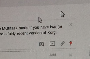 Screenshot
antimatter15@antimatter15-desktop:~/online$ xinput create-master Auxiliary
Now it’s time for the third (or is it fourth) and final step, to reattach one of those master pointers into the auxiliary pointer. To do that, pick out some mouse. For me, I picked my “A4Tech PS/2+USB Mouse“ which is was my mouse with a broken scroll wheel. You can see that it’s been given ID=8, so that’s the number I’ll be using for the next step.
antimatter15@antimatter15-desktop:~/online$ xinput reattach 8 "Auxiliary pointer"
And then I can now use two mice at the same time for whatever ungodly purpose I desire.
It’s hard to take screenshots since it appears that every screenshotting or screencasting app which I can find seems to make the wholly unwarranted assumption that a desktop computer only has one cursor, but it does actually work. Though I don’t think I’ll ever be able to multitask through this scheme, it’s mentally jarring in far too many ways.
There’s just something incredibly alluring about the concept of holding the sum of human knowledge with you at all times. While near-ubiquitous connectivity alleviates this to a certain extent, the momentary lapses of networking are incredibly corrosive to an information dependent mentality. Wikipedia never ceases to amaze me and, while I’ve tried in the past to encapsulate part of its sheer awesomeness, this marks a much more significant attempt.
The differences start even before the data gets to the application. The preprocessing toolchain was entirely rewritten for a multitude of reasons. First of all, it compresses not the entireity, but rather the most popular subset of the English Wikipedia. Two dumps are distributed at time of writing, the top 1000 articles and the top 300,000 requiring approximately 10MB and 1GB, respectively. While ostensibly, the mere top 300k articles is far too narrow to delve deep into the long tail, the breadth of the meager 1/25th of articles consistently surprises me in its depth. The advantage is that at 1GB, it’s relatively easy to fit into any system. The algorithm which strips extraneous content has been made far more sophisticated than the original series of regular expressions. This enables greater compression and less accidentally omitted content.
On the application end, the application has switched from a GWT-compiled LZMA SDK to a speedy, pure javascript decoder. This makes page loads significantly speedier and allows greater compression ratios, for individual blocks can be made larger (256KB instead of 100KB). It also now uses WebGL Typed Arrays to further speed things up, such as sending data to and from the WebWorker thread.
The interface was redesigned with CSS media queries to dynamically transition between different modes in response to different viewing environments. The interface consists of two regions: the fixed position recessed left panel which holds the page title, a search bar, controls and the page outline. This collapses down to a toolbar header automatically when the screen estate is limited. It uses an Apple-esque noise texture background.
Downloads happen in little units called chunks (they’re half a megabyte for the dump file and about four kilobytes for the index). The local file can be built up out of order. While online, all storage operations check the virtual file, indexed db, or web sql database. If it’s not there, it transparently uses an XMLHttpRequest in order to fulfill the request and caches it to disk in the respective persistence mechanism. A bitset is used to keep track of which chunks are already downloaded and which need to be downloaded.
Recently Surplus stopped working. Well, it hasn’t been working for a lot of people for a long time already, but that’s besides the point. It stopped working entirely. Surplus has always been a rather fragile creature. It operates like a kid on a high speed scooter attempting to carry a house of cards between two strangers. That house of cards is part of a delicate system of frames inside frames inside frames inside frames that move between frames. Surplus is this fairly atrocious mess of frames.
Framing things works out fine until you discover that whatever you’re framing is trying to break out. Meet the X-Frame-Options header, the source Surplus’s recent predicament. It has well meaning motives: to prevent Google from suffering from evil attacks like Clickjacking, XSRF and other nasty things. Incidentally, security-wise, Surplus would probably belong closer to something of that nature than a legitimate application. It doesn’t use an API because applications generally wouldn’t find it useful.
Recently, all Google properties started including that X-Frame-Options header, and now can’t be embedded in frames. It wasn’t an absolutely unprecedented move, because just a few weeks earlier Google Video had started sending out the header (which led to an update which moved from a Google Video host frame). But now it was across all Google Sites, and there was no short term hack that could be done.
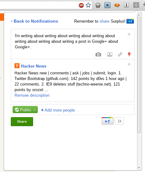
The solution was to take a random Google page which didn’t send out the header and mimic all the postMessage messages that are sent from the Google Plus notifications frame. Consequently, the entire frame signaling and attachment system had to be rewritten, and that system was so deeply tied into everything else that Surplus 4 ended up being almost an entire rewrite (the inner frame actions, the options page and the notifications parser did not change).
https://chrome.google.com/webstore/detail/pfphgaimeghgekhncbkfblhdhfaiaipf
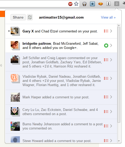
In a continuation of my rather unhelpful habit of documenting my activities on this blog long after you probably already know about it, I guess it’s time for me to discuss Surplus, my wildly popular (at time of writing) chrome extension which integrates Google+ notifications into Chrome.
Even more impressive, the name, which is a fairly common word is actually on the first page of a Google search for the word (around eighth result). It peaked at around 53,000 users and at one point made me the 329th most followed person on Google+.
On 5:04pm EST June 21st, 2011, I got an email inviting me to the super exclusive cool club: the Chromebook guru program. Today, June 23rd, 2011 8:05am I woke up to the sound of my iPhone 3G ringing to a certain 800 number. I have this paranoid tendency to ignore most calls, and my half awake zombie state didn’t exactly help my judgement. Fast forward two minutes, I checked my inbox and there was a terrifying Google Voice transcription sitting there in my inbox. That took two minutes because of how glacially slow it is to get anywhere on an iPhone 3G after the deadly error of updating to iOS 4.
Billable to sign for the shipment. You can go to Fedex dot com To track your package is Status, and determine if it is elligible to be held for pick up at a convenient FedEx location yo repeat this information, press any key yank you from Fedex goodbye. It felt oddly incomplete, because it turns out, it was. I listened to the (less disjointed) real message, and it was clear that the first forty minutes of the message was probably omitted, and Google Voice only picked up the small section after the beep. Apparently robots aren’t very good at talking to other robots.
I ran downstairs and checked the door. Nothing was there. I opened the blinds and waited. A few hours later (I managed to build a <canvas> pinball game in the time in between), I heard a sharp knock on the door. I’m not exactly sure of the time because I recorded it all on my iPad and apparently Apple feels that nobody ever cares about when the picture/video was taken and makes it virtually impossible to get that information.
So here it was, a brown box. Delivered by FedEx (Which is what’s called a “syllabic abbreviation” of Federal Express as opposed to the boring initialism UPS which stands for United Parcel Services, Inc.). Just because I can, I’ll tell you that the box was about 16.25x16.25x5.5 inches (my portable tape measure is only customary, no metric love). Inside is yet another box (boxes inside boxes are awesome!), but unlike the Cr-48, it’s not a nice friendly brown box with a jetpack-wearing labrat diagram. It’s a gray box with a picture of what’s supposed to be inside the box. The outer box’s packaging was just crumpled paper, which doesn’t look nearly as nice as the other stuff (I think the Cr-48 came with awesome little packaging peanuts).
So here’s the unboxing. Wait, the box was already opened. And what’s with the small empty green speech bubble sticker on the side? Anyway, the lack of tape probably means that some time travelling ninjas hijacked the FedEx plane in an attempt to rip out the TPM module chip in my Chromebook in order to infect the kernel with a keylogger/filter which replaces all references to time travelling ninjas with time travelling ninjas.
Inside is some nice white packaging foam. It’s neatly packed, and pretty cool. Sadly, there’s only one component wrapped in bubble wrap, the rather useless VGA adapter. Random side note: I think it’s rather interesting that the Chrome OS people decided that somehow a VGA adapter was somehow more important than an ethernet port. I’ve never plugged in a laptop to a larger display, and I don’t imagine that being a primary use case. But it would make sense to enable a web-oriented device to have faster web access.
Setup
So I turn it on, and it opens to something about reformatting the stateful partition because of those time travelling ninjas. It doesn’t really bother me, it reboots, I ignore some legalese and click buttons. It updates (which, by the way, took forever), I login the first time and it asks me to take a picture. The camera’s actually a bit nicer and the video isn’t laggy for some reason. This device is noticably faster than the Cr-48. I decide against taking a picture and just select the little erlenmyer flask with bubbling green liquid (presumably this is what gives the time travelling ninjas super powers).
Once again, it reboots. I login, it says wrong password, I try again, realize that somehow it forgot my wifi password, login, and it still says it’s wrong because it’s not done connecting to the router literally three feet from me, and I type my google acounts password again and press enter where it still fails yet again because I’m way too fast at typing, or at least I’ll say that because truthfully I’m not really fast at typing but it wouldn’t do any harm pretending I am because I really feel stupid not thinking about waiting for the wifi network to connect first, and so I stare at that little icon on the top right and then it clicks solid. I login.
I’m greeted a page that tells me how to use a trackpad. I go through the exercises to test my ability to do some rather advanced and intellectually challenging tasks such as “Click the circle” and “Move the circle”. I realized that it was probably just a distraction so that Chrome has some time to load all my apps and extensions by the time I’m done with these challenges.
Testing out the speed of this thing, I clicked Angry Birds, which to my surprise actually worked. Though I have to admit that trackpads aren’t great for these kinds of pointer-driven games. I would much rather play Angry Birds on my iPad.
But I guess as a product reviewer, I should probably focus on the hardware first in order to provide a vague semblance of structure and order to this review.
At a glance, the Chromebook is thin (But I lied, it’s not really that thin). Still, it’s quite heavy. It feels heavy and has a really solid build. And it comes with tons and tons of stickers, and that’s pretty spammy, but I guess it has this partially glossy finish that needs protection from ninja fingerprints (oh wait, that’s an oxymoron).
Oddly enough, among the first few things I noticed was that the hinge is a bit weaker than the Cr-48’s. Or at least, when you hold up the device, the lid will sort of collapse on itself under the force of gravity. I think this also happens with Macbooks as well, but it’s a little weird.
Second, is the little chrome logo on the surface has a sort of texture which feels pretty cool. The chrome logo also really bothers me because the colors just feel slightly off. Also, speaking of weird logos, the Samsung logo doesn’t have a (looks up typography terms diagram) crossbar on the “A”, which looks really weird. So it’s more like schevronsung or S^msung or something.
The display doesn’t go as far back as I would like, and with the absence of a protracter, I’ll use my powers of eighth grade geometry (oh wait, no I mean the eighth grade launch of Wolfram Alpha, the last time I ever needed to do math) to determine that the maximum angle is 127.5 degrees (approximately, or 2.226 radians or 4.452 tau-ians if tau day is your kind of thing).
The body of the Chromebook is nice plastic, it’s smooth and pretty hand friendly. The lid is a little weird though, the rim is actually slightly sharp. Not sharp enough to function as a type of improvised knife for murdering people nearby, which a Macbook would suffice at (Anecdote: My leg once started bleeding a lot because it rubbed a little against the sharp part of a macbook pro). But it’s still sharp enough that it feels inconsistent with the rest of the device and to make it feel weird opening and closing the lid. Also, on the lid is this huge terrible shiny bezel. It’s sort of cool for a while when you think it’s sort of cool that you can look at the movement of your fingers while you’re typing a blog post. But it very quickly starts getting annoying and makes the device look cheap. It simply doesn’t feel right in combination with the matte display and the soft diffuse black plastic body.
Sticking cables like USB and the power adapters makes a somewhat loud click, and rather annoyingly it’s nigh impossible to yank the cable out. Unlike the Cr-48 or any Mac, whose cables pop out fairly easily, this device seems to grab hold of the cables and never wants to let go.
I like how the new Chromebook is sleeker and looks more solid. It’s less bland (Once I actually mistook a random black paper folder/portfolio for a chromebook). But it also is less of a total Macbook clone. And when making something less of a Macbook clone basically means adding a glarey bezel and a cheap looking lid, sometimes the blatant clone is better.
I’ve actually never noticed the special browser function keys on the chromebook aside from the volume, brightness and power buttons. I’ve basically never used the full screen button, which I just pressed a second ago and I think this is actually pretty cool. Now I see why OS X Lion has that full screen emphasis. Though for some reason, I can’t leave one page full screened and Alt+Tab over to another non-fullscreen window.
The window switching button, which is more like workspace switching since you only ever have one window open at a time, is more accurately referred to as the “window jiggly button”. Because that’s exactly what it does when you’re on one window, as I’m always on. I guess it’s main purpose is to facilitate those politically incorrect image macros with bad taste about holding F11 in order to make a picture of Haiti (or Japan) shake. It would be a lot more useful if it was a tab switching button instead.
I’ve never used the refresh button, because it’s always easier to hit Ctrl+R and likewise for forward and back, it’s easier to hit Alt+Left or Alt+Right. Same with the search button, I just hit Ctrl+T.
Another weird thing is the placement of the Alt and Control keys. I generally never use the alt keys on my desktop computer, but I happen to use it a lot more often here (mainly for forward/back). But it’s also annoying because it still has a mac feel so I want to pretend that Alt is the same thing as the Command button, and then everything’s weird. I liked the Mac Home/End buttons, which I think were Cmd+Option or something. Anyway, I would really want Ctrl+Alt+Left/Ctrl+Alt+Right to work as Home/End.
Just on looks, the Series 5 keyboard looks a bit weird. The letters on the keys feel slightly off center and the words are printed in a much lighter shade of white/gray. I guess this would help the problems I sometimes have with finding the right keys at night (but I haven’t had this long enough to encounter nightime, in fact, it’s still just past noon). I’ve never noticed that the shift key has a sort of connected “ft” arm (I sure hope I’m using these typographic terms properly, and yes, I did just set the word typographic in comic sans ms).
The touchpad is better than the Cr-48’s but it’s still really quite lacking in comparsion to the ones on all the Macbooks. Maybe it’s just software, because I’m so used to three finger swipe for navigating forward/back, and Chrome on Mac’s Tabpose feature is genuinely magical. Also, two finger scrolling should be kinetic, it’s just that much more natural of an experience and makes the device more intimate.
The idea of a Chromebook is very similar to that of a tablet (such as the iPad or a future Chromepad). Tablets are very web, or at least web information-oriented, much like how the Chromebook intends to.
Google has included a rather nice physical keyboard in the device, which shows that they view the keyboard as a superior (and necessary) system for interacting with the web. It’s pretty obvious that the keyboard is great for writing long blog posts, but that’s really not that common of an exercise. Google has to demonstrate that not only is the keyboard useful in certain fringe circumstances, but an everyday useful component.
Google needs to show that the keyboard isn’t just something that gets in the way of interacting with the web, but a useful aid. An emphasis on search; tab search, page search, or web search could do that (and it would be a great use for that Search key). Firefox has a great feature called Type Ahead Find (There’s a chrome extension that tries to do the same thing, but it’s buggy, and sadly Chrome doesn’t sync localStorage state) where you can just type to navigate and click items.
And I don’t think they’ve properly done that. The web is currently still very much a pointer driven world, and the Chromebook touchpad is quite lacking.
Chrome OS is actually surprisingly useless in situations where the user is offline. You might find the adverb “surprisingly” a little confusing, because almost all the other reviewers seem to bring the notion that being useless while offline is somehow intrinsic to the concept of the platform. Like that it’s obvious that anything built on internet connectivity will always be useless offline.
Every Chromebook out there, to my knowledge has a sixteen gigabyte SSD. Sure a gigabyte or two is necessary for the operating system’s function, the kernel, and the other kernel for that fast background feature. Fourteen gigabytes is plenty of space for a cache. Absolutely plenty.
Chrome has the opportunity to basically cache everything it encounters (and the cache itself is already sufficient for offline browsing if it were accessible), and you can load everything from the cache when the user’s offline. Firefox does this, and I have no idea why Chrome doesn’t.
As for Google’s own applications, it’s rather disappointing how long it’s taking them to add offline. The Gears API isn’t too much different from AppCache, and it’s unreasonable to take over a year (basically centuries in chrometime) to port that feature over. But at least there’s an expected date (summer, which, come to think of it is actually pretty soon).
I don’t know why I’m even writing this section. But since I am, let me first write a disclaimer. Chrome progresses fast. A major release every six weeks. Things get fixed quickly. I remember (half a century ago in chrometime) either Larry or Sergey said something about how Chrome/OS is really about a radical shift that rather than having your software get slower (due to bloat, etc) over time, it actually gets faster. Everything here will probably be irrelevant very soon.
The bundled version, which I’m not using since I almost immediately switched to the always-better unstable ones, had some weird properties. Hovering over the wrench icon would give this horribly hideous black-gray gradient background (and really, that’s all I noticed). Unstable doesn’t have any of that.
Also, I was disconnected from my Wifi network three times in the process of writing this. It may be my wifi network’s problem, but it’s never happened to me before. Music Beta is acting buggy and sometimes stops after opening and closing the lid.
The very first impression is always from the hardware. When it’s covered with layers of stickers, that really does sort of subtract from it’s beauty. I don’t want to spend time peeling off six layers of stickers on a laptop already in a bag inside a foam cover inside a box inside packaging inside another box. The hardware underneath all those stickers is pretty nice, with exception to the lid which has a somewhat sharp edge.
The second impression comes from the setup of the software. I guess legalese is fairly standard, so I can’t take points off for that. Updating right then and there hurts the user experience. You can do that in the background. That’s the point. There’s probably some security rationale, but that initial feeling has a big impact on what users feel.
Once that’s done, the user learns that the device is practically useless offline.
Chrome OS feels incomplete. It’s probably deliberate.
Chrome OS is visionary, and part of the idea is that software can improve over time, rather than getting worse over time. Starting with a flawless experience means that there’s only one way to go: down (That’s why if you’ve owned a Mac for any amount of time, the weakest Macbook Air at the Apple Store feels so much blazingly faster). Starting with a terrible experience gives profound opportunity for a great anagnorisis, which wikipedia defines as
a moment in a play or other work when a character makes a critical discovery. Anagnorisis originally meant recognition in its Greek context, not only of a person but also of what that person stood for. This first batch of Chrome OS devices represents the beginning of Google’s great plan, that of instituting the new paradigm of progressive enhancement rather than regression. The deliberately sour experience gradually and noticably improves every six weeks. It’s the equivalent of waking up one day and seeing that your toaster now makes coffee.
This is what Chrome OS represents. It’s not the web as a platform, because any platform can run applications. It’s about what the web represents, a continuous online system where things improve every day, without notice. Change just happens. Updates are silent and computing becomes alive.
Or at least, I want more free hardware.
Note: I’ve changed a few things that will hopefully make my point a bit more clear
Apple got it right in 2007.
If you’ve read any of the other posts in this blog, you will probably come under the assumption that I’m a devout follower of the Church of Google. Thus it will probably be quite a surprise to read the headline, something which appears downright sacrilegious: it questions the infallibility of the great Google. But I try very hard to maintain some semblance of objectivity and rationality, and this post will be about why I think the Chrome Web Store is bad for the web.
The Chrome Web Store is the applications and extensions gallery for Chrome. It’s Google’s centralized repository and directory for discovering Chrome-related things. Just hearing the name of it, you can probably tell, it’s likely quite inspired by the iOS/iTunes/Mac App Store. It’s not because they aren’t able to innovate (or it might, but I won’t take that view), but it’s probably the result of the huge App Store boom. It’s not that even what Apple did was particularly innovative, but somehow it managed to secure billions of dollars for the company, and all it’s competitors quite rationally want a chunk of it. This however, isn’t about improving the state and future of the web, but rather the indulgence of buzzwords. This post isn’t only about the Web Store, but rather the entire Chrome Applications and Extensions systems. From distribution to installation and the user experience afterwards.
There are two types of installable web applications that exist in the Chrome Web Store: hosted apps, in other words “glorified bookmarks”, and packaged apps. Glorified bookmarks are relatively hard to create, expensive and have no real additional functionality. Packaged applications evade the standardized mechanisms for offline web properties and eliminates many of the advantages of web apps in the first place.
Chrome’s developer overview for creating installable web apps describes the system as a solution to one, rather insignificant, problem. It’s the problem of permissions escalation: some technical detail that hardly seems important. Put simply, it’s that users get annoyed when they’re asked to hit “Okay” to annoying permissions prompts. And so Google’s solution is to invent a certain class of web site which has different security properties, where all the permissions are put into a single prompt.
To users, however, the existence of a web app is a solution to a much different user experience problem: they want to hit nice large pretty icons to go to sites which they frequently visit. But somehow, the solution they opted for creating these large clickable bookmarks is quite terrible. The only user-facing purpose of installable applications is the ability to bookmark with a large icon, something that Apple got right with iPhone OS in 2007.
I love those four words in that order, it feels so sensationalist and rebellious. But before the Cult of Apple leaps on that statement, notice the wording “Apple got it right”. It doesn’t strictly mean that whatever Apple’s doing now is right, just that what it did is right. In fact, that’s exactly what happened. Apple got it right, then made it different, and Google made it wrong.
First, we need to recall the distant year of 2007. It was quite a while ago, and I won’t pretend that my memory is that great. But it was a long time ago, a full year before the first beta release of Google Chrome. The iPhone was released with it’s plethora of eight apps and no ability to install more. The App Store didn’t exist, and the closest semblance was the Installer.app for jailbroken devices (Cydia came later). A few months later, Apple released a series of updates, and Steve Jobs signaled what he believed to be the future of iPhone applications: The Web. It doesn’t come surprising that Apple’s Mobile Safari was and likely still is (more or less) the best browser for any mobile device.
The important aspect is the way these web applications were installed. You went to Mobile Safari, and browsed around. You found a web app, and you used the web app the way the web was intended. No installations, you just navigate to a URL and start using it. You find the app useful and/or awesome, and you “bookmark” it. But, instead of actually doing the browser “bookmark”, you hit the button right below: “Add to Home Screen”. It asks you for a name for that application, automatically prepopulated with the document page title. You hit “Add”, and you now have a nice, shiny icon on your home screen. You can hide the browser chrome and it becomes indistinguishable from the normal native application experience.
That app icon is just an image URL specified with a single meta tag. It’s totally decentralized in every way, and represents the openness and simplicity that simply makes sense for this platform. All a developer needs to do to enable their web site to turn into a fully fledged web application is to add a <link rel="apple-touch-icon" href="/customIcon.png"/> in the head section of the page.
Contrast that with what Google requires: creating a Google checkout account, entering credit card information, navigating to the Chrome Web Store page and clicking several links in the footer in order to navigate to the page where you have to pay $5 for creating an app, create several icons, copy the manifest.json template and editing some values pointing to the icon locations, going to chrome://extensions, enabling developer mode, adding the unpacked app to make sure that it works, then going back to the original directory, zipping it up, and uploading it to the Chrome Web store, where you have to write a description, add screenshots, reupload an icon, publish, wait ten minutes, and then spam the internet with that link and edit your site’s code to point to that page. It’s an awful much to go through in order to just create a bookmark.
This subtitle is intentionally misleading. I don’t really think Apple’s evil, but that loaded four letter word is much more concise than the more appropriate phrase “Apple adopts a new platform and shifts ideologically to favor a system which is ultimately in conflict with and entirely inapplicable to the web in its current state or in the foreseeable future”.
Apple’s prescience of the power of the web was sadly a bit anachronistic. The web technologies that would enable their vision were not yet ready. The second browser wars haven’t really even begun, and the jailbreakers, despite handicaps, still managed to develop that platform more than the officially sanctioned web developers could. Browsers were too slow, hardware was to slow, there weren’t enough features, not enough could be done, and the paradigm was not well understood.
Apple followed the lead set by the jailbreak community and launched their own native application development and distribution system: The App Store. It was a hit, and soon became a super huge buzzword. It an all that it represented: centralized one click micropayment driven mobile advertising funded indie developer weekend novelty apps.
Google gets it wrong.
So there was an App Store craze, and everyone wanted one. So it logically follows that Google built an App Store. But the web had no notion of apps. There were web applications, but they weren’t rigidly defined as apps. This is where Google got it wrong. The Chrome Web Store needed to sell apps, and had to create a dichotomy out of the web in order to do so. It created a distinction between web apps and websites where none had existed and shouldn’t have ever existed.
The false dichotomy.
Steve Jobs said that on Mobile, people want Apps, not websites. Before blindly mimicking the concept of apps on another platform, one should probably explore why users like apps over websites. It’s because the mobile app offers a _better mobile-optimized _interface to whatever they’re doing.
Websites aren’t generally designed for mobile, they are often slower, and can’t make use of persistent user interface elements like a tab bar. Apps aren’t popular because of the existence of the App Store. It’s because there’s additional value provided in having those apps, that users use the App Store to get them.
However, web apps, just like websites are optimized for normal computers. Web apps are no better than web sites, and when web apps really have nothing to provide, their respective web stores are useless.
One purported reason for creating the distinction between apps and websites is to give developers the opportunity to charge for the application in the web store. But why should the ability for an author to receive money for his or her respective works be exclusive to web apps? Why not all web sites?
While it’s quite clear that if anything meant to supplant a desktop application and is built for the web can be considered a “web app”, nearly everything else exists in a sort of gray area. Facebook, Twitter and the other social networking are predominately content focused, but have some app-like characteristics, and so they could be considered “web apps” too, despite how there aren’t really desktop equivalents. But what about sites like the New York Times? Pure content sites would logically seem to be the farthest one can go from the concept of an “application”. It’s clear that any web site can be considered a web app.
Since anything can be considered a web app, the Web Store is a mere directory of a certain number of websites. It’s a limited subset of the internet with terrible discoverability properties restricted only to sites where the owner (or a particularly devout fan) is willing to pay $5 in order to allow a subset of users to bookmark the site. It’s proprietary, no other site can have quite the same properties as the web store because Google has the Web Store URLs hard coded into chrome somewhere. Searching in the web store really isn’t that great either, with no ability to search reviews, no pagerank, no search operators, no ability to search within the content of apps. You would figure that if Google were to clone a subset of the internet, at least they would get search right.
This closed, exclusive and excessively tedious process for creating mere bookmarks attacks some of the web’s traditional benefits and ideals.
The above sections dealt with how the “glorified bookmarks” are useless and downright harmful. There is a second class of applications which are similar to the former in that they also get a pretty large prominent and clickable icon, but different in that they actually provide functionality that is different from mere ordinary websites. Its virtues include that they tend to work offline and have the ability to do certain things that normal web apps can not do. However, it pretty much stops there.
Packaged apps work offline, but their mechanism evades the standardized system of HTML5. Rather than promoting the use of standards, they promote the use of a proprietary and nonstandard signed zip package.
As they’re “packaged”, they aren’t really “true” web apps, because they don’t actually operate in the scope of the web. They are much closer to desktop apps, practically. They have no URLs, and thus can’t be linked to, evading the very first two letters in HTML and HTTP: “HyperText”. One of the greatest things about web sites is that they can be linked to, and they almost always share that universal identifier to share with people. It’s universally accessible and one of the few things that actually enables intra-site interoperability.
While the “glorified bookmark” class of applications, which make up the vast majority of the Chrome Web Store, can be quite easily fixed by implementing something akin to the iPhone OS home screen web apps, the “packaged applications” are a bit more interesting. They are the source of that problem which the applications system was meant to resolve: permissions. In the current state, there is no system for handling multiple permissions on the web, aside from flooding the screen with infobars, when even that only partially works. What the web needs is a user friendly, informative, and useful system for giving additional permissions to web sites.
Along with that, the Web Store handles the selling of applications. Accepting money is a two part process, consisting of authentication and payment. Browsers should handle user identity, since they have the resources to do it right, in a nuanced, secure, efficient and user friendly way. Once that’s done, payment would be a logical extension to that. A developer could drop in a Google Checkout widget to have one-click in-app-purchases by tying into the secure browser identity system.
The Chrome Web Store should be reduced to a community maintained directory of useful web applications, something like a wiki, and there shouldn’t be a $5 fee to add applications.
Some people have expressed the idea that the Chrome Web Store is useful because it allows Google, a trusted party, to take down dangerous or malicious applications quickly. And while this is true, note that the Web Store is not actually the sole means to install chrome applications, and a malicious party would most likely exploit those alternate channels, and the only way to combat those is to institute a sort of Kill Switch, much like the kind that iOS, Kindle, and Android already implement.
Perfection is achieved, not when there is nothing more to add, but when there is nothing left to take away.
Antoine de Saint-Exupery
Warning: This is half a post about how I really want Google to send me a Cr-48, and half of my inability to work on an essay at three in the morning. Also, parts of this post were written on a Logitech Revue Google TV, that was just sent today. So, as this post is pretty broad and tangential anyway, I’ll cram a consise review of the Google TV system in here as well; The initial impression isn’t that great. Setup is longer than it should be, and the immediate uses aren’t really clear. Initially, it seems like an unnecessarily complex over simplified (somewhat an oxymoron, but that’s what Google TV is) media center PC. But after playing with it for a few hours, it does seem much nicer. The keyboard is nice and the touchpad is surprisingly usable (my only gripe is that the click button is too close to the back button). Finding videos and watching them is quite nice, the twitter client is surprisingly usable and the browser is great most of the time.
Critics of Chrome OS often say that Chrome OS is useless for it’s lack of “native” applications. But “native” is really just another word that has lost its intrinsic meaning, like HTML5, Ajax and Web2.0. Most people consider Android’s App Marketplace apps “native”, despite that they’re Dalvik VM bytecode and not raw binary ARM code. Even in iOS, a native app usually refers to, not the binary that comes out of XCode, but the application’s usage of the Cocoa Touch graphics framework. The only case when the word “native” poses any real meaning is in gaming, where frames need to be drawn as quickly as possible, where the core loops are often hand written optimized assembly. But iOS, Android and Chrome OS support this in the form of the NDK and Native Client. That leaves a single primary connotation of native applications: consistent interface look and feel.
The web as a platform is relatively low level. The only user interface widgets provided are form components such as checkboxes, buttons and text fields. This low level interface forces for the most part, people to implement their own extended widget sets, and in many cases, choose to reimplement the native controls to introduce consistency across browsers.
Rather pleasant update: This app works again. After some epic hackery, it now works again. Install it now, in its fully functional, redesigned glory.
Rather depressing update: This sadly no longer works. It was fun and somewhat useful while it lasted. I have no idea why it doesn’t work, and I would really appreciate if someone could find out why it fails. However, it would be a good idea to install it anyway and I guess.
Google Music Beta is a pretty cool web app, but the Music Manager sadly only works on Windows and Mac. As a Linux user who unfortunately feels neglected by the service, but still appreciative of being invited to the service a mere day after it’s announcement, I decided to do something to remedy the situation. Not to mention the irony that one can’t even upload music to the service from Google’s own Chrome OS. So MusicAlpha was born.
This project was a pretty interesting hack, so I guess I’ll try to document the process of how I made it and how it currently works. And also, for any prospective filmmakers, this story might make for an interesting abstract action movie. But for any of you who just want to install the app, click here.
I started this only days after finishing the new revision of Cloud Save, the extension that I never quite understood, but everyone else seemed to get. One part of the newest revision was adding support for Amazon’s Cloud Drive service, which does not have an established API. However, the interactions between the javascript web interface and the server are pretty simple to understand, thanks to the almighty web inspector. The only weird thing was that the actual file upload was actually conducted through Flash, which felt unnecessary but it wasn’t an insurmountable task. But it was all built on carefully learning the way of the web client.
There was one feature request for Cloud Save to enable saving to Google Music, and that’s when the idea sort of started.
The first step was to get a Google Music account, nothing surprising there. A few hours after the announcement was the first opportunity for me to access a computer, and also when I hit the “request invite” button. In a shockingly short amount of time of a mere day, I received a nice email saying that I had been invited to the service. Yay. Now the letdown of not being able to upload from Linux begins, as well as the scheming to reverse engineer it.
A few months ago, I had the idea to do something similar, but with another Google product: Google Goggles. But after hooking up the anrdoid simulator with a http proxy (Charles), and looking at the results. I was rather dismayed, but not particularly surprised by the results: all the communication was encoded using Protobuf. Protobuf, or Protocol Buffers is “Google’s data interchange format”, according to it’s Google Code project page. It’s a structured system for encoding binary data where a .proto template is already known and compiled. Protobufs are bad in much the same way minification is. There are totally justifiable reasons to minify source code, but the elimination of a useful View Source detracts from the open ideal of the web. Though protocol buffers aren’t encrypted, they are not comprehensible without a .proto file to decode them. With a lot of work, one might be able to reverse engineer a .proto file, but it’s certainly much harder than a JSON protocol.
Before I began, this was the worst fear. That everything as encoded with protocol buffers, and my attempts to mimic it would be rendered futile.
I borrowed a computer which ran Windows 7, and installed the Music Manager in hopes of deciphering the secret enigma of the great google. I needed a simple packet sniffer, and so I used nirsoft’s smartsniff. I didn’t use wireshark because it wasn’t my computer, and I didn’t want to install and download a huge app with an intimidating user interface. Smartsniff worked pretty well, and I thought I was almost there. Packet sniffers generally can’t decode https data without some MITM-esque certificate faking, and I have reason to believe that that wouldn’t work either since running the strings command on the MusicManager.exe file includes something that resembles a public key.
Anyway, I found two raw unencrypted HTTP requests, and sort of fixated myself on those two.
POST /uploadsj/rupio HTTP/1.1
User-Agent: Music Manager (1, 0, 12, 3443 - Windows)
Host: uploadsj.clients.google.com
Accept: /
Cookie: SID=[redacted] domain=.google.com path=/
Expect: None
Content-Length: 851
Content-Type: application/x-www-form-urlencoded
{“clientId”:”Jumper Uploader”,”createSessionRequest”:{“fields”:[{“inlined”:{“content”:”jumper-uploader-title-19Redacted”,”contentType”:”text/plain”,”name”:”title”}},
{“external”:{“filename”:”Redacted.mp3”,”name”:”C:\Users\Redacted.mp3”,”put”:{},”size”:610Redacted}},
{“inlined”:{“content”:”0”,”name”:”AlbumArtLength”}},
{“inlined”:{“content”:”0”,”name”:”AlbumArtStart”}},
{“inlined”:{“content”:”3rBe9dCa%c2tBeJdD”,”name”:”ClientId”}},
{“inlined”:{“content”:”00:1F:R3:DA:C7:ED”,”name”:”MachineIdentifier”}},
{“inlined”:{“content”:”5a5de21sd-54dsfe-Redacted”,”name”:”ServerId”}},
{“inlined”:{“content”:”true”,”name”:”SyncNow”}},
{“inlined”:{“content”:”153”,”name”:”TrackBitRate”}},
{“inlined”:{“content”:”false”,”name”:”TrackDoNotRematch”}}
]},”protocolVersion”:”0.8”} I noticed the second request was rather huge, 3556KB. Just enough to fit a normal-sized MP3. I knew what was in there. PUT /uploadsj/rupio?upload_id=REDACTED&file_id=000 HTTP/1.1
User-Agent: Music Manager (1, 0, 12, 3443 - Windows)
Host: uploadsj.clients.google.com
Accept: /
Cookie: SID=REDACTED domain=.google.com path=/
Content-Type: audio/mpeg
Expect: None
Content-Length: 3141REDACTED
ID3…..%vTENC….@..WXXX……..TIT2……. Redacted At this point, I was relatively ecstatic. Or at least, I will pretend that I was, because everything looked elegantly and remarkably simple. I had no idea where the upload_id came from, but I figured that it was part of the response from the first POST request. Part of the problem was that SmartSniff didn’t give me the actual responses to the HTTP requests, only the request data. Or at least from the five minutes that I bothered using it. The cookie looked like a generic cookie that would exist in a normal browser session.
Since it used generic browser cookies, the simplest way to start would be to make a browser extension. Specifically, a Chrome App. That way, I could get the necessary permissions to do all the cross domain security protocol violations and probe around a bunch of requests. Since XHRs already include cookies for a specific domain, there’s nothing I need to do to set the cookies. I hoped and suspected that the User-Agent, Accept, and Expect headers were basically ignored, and the content-type would be rather trivial to set.
A lesson in premature optimization was the huge block of JSON which got sent with the first POST request. I had no idea what was really essential, so basically, I just deleted almost everything there except for what I thought might be really important: the file name and size. There were no errors in the POST request, so I figured it was okay to delete all of that stuff. I ran the POST and just as I suspected, the JSON that resulted included the upload_id, in fact, it included the entire PUT url, which was pretty nice.
{“sessionStatus”:{“state”:”OPEN”,”externalFieldTransfers”:[{“name”:”REDACTED.mp3”,”status”:”IN_PROGRESS”,”bytesTransferred”:0,”bytesTotal”:314REDACTED,”putInfo”:{“url”:”http://uploadsj.clients.google.com/uploadsj/rupio?upload_id=AEdREDACTED&file_id=000"},"content_type":"audio/mpeg"}],"upload_id":"AEdREDACTED"}} Then, when I executed the subsequent PUT request. I was scared. {“errorMessage”:{“reason”:”REQUEST_REJECTED”,”additionalInfo”:{“uploader_service.GoogleRupioAdditionalInfo”:{“completionInfo”:{“status”:”REJECTED”,”customerSpecificInfo”:{“ResponseCode”:404}},”requestRejectedInfo”:{“reasonDescription”:”agent_rejected”}}},”upload_id”:”AEdREDACTED”}} Scary. The rejection reason was “agent_rejected”, which made me think about the User-Agent header, and I wondered if that was supposed to matter. If that did matter, then I would have to prototype it in a different language since XMLHttpRequests forbid the setting of the User-Agent and other headers for security reasons (even operating in a privledged environment!).
But thankfully, before attempting the drastic route, I pasted back in the alleged cruft, the jumper-uploader-title, TrackDoNotRematch, TrackBitRate, SyncNow, ServerId, MachineIdentifier, ClientID, AlbumArtStart (hey that rhymes!), and AlbumArtLength. Magically now, it worked. Yay.
During my quest to understand the bizarre agent_rejected error (because I totally fear rejection, they should have used a nicer word), I tried googling GoogleRupioAdditionalInfo. (I had googled “Rupio” before, since that was part of the POST url, but that didn’t yield any relevant results, it just ended up being a bunch of people’s names). Searching GoogleRupioAdditionalInfo yielded a more limited subset which happened to be more interesting.
The first result, from the SMEStorage Blog described an error emitted by the Google Docs platform. The next result was on the Picasa help forums, about “Upload video results in Error”. Then was a french language forum which mentioned an error which included GoogleRupioAdditionalInfo, this time on the url “upload.youtube.com”.
So, it seems “Rupio” is the codename (or just the name, but it’s much more fun imagining that there are subliminal codes everywhere) of a unified Google data upload/storage platform. That’s pretty cool. It probably makes sense that they have a sort of unified file storage system across Google Docs, Picasa, and Youtube, since it would probably be easier to maintain a system which is internally consistent. But to inject a sensationalist twist where occam’s razor shows that it’s not justified, this is a hint at an upcoming unified Google file storage service. A sort of file-browser dashboard which links all media and document files together in an accessible and uniform manner.
It worked. Or at least, it seemed to work. Vaguely. At this point, I was reasonably satisfied and began sculpting a nice pretty interface for it. Following my usual way, I just stole the Tango icon for an audio file mime type and built the entire interface around it. I remembered that earlier that day, I had discovered something called Layer Styles, which is a photoshop gradient/style clone that instead generates CSS3 gradients. I thought that was cool and I remembered it, so I played around with it and made a centered rectangle. Gray on Gray.
I decided on a name for it: MusicAlpha. It’s a sort of play on how this Google product features Beta in a way which is much more prominently than usual, with the gray “beta” the same size as the actual “music”. The Alpha sort of says something about how it will almost eternally be stuck in this unstable and incomplete form. It also reminded me of one of my favorite websites: wolfram alpha, and how the logo is stylized WolframAlpha or Wolfram|Alpha.
I wanted it to be minimal, but I’ve since adopted the belief that drag-and-drop file selection was only a fad. Sure, it’s often really useful, but it’s not great to restrict to that. A hybrid approach is much better, and if you have to have only one, then the standard browse button is better since you can drag and drop files to that button (on chrome, anyway) without any special code. Drag and Drop is often quite terrible on laptops, and I’m not sure if you can even drag and drop files with Chrome OS, since the file browser might be modal.
There’s not much to the interface, it’s probably as minimal as it can get. Two links, one to the service, the other to me. A button. That’s it.
At some point in every good story (not implying that this is a good story), there’s false hope, where the protagonist (not implying that I’m the protagonist here, either) believes that he or she (not implying that I’m a she) is closer to the end than is factually warranted (I’m actually implying that that’s exactly what happened). I checked the Google Music song list, and lo and behold, the song was there.
Sort of. Not really. Something was. Not sure it was a song.
There was a blank row. Double click it, and something does play. And it is the song. But, there’s no way to seek because incidentally, it doesn’t know how long the track is, so there’s no way to render the position of the song.
It was late, and this was frustrating, so I just posted a terse blog post announcing the beginning of the project:
So pretty soon, I hacked together something that almost sort of worked, with one rather significant caveat: It doesn’t pick up any tag data, name, time, artist, album, etc. I can’t figure out why. I guess I’ll try some more tomorrow. And by the way, I totally lied. I didn’t try at all the next day.
Yesterday, that is, May 13th, the delightful Friday the Thirteenth, I tried again. I installed Music Manager on a VMWare installation of Windows XP, and sniffed the traffic with Wireshark running on the host computer. Didn’t notice anything new in the plethora of data which happened to get exchanged. I tried running smartsniff from the VM, but every time I tried to start sniffing, VMWare magically crashed.
At this point, I thought of looking at the MusicManager.exe binary. Usually, binaries have some random strings in them, which you can look at to give some hint at what it does, without actually decompiling something. I’m now going to proceed to anachronistically mention something about android, because of a certain URL that I find out later in this chronology: android.clients.google.com. So I used strings MusicManager.exe | grep android, and found some rather interesting things
2-.wireless_android_skyjam.CopyrightStatus.Type
2”.wireless_android_skyjam.ProductId
wireless_android_skyjam.Uits
Metadata.ParentalAdvisoryType There appears to be 214 mentions of the phrase “skyjam” in the executable, which I assume is not some new solar powered Google sandwich filling distribution mechanism powered by artificial intelligence driven aeronautically mobile condiment dispensers (obviously using Arduinos).
I have no idea what Skyjam is, but that’s totally a much cooler name than Google Music, regardless of how big you write “beta”. And what’s wireless_android_skyjam? Why is skyjam so deeply tied with wireless and android? Maybe it’s got something to do with flying robot sandwich machines. Or not.
Maybe it has something to do with that Simplify Media company which Google bought last year. Or maybe I’m just a little sad that the product ended. According to TechCrunch,
Google VP Vic Gundotra said that Simplify’s technology will be used to offer a desktop app that will give you access to all of your (DRM-free) media on your Android devices remotely, using Google’s new iTunes competitor on the web.
> Desktop App: Check. Android: Check. New iTunes Competitor on the Web: Check. Simplify’s Technology: Not so much.
For those who aren’t familiar with what Simplify did (which I assume is nigh everyone), it streamed your music by making your desktop into something of a server, so your huge cache of music can be accessible by any mobile device remotely.
I had a random false lead. I thought that the server still read ID3 data on itself, and noticed that the HTTP dump was somehow slightly different from the original file. It was the same length. The exact same length, but some of the bytes were different. Most were the same, and they were all in the same place, but for example, all 0x00’s seemed to have been swapped with 0xe4’s. Some other bytes were also different, and in retrospect this was probably because the program which created the http dump sucked and encoded all the bytes wrong or something. But I tried opening it up in Ghex and I swapped every 0xe4 with a 0x00, and magically the broken file now played, with one exception: the audio now sounded like a fishtank. It’s like everything’s just water, magestically moving around with exquisite sublimity.
I borrowed another Windows computer this time, and tried again. This time, I also tried the HTTP Proxy called Fiddler, which seemed to be able to capture more information, or at least give me more of the information that I would find useful and less of what I wouldn’t find useful. I noticed that for every file which was uploaded, there were in fact three requests, not two as I had previously observed.
So where had this covert HTTP request been hiding? Behind in the magical realm of HTTPS/TLS encryption. I couldn’t peek into the actual content of the HTTPS requests because of the fact it was encrypted. And as the strings command had revealed earlier, there was a huge block of base64 encoded text which appeared to look like a sort of public key. It suddenly connected, the Music Manager probably has its own list of trusted certificate authorities, and that’s why adding a mere certificate to Windows wouldn’t do a thing.
But the unencrypted CONNECT request, which initiates a HTTPS connection said enough.
There was a request to android.clients.google.com and it was encoded with gasp: application/x-protobufs. If this was some sort of action movie, here would be the scene where the antagonist from the previous movie reveals that he is still alive (with some facial scarring) and the person responsible for all the disappearing bodies (of data).
I was about to give up at this point, but then a new idea sturck.
This is the second movie-title article sub-title that I’m aware of, unless there’s a movie called “Packet Sniffing”. For the prospective filmmaker, this is when the protagonist has the flashback and remembers that time, long long ago (though here it’s only like four days, you can take creative liberties), when refining the art of hackery, a task involved crafting an implementation of a storage system from the web interface of a specific cloud drive service.
So, I noticed that I had spent so much time exploring what enigma lay beyond the surface of Google Music, that I totally forgot to actually use the service. And when I did, I realized that there was an Edit Song Info context button. Trying the feature out, it seems to be a simple JSON post to a certain modifyentries URL.
{“entries”:[{“genre”:”REDACTED”,“beatsPerMinute”:0,“albumArtistNorm”:””,“album”:”REDACTED”,“artistNorm”:””,“lastPlayed”:1305419744984200,“durationMillis”:192168,“url”:””,“id”:”564ads4f8e4-REDACTED”,“composer”:””,“creationDate”:130541974874500,“title”:”REDACTED”,“albumArtist”:”REDACTED”,“playCount”:0,“name”:”REDACTED”,“artist”:”REDACTED”,“titleNorm”:””,“rating”:0,“comment”:”REDACTED”,“albumNorm”:””,“year”:”2004”,“track”:”04”,“totalTracks”:””,“disc”:””,“totalDiscs”:””}]}Amazing. I just stumbled on the magical code which would allow me to finish the project. Yay. Now I had to figure out what the xt= parameter means (after determining it’s necessity). My first hunch was to search the HTML source of the page, because the magical access codes for Amazon Cloud Drive were put inside a hidden input element. But no, it wasn’t there. Now the fear starts settling in, what if it’s a strategically computed magical super string? But why would they ever do that?
Somehow I noticed somewhere on every time the page is loaded, the network logs indicate a Set-Cookie: xt=AM-REDACTED. Now I knew how to get it: Just send an XHR to the cloud player and copy the cookie.
Now, the important pat of all the items in the entries object is probably the id. Everything else seems somewhat generic, and probably exists for any song that you throw at the service, but id clearly has a definite, important, non-random, predetermined value. I thought that there was no correlation between the data passed from the uploaded data and the id which was here, since the upload_id was way too long and had nothing in common with this song id.
Since the songs that get uploaded have no title, they always appear first on the alphabetical list of songs, so I figured I would just pull a list of the songs, alphabetically, and then take the first one to get the ID. Then I discovered the auto-playlists, which included one for most recently added.
Unless you have the power of omniscience, you don’t know that the format of the IDs here were like das8f7-adf0w8f-adf87we-mwere, because I slapped a huge REDACTED on the latter half. The random string generating code that I’ve used for years out of convenience is Math.random().toString(36).substr(2), which basically generates a random float, converts the fractional part to base 36 (0-9 a-z) and strips the leading “0.” from the string. This incidentally ends up being quite short (especially on chrome, it’s much longer on firefox), and lacks the dashes.
So I looked at the ID for one of the streams and noticed that the id string was unusually short. I started wondering why something like that would happen, and then it struck me, not quite like lightning because I’m still alive (though whether or not I am when you’re reading this is a totally different question). This file ID was the same thing as the ServerID which I thought was just a random useless value that was arbitrarily required for it to work. I deleted the whole getRecent routine and suddenly everything started to make sense.
You probably don’t remember my old blog post, almost a year ago, titled A Bright Coloured Fish: Parsing ID3v2 Tags in Javascript and ExtensionFM. Recently, by fate, I happen to have used that code more times that I’m comfortable with, and it seems that once again I must revive this old memory. It’s fairly outdated, and some things are very nasty. Not being able to parse ID3v1 is pretty terrible, though I don’t think I have any songs using v1.
I hoped that Google’s magical server farm would have parsed out the ID3 data, but that doesn’t seem to be the case. I have to manually parse them in the client.
I had to change the id3v2 library a slight bit: the picture parsing code now includes a blob attribute, since the the album art must be uploaded to Google’s servers in order to be included in the metadata.
I guess that fishtank sound was an omen. I’m sure the prospective filmmaker could use it in some way like this.
Rather auspiciously, the modifyentries command included durationMillis. Since it became evident that the music player app had no way of knowing the length of a song without some tag data, that it would be impossible to seek to a certain portion of the song without this ability, it was really important. But since this was from the API for a user-facing operation, and editing the length of a song isn’t something that a user can or should be able to edit, it was pretty fortunate that that was included as part of the API.
This wasn’t without problems though. It’s not that easy to measure the length of a song. The Length tag of a MP3 file is actually seldom included, so that clearly can’t work. I looked at how to measure the length, and it was pretty scary, since it doesn’t seem like there’s any way other than parsing all the frames out and multiplying the bitrates.
But this time, HTML5 comes to the rescue. I never thought I would be so happy to use . I just take the file, convert it to a blob URL through that nest of if/else statements that handles different versions of chrome. I open it with new Audio and wait for the metadata event, indicating that I now know the length of the song to thirteen places after the decimal. Because of course, I would hate to miss the last picosecond of my song.
I felt sad for the little femtoseconds and attoseconds who were neglected by Google when they decided that the song lengths should be milliseconds. Not quantized divisions of Planck time.
At this point, nothing interesting really happened. I fixed up the interface, added queueing, and other insignificant things. I published it and spent the rest of day writing a hopelessly long document describing it.
For those who want to build their own programs which upload to Google Music, I guess I’ll write a summary of how it works.
To get the app described in this lengthy narrative, click here.
So, I finally updated my most popular browser extension: Cloud Save. This adoption has always sort of puzzled me, as it was originally simply a 30 minute hack on drag2up. So I’m trying to be careful not to introduce any huge changes in fear of alienating that magical use case that everyone else seems to have stumbled upon.
Nevertheless, 1.3 introduces lots of useful features. First and foremost is the introduction of a progress bar. I really can’t imagine using it without the progress bar or some other indicator - like how it was in the last version (yet how people still found it useful absolutely bewilders me). The progress dialog is awesome and probably the most significant feature, and after that was just a few backend changes which enabled this.
Published retroactively on 10/22/11
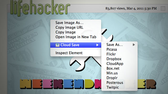
I didn’t really want to write a post about yet another chrome extension, as the last five posts have somehow or another related to Google Chrome. Actually, the post I was planning to write before this was “Why the Chrome Webstore is broken”, which would be sort of less fanboy-ish. Anyway, this extension is rather simple, so I’ll probably go into the reasoning as to why I made it, where it might be headed and how I made it. There probably won’t be too much interesting information here.
I wanted a Cr-48. Why? I’m not sure, partially because I don’t actually have a laptop of my own, though my brother’s Macbook Pro (which I’m typing this post on) is pretty awesome. Plus, the platform is new, non-intimidating, more or less open, and there’s such a lack of the most basic tools, that I could probably get a few twitter followers by creating web apps which did things that are really basic yet somehow the web is lacking with. Things like an offline dictionary or wikipedia dump reader. So, Chrome OS seemed cool, and probably guaranteed bragging rights, at least more so than a Google TV probably would. Due partially to my age, I’m pretty scared of using money and have this feeling that I shouldn’t spend anything on anything more than a can of soda. I guess I’ve gotten off-topic enough, and so, I wanted a Cr-48 (for free, of course).
In my opinion, Google’s pretty good at copying Apple. I don’t mean that in a bad way. I wouldn’t say it’s the intention, but at least they can recognize a good feature and can copy the essence of it in a pretty functional way while for the most part, distancing from the less good parts. Unlike my feelings of what Microsoft would do, which would be to copy most of the bad parts wholesale and add some pretty fascinating and novel parts. So, if any company were to give me a free laptop, that would be awesome, but Apple certainly isn’t going to give things away, and Google’s the only company I think can properly copy the trackpad (though it appears they can’t even do that, from what I’ve read).
So, that’s probably random enough, and you’re wondering how this relates to anything at all. Well, part of my quest to attain a Cr-48 involved building some pretty interesting pieces of software targeted at chrome os (but not by any means exclusive to chrome os). This included the offline dictionary and wikipedia reader. That way, if I didn’t get a Cr-48, I could have an excuse to hate Google and I might be less frequently arguing in their support. But this backup plan failed (fortunately), and I won the LucidChart Cr-48 competition by drawing a picture of a Cr48 out of flow chart components.
I started using Google Groups because I could. I wasn’t spammed by google in the great spamming of some time in february, which means Google hadn’t magically picked for me to have one of those devices (I think this was before I won the LucidChart competition). So I later joined the non-involuntary group for chrome notebook pilots so I could eagerly await the knock on my door from UPS and be prepared for what to do when that happened.
I skimmed through tons of random posts and eventually I noticed a pattern. People hated the file system and wanted a way to basically get rid of it. The irony is that this new Cloud that is being created, is a static collection of walled gardens. So much for progress. There’s no standard for interoperability and it hasn’t really been too important, but somehow, because of Chrome OS’s probably bad file system, people are recognizing that that this isn’t right to have an intermediary step to get data from one application to another.
I’ve always held that Browsers are to improve the user experience as much as possible while keeping all of the internet on a balanced and equal platform. I felt that Extensions were the means to trigger change to a specific group of websites or a general heuristic in order to make a more perfect experience. I thought of that while making drag2up, which creates a novel and useful feature which should be used by everybody. As part of building it, I ended up with a sort of OCD toward creating an implementation of every imaginable file host.
Cloud Save’s heritage is probably as much owed to drag2up as it is to Clip It Good, the latter of which I’ve never actually used, but found it inspiring nonetheless (and I ripped the Picasa implementation out of it too). Clip It Good was the general idea for Cloud Save, except that Cloud Save had more hosts. I made Cloud Save in thirty one minutes and thirty nine seconds, give or take a minute or so. The fact it was made in a mere half hour shows how the idea isn’t novel at all. In fact, most of those minutes were spent setting up the directory structure, manifest, installing inkscape, downloading the tango icon set and unzipping the icons to steal the save action icon (much like how I stole the up arrow icon used as drag2up’s logo). Nearly all of Cloud Save was the code needed to create the context menu. The downloading from URL, authentication and upload stuff was already in drag2up (I myself was pretty impressed about this. Evidently, I forgot how many features I had put into drag2up.).
Cloud Save wasn’t meant as a sort of glorified bookmark system. Or as a means to politely reshare images without hotlinking. I thought the need was to bypass the physical filesystem. That’s why the application is target primarily toward services which provide a virtual file system: a directory structure, files, privacy, etc. It wasn’t ever really intended as a means to share files, but I guess this is what people want it to do, so I’ll probably make the extension more sharing oriented in the future.
I realized I just forgot the rest of what I was about to write about, so I guess I’ll end it rather abruptly here. This morning, at 11 AM (though I don’t know if this date has been adjusted for my time zone) when I was still probably in school, Lifehacker posted about it and now people are using it. Awesome. I didn’t expect this to be that significant.
So, lets begin with a plead for you to rate my submission (ideally favorably) for the LucidChart chrome notebook contest, partly because it would be awesome, and I need to test the aforementioned HTML5 offline Wikipedia dump reader.
Wikipedia is awesome, and on my service-less iPhone 2G, one of the most useful apps is one with an outdated (by something like three years) Wikipedia dump reader. There’s something very much like the Hitchhiker’s Guide in carrying the “sum of all human knowledge” in one’s pocket. Wikipedia grows really quickly and the English language dump (as of last month at time of writing) is over six gigs of bzipped XML.
Another reason for building an offline Wikipedia dump reader is simply that I can. There’s a lot of cool and cutting edge stuff in this. It uses the file input JS API, FileReader, Blobs, WebWorkers, fast Javascript to handle a pure-JS implementation of the LZMA compression algorithm, and the FileSystem API.
All this stuff has only been possible for a very short amount of time. In fact, the FileSystem API only arrived with the release of Chrome 9 today. It’s pretty awesome to imagine that a web page, HTML and Javascript is processing multiple gigabytes of data at real time. At the current unoptimized state, the search results and the article shows up instantly within 100ms of a key press event (However, I admit it has yet to be tested on the actual English Wikipedia).
This app is almost ideally suited for Chrome OS. A hundred megabytes worth of data in a month (with the Verizon deal, not to mention that it’s limited to two years) isn’t very much and it would be a pity for the sixteen gigabytes of SSD space on a Cr-48 to be wasted. One of the dumps that I’ve compiled is a subset of the English Wiktionary which makes a great lightweight (8MB) dictionary with over sixty five thousand words. Wiktionary is fairly large at 217MB, and the Simple English Wikipedia is 51MB.
Assuming you can somehow access the dumps, I probably won’t post them on this server because of the massive bandwidth usage, someone else could, the process for using it is very simple. Download the file to your computer through HTTP, a torrent, or create it yourself. You might have noticed that the favicon is a picture of a carrot because that’s the current codename. Well, not really a codename, but I was scrolling through some icon lists and saw one for a carrot on the first page. I don’t even like carrots, but I digress. The dump uploading screen has a picture of a bunny biting a file upload carrot that you click on to select the file. Select the file, and it automagically copies it over to a persistent folder. Then you’re off to searching and reading articles and definitions :)
I’m not done yet, or at least, I don’t feel like packaging it up and submitting it to the chrome webstore yet because I need to figure out a good way to host database dumps.
 drag2up firefox dragging twitter
drag2up was a browser extension I built a few months ago, and recently bumped it up to 2.0. The basic idea is to use HTML5 File API and the drag/drop integration that Chrome and Firefox implements to enable uploads to any website by simply dragging and dropping the file from your computer onto the respective site. Instead of the trouble of opening a new tab, navigating to your favorite file provider, waiting for it to load, pressing the browse button, navigating to the folder with your image, pressing “Open”, then hitting the submit button, waiting for the upload to finish, copy the link, find the original tab among the mess of tabs that fills your tab bar and finally scrolling down, selecting the box and pasting the URL. All to share a three megabyte file. drag2up streamlines the process into a single, swift gesture where you drag the file onto the text entry field. The link is instantly added while the file is being uploaded in the background. If someone navigates to the link before it’s done uploading, the page uses the Google App Engine Channel API to stream real time upload status.
It still has a pretty simple user interface that works with zero initial setup. In addition to using gist and imgur for text files and image uploading respectively, it includes many additional services, configurable through a simple drag and drop interface. The new version also sports Firefox support.
New Features
Try out the extension now :) I would really appreciate any and all feedback.
Technical Information
There’s some pretty cool stuff going on in the new release. This release is really close to the bleeding edge of what’s capable on the web and with browsers. On Chrome, to upload files, the multipart/form-data xhr is being pieced together with array buffers and typed arrays, stuff from the WebGL specification. The Firefox version is based on the latest beta release of Mozilla Jetpack (hacked slightly so that the resulting xpi works with 3.6 as well as 4.0). Transferring data between the background page and the individual content scripts (or pageMods in Jetpack’s terms) is done with the createBlobURL (also called createObjectURL) function and binary XMLHttpRequest. On older versions of Firefox, FileReader is used to load files into base64 encoded data urls. Inter-frame communication is done with postMessage and native JSON serialization and parsing functions. Picasa and Dropbox support are built on Javascript implementations of OAuth (based on Clip It Good and Chromepad). So, yeah, there’s lots of new and super cool stuff in there.
The content script was more or less rewritten in order to support Gmail, which led to some interesting design changes. Firstly, the new version establishes a sort of hierarchy, a difference between a root frame and the most subordinated one. Each drag event is sent to the top using postMessage, where the root frame decides whether or not to render the targets or to remove them. Once the decision is made, it trickles downward to each of it’s immediate frames and then trickles back down to each subordinate frame. Whenever a frame is created, a loop detects that one has been added and attempts to access it’s DOM in order to insert a script element that initializes the code. Interestingly, content scripts (in chrome) are unable to access the child frames so a script needs to be inserted into the immediate page in order to insert a script into a child page. The scripts also set document.__drag2up to ensure there aren’t any frames that load themselves twice (interestingly creating an event and dispatching it seeing if there’s a event listener that does preventDefault isn’t a reliable indicator. I wanted to ideally create a system that was mostly undetectable by the parent page, but eventually settled for this simpler and more reliable implementation).
Once the “trickle_reactivate” message (every message happens to be eighteen characters, because of certain really weird design ideas) is recieved by all the frames, they loop through all the elements on the page, searching for elements that meet the isDroppable criteria. It does not trigger on elements who have a width*height < 100, so no really tiny boxes. It needs to be an input element type text or textarea that isn’t read only or disabled, or it needs to be an element whose contents are editable. Then it checks the positioning of the element using the document.elementFromPoint function twice (one accounting for scrolling and one that doesn’t to differentiate fixed positioning from others). The drop target is a div with a massive style attribute. It has rounded corners, css transitions and is positioned either absolutely or fixed based on the positioning of the associated input element. It’s centered around the element or completely covers it for smaller areas. When the user hovers over it, the opacity changes (the behavior is actually reversed from the last version). The original version faded out slightly when hovered over, which, after some thought, I realized made no sense. Similar to the drop target is a purple settings box on the lower right corner. I’m actually quite displeased with it. It’s not a great user experience, but at least it’s noticable. Primarily, it was added because I have no idea how to get the Preferences button to work with Jetpack and Google manages to bury the Options button somewhere deep within the depths of Chrome’s single menu.
Once the file is dropped, the content script decides whether it was a file that was dropped or an image that was dropped from some other page. If it’s an image (because that’s the simpler case to deal with), it does something that’s actually slightly counterintuitive. Using getData(‘text/uri-list’) isn’t reliable as in many cases, the image is wrapped in a link tag and that only gives the link URL instead of that image. So instead, it reads text/html and inserts it into a temporary div and pulls out the source attribute which is then sent to the background page. If the thing that was dropped is a file, first, it checks if the browser supports one of the Blob URI creation methods and if that’s available, it uses that to create a URL. If not, the file is read using FileReader as a base64 encoded data url and sent to the background page. But not immediately, because often the script is running in an unprivledged environment, so it does a postMessage to the topmost parent which should be privileged. The privileged content script sends the message to the even more privileged background page that initiates the actual uploading process.
Before going into what the background page actually does, there’s the settings page. I’m actually pretty proud of how it turned out. With the large number of hosts that are supported, I needed a way for the user to select hosts for different types of files. I could have used select boxes, but they’re not generally great when dealing with image based concepts, because a company’s logo is often more recognizable than the name (odd that I’m saying that, seeing as this blog has neither a distinctive name nor even a favicon). So instead, I built this little grid where the user can drag hosts into boxes on the right. It’s made with jQuery UI, because I don’t particularly like the API’s provided in HTML5.
The background page handles the uploading. Basically, there’s a bunch of javascript files that are loaded into it. The hardest part was by far, OAuth. If anything, this project has only refined my dislike of OAuth. And because this post is already insanely long, I’ll go and rant about the problems of OAuth anyway. There’s already a great article on how terrible of an idea it is for OAuth to be used in any application that runs code on the client. But Photobucket, Picasa and Dropbox still don’t understand that (or don’t care) and only provide OAuth. But that’s not really a problem, I just hate OAuth because even though It’s a standard, each service provider has some little quirks that take hours to debug and ends up being extremely frustrating. Maybe the OAuth gods are angry with me or something, but it’s incredibly troublesome.
Try out the extension now :) I would really appreciate any and all feedback.
So now that the chrome web store has launched, it’s there. You can use it offline and it stores progress with localStorage.
With help from @Frenzie and @paul_irish, the latest not-yet-versioned release of Weppy, my Javascript WebP to WebM conversion library, or something of a polyfill for a format that is yet to be part of any specification (HTML5 seems to specifically reference the image src attribute are examples such as PNG, GIF, JPEG, APNG, PDF, XML, SVG, SMIL, and MNG). The new release brings some awesome new features that really don’t change much and shouldn’t really be used in the real world because most browsers in the world still aren’t Firefox, Chrome or Opera - that is, a large portion of the browser market includes browsers like Safari and IE, either suffering from antiquity (IE6! aah!) or just liking h264 (IE9 + Safari).
The new release supports Opera. I never bothered debugging Opera, I figured it was another huge issue that would demand a rewrite (as supporting Firefox had needed, because the order of the object keys isn’t preserved and breaks the EBML result, or at least for Firefox’s parser which seems to be somewhat stricter than Chrome’s, is that ffmpeg?). And after premature optimization (stripping “unnecessary” EBML tags), my code didn’t work in chrome, so I had to revert to an earlier revision. All my testing code was based on file drag-drop stuff, and Opera doesn’t support that. Until I saw this mozillazine topic, I didn’t care, but it was a lot easier to fix than I feared.
Part of the solution was getting rid of the canvas stage. Admittedly, the canvas stage was pretty useless once the toDataURL() stage was removed before the first public release, but I didn’t feel like deleting code, so it stayed there. Also, I noticed that the global variable that gets introduced was accidentally named “WebM”, which is wrong, it should be “WebP”, but because of the uncreative format naming and similarities, I didn’t notice. Not sure, but it seems to be more stable now.
Chrome probably will add WebP soon, and it needs to be future proof, detecting whether or not a browser supports the WebP format. To do that, it creates an Image, sets the src to a data url of a 4x4 webp image and listens to the onload and onerror events, checking if the size is correct and there were no errors loading it. The routine is expected to error and totally untested as there aren’t any browsers that support the feature yet for me to try.
Another change, is that by default, it will automatically load all the same-origin (because of the limitations of XHR) webp images (from <img> tags), on the DOMContentLoaded event, so the library is practically drop-in now. In any web page, you can pretty much add <script src=”http://antimatter15.github.com/weppy/weppy.js“></script> and on the supported browsers, it should automatically load and replace all WebP images, though not something I would really recommended.
The demo is the same place it always was: http://antimatter15.github.com/weppy/demo.html
There is also this nifty hack that uses <canvas> to add an alpha channel to the WebP image (adapted from the original JPEG one): http://antimatter15.github.com/weppy/alpha/alpha.html
Also, please follow me on twitter.
Drag2Up, is an app named horribly, as I suck at naming things. It’s very simple in terms of capabilities - no buttons, no interface, which is pretty much the ideal type of user experience, something that’s intuitive and lends focus to content, not chrome. Really, this post isn’t useful in any way. What you should do, is install it and try it out for yourself (Chrome only, It would be possible to make a firefox version, but I have no experience with Firefox extensions, and the new Jetpack isn’t quite out yet, though you can probably adapt the code relatively easily. Maybe a greasemonkey script by using GM_XHR). https://chrome.google.com/extensions/detail/bjgjolhpdlgebodaapdafhdnikagbfll
Drag and drop is probably one of the greatest forms of interaction ever, it’s intuitive and exemplifies the usefulness of a GUI. Recently, browsers have implemented drag and drop APIs (actually a feature of IE5.5+ but then codified into part of HTML5). Some browsers, namely Chrome and Firefox implement a dataTransfer property of the drop events that allow one to access files dragged from the user’s desktop (or file browser) onto a web application. The application can read the file through the File API, and do whatever it chooses. Probably most notably is Gmail’s utilization of the feature that allows dragging and dropping files from the desktop onto a message to upload it as an attachment. When it was announced, some people remarked how excited everyone was of a feature that was present in desktop clients for several decades already.
Browser vendors have the role of enabling developers to do cool stuff. It’s up to a web developer or service to maintain an application, to update it and add new features. Undoubtedly, many do, living on the bleeding edge of innovation, but most don’t, and stay locked in a certain state for years if not longer. Extension developers have no obligation to be entirely objective in terms of how it deals with websites, and many are site-specific, adding features to sites that lack them, integrated into the interface, utilizing product-specific APIs, or document structure. Browser vendors enable innovation, site developers integrate standards and browser extensions add features to sites, because the developer is unwilling or because of restrictions on the functionality of web apps (x-domain, persistence, etc).
Uploading images is a fairly common task, and the standard go-to-file-host-site, click-the-attach-button, browse-button-hitting, navigation-through-folders and waiting-for-page-to-reload-after-uploading, link-copying, tab-switching and pasting. Some applications like CloudApp look promising in alleviating this needlessly tedious process, but only reduce the interaction steps a little. The ideal would be making that third-party file upload service integrate seamlessly into all web applications, with a level of integration akin to Gmail, drag and drop.
As awesome as it sounds, it’s not as easy to implement as one might like. The basic idea was to detect when a drag event started, and to iterate all the elements, adding an absolutely positioned, semitransparent mask to indicate that it’s a drop target. A few issues occur with that, I have a little writeup on those issues.
A lot of WYSIWYG editors use iframes, and creating content scripts with all_frames: true doesn’t necessarily mean it runs on all frames (for some very odd reason). And also for some reason, there’s no way to access frames from window.frames in content scripts. So I have this hack where if there are frames, it injects some javascript into the real page executed in the page’s context to run it within the iframe (if it’s the same domain, as it always is in wysiwyg editors). Then events get propagated from the sub-frame into the parent window, through postMessage that is subsequently handled by the content script, forwarded to a background page using chrome.extensions.sendRequest, and it all happens in reverse once the server gives a response. As such, it’s a really bad idea to use this for large files since it needs to be passed around several times over several pages, and apparently V8 isn’t the best with big strings.
Aside from that, uploading to imgur for some odd reason takes a long time. I don’t like sites that don’t have simple JSON POST APIs, and there really aren’t many that fit that criterion. So with the initial release, images are uploaded with imgur and text files are all uploaded to a github gist.
I’m making a (really awesome) chrome extension that involves dragging and dropping files. MDC, as usual, has great information on the topic. Gmail does it almost perfectly, with the green file drop target. But all other implementations of this feature suffer from two issues, and Gmail’s code is far too obfuscated for any mere mortal to interpret (no doubt thanks to closure). When implementing the file drop target, two fairly important user experience issues occur. I don’t know what way Gmail does it, and I just used whatever solution worked.
Firstly, is that you only want to trigger the drop target once a file is being dragged onto the web app. You don’t want a file drop target to appear once someone starts dragging text (fairly simple, check that e.dataTransfer.types includes File). Even trickier (even Gmail doesn’t get this right) is dragging links also triggers the file drop target for some reason (it’s tricky because then e.dataTransfer.types also includes the File type for some odd reason). There’s no way to access file data as it’s being dragged (getData always returns undefined). One thing that I still have no idea about is inter-browser-window data transfers.
Secondly, is how to get the dialog to dismiss itself once the dragged image is dragged out of the viewport. It’s pretty tricky because of how the events bubble and don’t always go through <body>. The solution I eventually arrived at was to add a timer on the dragleave and see if within fifty milliseconds (a random amount of time, zero works too, but fifty feels safer), another drag event is fired.
Hopefully, people will find this useful :)
I was inspired by chris messina‘s idea of integrating Readability into a twitter client. Sadly, I don’t have newtwitter yet, so I can’t actually do that. But since I do have the ultrahackable Streamie client, I’ve updated my fork of streamie with that functionality. It relies on a chrome extension that sort of makes an exception to the cross domain policy that makes all frames with a URL that includes #readStyle automatically load the readability bookmarklet.
Inspired by this
http://antimatter15.com/ajaxanimator/webstore.crx
If you run chrome —enable-apps and install it, you might be able to see an icon and magically be able to use the app offline. Or wait until the webstore is finally released and then you can just install it.
Edit July 10, 2010: Actually it was a while ago, but now the app works again and automatically restores the last state using localstorage.
The Ajax Animator (Wave/Mini interface version) now has support for basic Onion skinning, where the last keyframe is semitransparently placed in the background to aid in the positioning of the next keyframe. It’s now enabled by default at 20% opacity but can be disabled.
To disable it, click the advanced button on the right side of the toolbar and find the entry labeled Onion Skinning, there you can set the onion skinning opacity or disable it with 0% opacity.
I made an extension which shows a green sign (like gmail) on the side whenever there are blips outside the viewport. It allows you to quickly and effectively use keyboard navigation without blindly checking above and below, or generally scroll without needing to guess the position.
It comes as a Chrome Extension and also as a Greasemonkey Userscript.
I was surprised to find that one of the main referrers to my site recently has been Twitter. Looking into it, it seems to all be for my quickly hacked together CSS3 Sideways Google. Which uses the new CSS3 transforms supported by Webkit and Gecko (Firefox, Chrome and Safari) as well as the freaky DirectX stuff Microsoft has (Only major browser that isn’t supported is Opera, who is lagging a bit).
And in the spirit of CSS3 Sideways Google, I present CSS3 elgooG
It also appears that the awesome rotateme.org website was built entirely off of the original CSS3 Sideways Google and actually got 1500 diggs :)
I sorta expected it due to the new V8, Tracemonkey, Nitro, and SquirrelFish engines. But I’m thinking of making a port of ShinyTouch to JS and I was looking into what differences it might end up as.
I have to say I’m really quite suprised. It’s a simple piece of code:
setTimeout(function(){
    var start = (new Date).getTime();
    var n = 0;
    for(var i = 0; i < 10000000; i++){
        n += i;
    }
    var end = (new Date).getTime();
    alert(end-start);
},5000)
Just doing a loop a huge number of times and adding some numbers. But the unscientific results are quite amazing:
Python: 2640, 2110, 2000, 2190
Firefox 3.0 Spidermonkey: 777, 672, 685, 665
Firefox 3.5 TraceMonkey: 659, 365, 629, 629
Chromium Nightly: 146, 150, 147, 152
While these only test basic arithmetic and recursion, The browser is 15 times faster than Python, it just feels quite incredable.
During the last two days I worked a bit on my cross platform, Raphael based vector graphics editor. It now supports Firefox, Opera, Chrome, probably Safari and magically, something called IE. Yes, it works on that nasty terror. Really, the project started with just the idea of being able to support IE. Sure it has a few neat features (multiple select mainly), but the fundamental idea is to support IE and to do so in a stable manner. It’s actually running quite well in IE, though only the latest version has been tested.
Among the updates is a new delete tool that is far more flexible and powerful. It is now not just a button but an entire tool. So while you can still click on it to delete your current selection, you can also use the tool to click on shapes or drag and delete whole groups (not sure what that thing is called). It even has a nice red tint to signify deleting. There is also event listening, vX support (it only uses events and position), and selecting fill, stroke, stroke opacity, fill opacity, and stroke width.
It also integrates well into the Ajax Animator in an almost drop-in replacement type. Maybe eventually something to choose between VectorEditor and Onlypaths. The really only bug features there are multiple select and drag and line editing.
Lines are now done almost perfectly. Dragging them works perfectly and it shows two little boxes on the ends that fan be dragged to edit. This vastly simplifies the old issues with lines and stick figures. Stick figures that inherently satisfy me a lot because that was the highes level of animation I ever did.
It’s probably a bad thing that the developer od an animation application never did anything more complex than stick figures, and probably makes it seem strange for me to even start it. But anyone with more knowledge of animation would not be so naiive as to attempt this.
It’s awesome btw. The tab bar location is like opera, the new tab button is like IE, the password manager is like firefox, and buttons are like IE 8. I’m actually posting from IE 8, and it (being based on Webkit) works with the Ajax Animator.
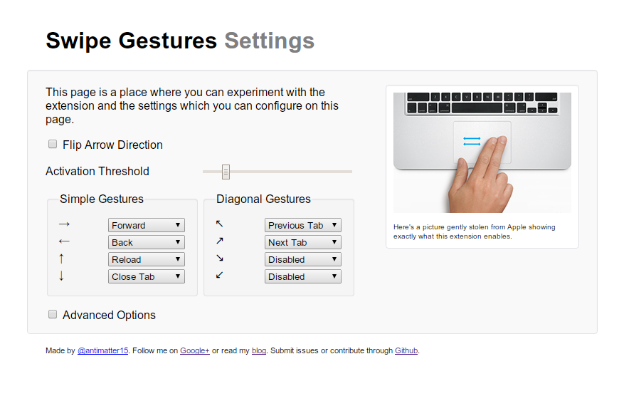
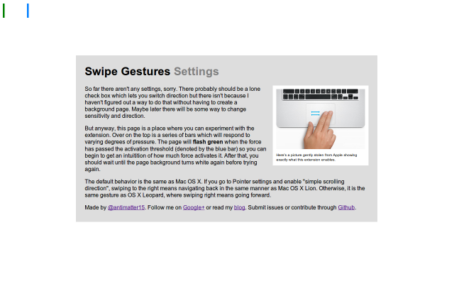
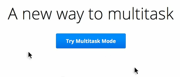
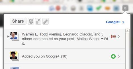
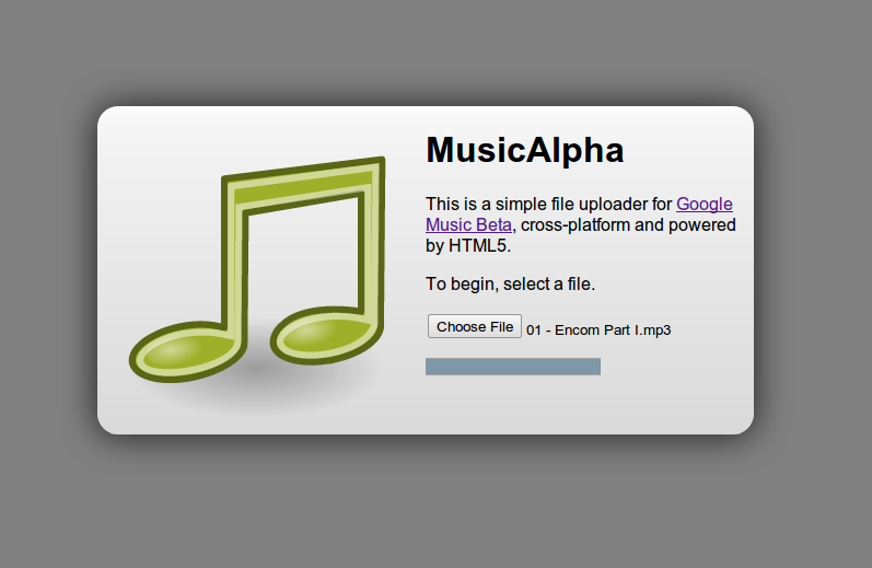


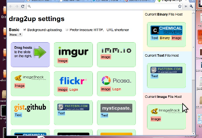


/Selection_065.png)

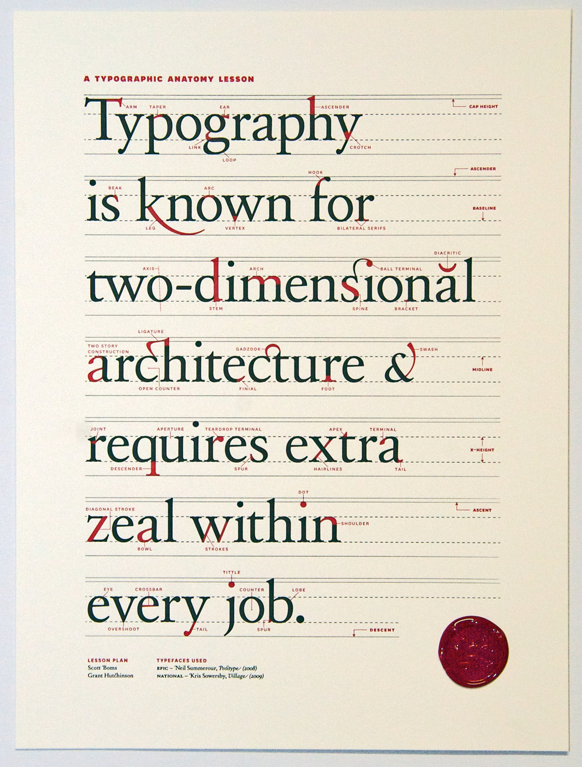