somewhere to talk about random ideas and projects like everyone else

stuff

#shiny

Recoloring Planck Data 30 April 2013

Recolored and Merged OnWhite Thumbnail

The rationale behind this is actually pretty contrived, but one of my friends had an imminent birthday, and I had no idea what kind of present to get her. Incidentally she sent had been working on some project and sent me a copy to look over- a request that I honored by perpetually promising to get to it eventually. Sure, it was interesting enough, but several months elapsed and I was beginning to face the fact that I would in all likelihood never actually get to it (kind of like my bottomless Instapaper queue from three years ago)- but that resounding guilt instilled the notion that somehow she liked astrophysics (the paper was something on Perlmutter’s Nobel). So in the absence of any other good ideas, I decided to get her a giant printout of the classic WMAP CMBR.

Soon after finding a poster for sale off Zazzle entitled the “Face of God“ (a particularly poetic pantheistic epithet), I found out that only a week earlier the European Space Agency had published the results of their Planck probe- a substantially higher quality rendition of the cosmic microwave background. So the solution would be simple, I’d just take that new, clearer image and upload it to that poster-printer under some clever title like “Face of God- Dove Real BeautyTM“, as if the NASA’s WMAP is some kind of odd gaussian girl trope.

Original OnWhite Thumbnail

ilc_9yr_moll720-300x150

But the ESA’s Planck coloring is for some unfathomable reason particularly ugly. Sure it has a kind of crude appeal reminiscent of some kind of yellowed 14th century cartographic map with its tan speckled shades of color, but in general, it’s just kind of ugly. Maybe it’s five hundred million years of evolution that makes me particularly predisposed to the blue-green aesthetic of leafy flora and the azure sky. Also, for sake of recognizability, the WMAP data has made its fame with that particular coloring, it’s kind of unreasonable to expect someone to recognize it even after the color scheme has been changed.

The task of recoloring it was actually pretty simple, I just had to locate a legend for the respective graphs- a solid gradient which spans from the cool side to the warm side (the actual range of the data is only ±2mK so there isn’t in this case a massive difference between cool and warm). After crawling through a handful of scientific publications, it’s easy enough to find one and take a screenshot.

wmap
planck-small

The difference in width is actually a kind of useless distinction, an artifact of the resolution of the paper or image I extracted the gradient from. It’s kind of interesting because I don’t really have any idea what the mathematical basis of these gradients are. The WMAP one looks like a simple rainbow so it may just be the colors arranged in progressively increasing wavelength, while the ESA coloring appears to be some kind of linear interpolation between red, white and blue (if the nationalities were inverted, one might be tempted to say murrica).

But once the gradient is established, it becomes the trivial task of mapping the colors of one image to another, something that I kind of hackedly accomplished with a Python script using PIL (It took a minute or so to process the 8 million pixels, but that’s not really too bad). And then, because the ultimate purpose of my project wasn’t so much to attain scientific accuracy as feigning it with some kind of better aesthetic, I went to GIMP and superimposed a translucent copy of the WMAP data so the image isn’t quite so speckled and the larger continental blobs more apparent.

Here is the poster if you want it. And the resulting 6.1MB jpeg.


Meta Analytics 17 August 2012

I’ve been maintaining this blog, or at least the content inside it for about five years now. It’s been through a handful of incarnations, often paired with significant changes in web hosting. I’ve had a blog for a little bit longer, but I don’t think I have the medium figured out. The structure of the posts and the style has changed over the past few years, but I can’t at this point call it evolution, a positive progression. Part of the power which lies in analyzing data is the ability to realize patterns, often at a different scale from human observation (spans of months or years) which are equally if not more insightful.

That’s been my personal attraction to data science. I’ve had a couple of personal experiments involving collecting data about my daily activities, my old writing and code in hopes of distilling the changes that I’m too conceited to admit without the infallible hand of statistics. For nearly two years now, I’ve logged my entire life within precision of approximately 30 minutes from Google Calendar (or the Calendar app on iPad which syncs to Google Calendar). Actually, the label is slightly off, I quite often dedicate large spans of time to more or less useless labels like “not productive”. But this temporal information falls apart in terms of its richness, for my schedule is dictated more so by the mandatory rhythms of school life than the drifting cadence of other behavior.

But I digress. This isn’t about why I collect data so much as “I have this data, now what?”. In this case, I had a hypothesis, a rather simple albeit morbid one at that “my blog is dying”. It’s not hard to see how I’m coming at the conclusion. I’m pretty much struggling at this point to meet my goal of one post per month (itself not a particularly difficult goal, but as time has gone on and my posts have become more infrequent, I feel more compelled to write obscenely long posts to compensate, but of course this also leads to big posts sitting there unfinished for long durations losing the sort of one post = one sitting mentality). But before I ramble for too long, I’ll cut to the chase and answer the question posed at the beginning of this paragraph: “Graphs.” (you could imagine those haunting glyphs levitating in the midst of air caught in the invisible grasp of Giorgio A. Tsoukalos, or better yet, I can spare your cognitive abilities by making it real)
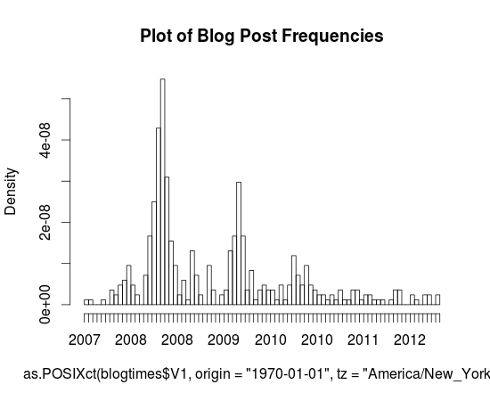
Here’s a pretty little graph I made in R (sorry for the mess on the horizontal axis, and I just realized I have no idea as to how to interpret the dates, I’m assuming that they’re linear and it’s just some odd aliasing issue that makes even-numbered years repeat twice), it’s a histogram of the dates of posts that I’ve made to this blog (extracted with a simple Python script and Wordpress’s built-in Export button).You can probably actually tell that the blog’s demise is quite a long way’s coming. Every annual peak ends up shallower the following year and the first time gaps have actually existed was this fateful year, 2012.

It’s actually sort of interesting that these peaks exist, but I can’t really tell during what months that happened during (since these axes are labeled so terribly, it’d be nice if I knew some nice interactive graph engine that worked with histograms, something like that cool time series viewer that Google had for Finance for like ever but for histograms, but I guess that just shows how much of a non-scientist I am, to have no idea how to fluently articulate in a statistical or graphical language of my choice).

For more graph fun, here’s a scatter plot of word lengths as a function of year. I wasn’t dedicated enough to figure out how to get NLTK to tell me the Gunning-Fog, Flesch-Kincaid or ARI value for individual posts, and I doubt that would end up showing anything particularly insightful. But yeah, so here it is. Charts. Charts of words. Note that thing that sticks out clocking in at around 3724 words is my first Music Alpha post.

Actually, I won’t mind that Wordpress isn’t yet self aware (‘ello Skynet) and still sends trackbacks and pings (whatever they are) to me when I link to myself. Seriously, you don’t actually need to have a self-aware artificial intelligence in order to learn how to not spam me with emails when I’m quite probably as in super definitely aware of its existence. But anyway, I guess I’ll stomach the lurching pain of a thousand emails (I’m using hyperbole here, in case your rudimentary artificial intelligence algorithms can’t quite distinguish them, but I’m also pretty sure your algorithms wouldn’t be able to handle n-th degrees of meta, so this excruciatingly useless parenthetical wouldn’t be much other than that: excruciatingly useless) and post the last part of the list here.

1340133957.0 , 2012-06-19 19:25:57 , 1178 [http://antimatter15.com/wp/2012/06/pinball/](http://antimatter15.com/wp/2012/06/pinball/)

1333025085.0 , 2012-03-29 12:44:45 , 1302 [http://antimatter15.com/wp/2012/03/musicalpha-v2-0/](http://antimatter15.com/wp/2012/03/musicalpha-v2-0/)

1293394934.0 , 2010-12-26 20:22:14 , 1409 [http://antimatter15.com/wp/2010/12/drag2up-v2-drag-and-drop-uploading-for-all-sites/](http://antimatter15.com/wp/2010/12/drag2up-v2-drag-and-drop-uploading-for-all-sites/)

1317686582.0 , 2011-10-04 00:03:02 , 1565 [Haven't actually published this yet, hmm]

1341591648.0 , 2012-07-06 16:20:48 , 2117 [http://antimatter15.com/wp/2012/07/cloudfall-a-text-editor/](http://antimatter15.com/wp/2012/07/cloudfall-a-text-editor/)

1307064165.0 , 2011-06-03 01:22:45 , 2180 [http://antimatter15.com/wp/2011/06/why-the-chrome-web-store-is-bad-for-the-web/](http://antimatter15.com/wp/2011/06/why-the-chrome-web-store-is-bad-for-the-web/)

1277922545.0 , 2010-06-30 18:29:05 , 2319 [http://antimatter15.com/wp/2010/06/wave-embed-api/](http://antimatter15.com/wp/2010/06/wave-embed-api/)

1294958307.0 , 2011-01-13 22:38:27 , 2762 [http://antimatter15.com/wp/2011/01/the-ambiguity-of-open-and-vp8-vs-h-264/](http://antimatter15.com/wp/2011/01/the-ambiguity-of-open-and-vp8-vs-h-264/)

1308832860.0 , 2011-06-23 12:41:00 , 2872 [http://antimatter15.com/wp/2011/06/samsung-series-5-chromebook/](http://antimatter15.com/wp/2011/06/samsung-series-5-chromebook/)

1305426252.0 , 2011-05-15 02:24:12 , 3724 [http://antimatter15.com/wp/2011/05/uploading-mp3s-to-google-music-beta-from-linux-chrome-os-win-and-mac/](http://antimatter15.com/wp/2011/05/uploading-mp3s-to-google-music-beta-from-linux-chrome-os-win-and-mac/)

That list was compiled by the command cat blogtimes.csv | sort -t',' -k3n | tail, and that’s quite an accomplishment because I had to look up the arguments for the sort command in order to figure that out. Of course, blogtimes.csv is the output of my magical six line python script (which uses BeautifulSoup to extract all the wp:post_dates).

So, with 10 blog posts in that list, every single 8 of them happened after 2011 and 3 of them happened in 2012. Considering that there were 10 things published in 2012 (according to my dataset) and 21 in 2011, that’s a rather significant fraction of the stuff which has been written recently to be insanely long.

Wordpress tells me this post is now at 948 words, so I guess I’ll add a bit of concluding at the end to push it over the magical power-of-ten barrier, so presumably you should brace for the terrible boom which occurs at this point (oh, what’s that? I think that’s my imaginary telephone operator who informs me when I make a factual error, apparently those kinds of booms only happen with waves, and apparently words flowing through word count orders of magnitude don’t count).

The original title of this post was “Meta Analytics & Upcoming Changes”, but in the spirit of the upcoming changes, I’ve moved the “Upcoming Changes” part into its own post (tentatively titled “Upcoming Changes”). You can probably at this point guess that “Upcoming Changes” involves something to tackle the excessive verbosity and to mitigate the absurdly infrequent posts. This probably doesn’t sound nearly as heroic to you as it does to me, because I’m listening to The Avengers soundtrack right now, and “A Promise” is pretty dramatic.


Surplus 19 August 2011

In a continuation of my rather unhelpful habit of documenting my activities on this blog long after you probably already know about it, I guess it’s time for me to discuss Surplus, my wildly popular (at time of writing) chrome extension which integrates Google+ notifications into Chrome.

Even more impressive, the name, which is a fairly common word is actually on the first page of a Google search for the word (around eighth result). It peaked at around 53,000 users and at one point made me the 329th most followed person on Google+.


Generating the iOS 5 Linen texture with Canvas 19 August 2011

noise
I guess the linen texture which is way too prevalent in Lion and iOS 5 looked pretty cool so I tried replicating the effect in canvas. It’s not instant but the texture is generated fairly quickly. It’s all done in around 20 lines of code. The basic idea is to first create a bunch of semi-transparent noise such as the stuff on the right (Though in the real one the opacity is only 3% and in the one on the right it’s been increased to 70%). To do that, we createImageData and set every fourth pixel to 6 if Math.random() < 0.1. That means approximately 10% of the canvas will be semi-transparent with the rest being totally transparent. I’m not clever enough to embed some steganographic message in the ostensible noise pattern, because I’m just way too lazy for that sort of stuff. But if you think that that last sentence was actually a decoy for my master plan, feel free to waste time decoding a message which probably isn’t there.

After that, the canvas is converted to a DataURL so it can be loaded as an image. After loading the image, we iterate 40 times and call drawImage on the original canvas with an offset to make every single point into a cross-shape. Demo.


It's host switching time. 29 June 2010

Every year at about this time, I switch hosts, now I’m switching to Host Monster. This site may probably be down for the next day or so.


stick figure animator 22 June 2010

One thing the ajax animator’s pretty bad at is stick figures. Sure it’s not impossible, but it can’t really compare with the ol-fashioned frame-by-frame joint-manipulation likeness of Pivot. It’s called stick2 because the original experiment with stickfigures was named stick.html, and when I went to extend it and didn’t feel like setting up a git/svn repo, I copied the file and named it stick2.html, and with no good project-naming skills, it stayed that way.

Anyway, this was a project that got pretty close to completion in early march, but I never bothered to blog about it until now. It should work pretty not-bad on an iPad J(except the color picker), though honestly, I’ve never tried it.

The interface is pure jQuery/html/css. The graphics are done with Raphael, but the player actually uses <canvas> for no particular reason.

Basically, it’s organized into two panels, the left-side figures-box and the bottom timeline. The figures-box contains figures (amazing!) and clicking on them adds them to your canvas. The two defaults are the pivot-style stickman, and something called “blank” which is a root node with no additional nodes. Though it shows up as a orange dot, unless you add something to it, it doesn’t have any actual look when viewed in the player.

On top is the context-sensitive buttons. Well the buttons in my screenshot aren’t context sensitive, they’re permanent. But when you click on a node, a new set of buttons (and words too!) appears. One is a line and the other is a circle. Click them to add a new segment or circle to the currently selected node. Then are various settings for the current segment (each node other than the root one is associated with a segment). Clicking those allows you to modify them. Also, a red X appears on the right, and that basically means remove the node and the child nodes.

So, now you have some extra nodes, how do you change them? Simply hold it down and drag, and the the segments move as well. But note that the length of the segment doesn’t change as you move it. That’s because by default, it locks the length of the segments. There are two ways to get around it. The first is to hold shift while dragging. The second is to tap the little lock icon on the top left.

On the bottom, is the timeline with live-previews of your frames with a semitransparent gray backdrop of numbers. Switch between each one by clicking on them and add one at the end by hitting the green “Add new frame” button.

On the canvas, there are two yellow squares, those allow you to resize the canvas.

On the very left of the top toolbar, is the play button. Hit it and the figures toolbox minimizes and it plays out your animation. Click it again to get back. Then is a little upload button. Hit it and then a little box pops up with a link to where you can find your animation in a way that you can share and to edit (not actually edit, but more like fork, as each save is given a unique id). Next is the download button which you hit, and get prompted by a big prompt-box which you use to paste in the ID of the animation you (or someone else) has saved, so you can edit it. Most of the time that’s useless as when you send a link with the player, it has a button which says “Edit”.

Sample animation: http://antimatter15.com/ajaxanimator/stick2/player.html?rlsm4lx14c

Try the application out: http://antimatter15.com/ajaxanimator/stick2/stick2.html

Code: http://github.com/antimatter15/stick2


ShinyTouch/JS 28 August 2009

Yay for yet another demo that strives to mix an mash almost everything HTML5 related! ShinyTouch in JS dumps the stuff from a <video> tag with ogg encoded video (well, almost all video from linux is ogg encoded so it’s just whatever format i got first from cheese). It gets dumped into <canvas> and getImageData does it’s magic.

Interestingly, if you don’t use the video and just do data from a raw image, you get upwards of 125fps on V8. Adding the video, it ceases to work on Chromium (maybe a linux thing? this tells me it’s just linux, but you can never be so sure).

//At this point, run away as the algorithm gets messy and hackish

So the thing just searches from right to left up to down within the quad. When it finds a column of something that fits the rgb range of the finger that is larger than a certain threshold, it checks for a reflection from the point. If it detects a reflection then yay! it throws the data at the perspective warper (based on a python one which is based on a C# one and though it would probably be easier to port from C# to JS making long chains of derivative work is fun). If there wasnt a reflection then it logs that and if that number is larger than some othe rthreshold then it kills the scanning and goes on with it’s life. The reflection algorithm just takes the point 5 pixels to the right and assumes that would be a reflection if there was one and a point 15px above and 5px to the left (nasty stuff) and takes the hue value from their RGB values. It takes the absolute value of the difference of the hue values multiplied by 100 (or 200 in the python version) and compares it with a preset configuration variable.

So now that that horrible algorithm which was just whatever came to my little totally untrained mind first. But it works semi-decently, at least for me. But you can hopefully see how nasty it’s inner workings are and it inspires people to clean it up. It’s quite a bit more readable than the Python version and only 200 lines of JS so it won’t be too hard to understand.

But since HTML5 has no Video capture thing for webcams, and my webcam doesn’t work with flash so I can’t use that canvas<-flash webcam bridge i built, uh, almost 2 years ago. So now you just get to gaze at my finger moving for like 20 seconds!

http://antimatter15.com/misc/shiny/shinytouch.html


ShinyTouch Progress Update + Fresnel's Equations 12 July 2009

So I was looking through wikipedia to find out if there were some magical equations to govern how it should mix the color of the background screen contents and the reflection and make the application work better. I think Fresnel’s equations fit that description. It basically gives the reflectiveness of the substance from information about the substance, the surrounding substance (air) and the angle of incidence.

Well  this image really is quite intimidating. I wont even pretend to understand it  but it looks like Fresnels equations with different values of n1 and n2 (some ratio for different temperatures). And is the plot on the right the same Total Internal Reflection in FTIR?
A really intimidating image from none other than Wikipedia

It’s quite interesting, partly because the shinyness (and thus the ratios used to combine the background color with the finger to compare) depends on the angle of the webcam to the finger, which depends on the distance (yay for trigonometry?). So the value used isn’t the 50-50 ration that it currently uses in the algorithm universally, but it’s dependent on variables to Fresnel’s Equations and the distance of the finger.

I forgot what this was supposed to describe

Anyway, time for a graphic that doesn’t really explain anything because I lost my train of thought while trying to understand how to use Inkscape!

So here’s something more descriptive. The two hands (at least it’s not 3, and why they’re just lines with no fingers isn’t my fault) and they’re positioned at different locations, one (hand 1) is close to the camera while the second (hand 2) is quite far away. Because of magic and trigonometry, the angle of the hand is greater when it’s further away. Also, this plugs into Fresnel’s Equations which mean the surface is shinier for where hand 2 is touching while it’s less shiny for hand 1. So the algorithm has to adjust for the variation (and if this works, then it might not need the complex region specific range values).

Notice how Angle 2 for hand 2 is much larger than angle 1 because of how it
Yay For Trig!

So here it’s pretty ideal to have the angle be pretty extreme right? Those graphs sure seem imply that extreme angles are a good thing. But no, because quite interestingly, the more extreme the angle is, then the less accurate the measures from the x axis become. So in the image below, you can see that cam b is farther from the monitor (and thus has a greater angle from the monitor) and it can discern far more accurately depth than than cam a. The field of view for cam a is squished down to that very thin angle whereas the cam b viewing area is far larger. Imagine if there was a cam c which was mounted directly in front of the monitor, it would suffer from no compression of the x axis like a _or _b but instead it has full possible depth.

the more extreme the angle is  then the lower the resolution of the usable x axis becomes. So while you get better accuracy (shinier = easier to detect) the accuracy point you can reduce it to declines proportionally.
Extreme angles have lower precision

So for the math portion, interestingly, the plot for the decline in % of the total possible width is equivalent to the 1-sin() (I think, but if I’m wrong then it could be cos() and i suck at math anyway).

So since it
More Trig!

So if you graph out 1-sin(n) then you get a curve where it starts at 100% when the angle the camera is positioned at is 0 degrees from an imaginary line perpendicular to the center of the surface, and it approaches 0% as the degree measure reaches 90 deg.

So interestingly when you plot it, basically what happens is a trade-off between the angle the camera is at and the precision (% of ideal maximum horizontal resolution) and accuracy (shinyness of reflection). I had the same theory a few days ago, even before I discovered Fresnel’s Equations, though mine was more linear. I thought that it was just a point in which the values dropped for the shinyness. I thought that the reason the monitor was shinier from the side is that it was beyond the intended viewing angle, so since there is less light at the direction, the innate shinyness is more potent.

So what does this mean for the project? Well, it confirms my initial thoughts that this is far too complicated for me to do alone, and makes me quite sad (partly because of the post titled Fail that was published in january). It’s really far too complicated for me. Right now the algorithm I use is very approximate (and noticably so). The formula improperly adjusts for perception and so if you try to draw a straight line across the monitor, you end up with a curved section of a sinusoidal-wave.

Trying to draw a straight line across the screen ends up looking curved because it uses a linear approximate distortion adjustment algorithm. Note that the spaces between the bars is because of the limited horizontal resolution  partly due to the angle  mostly due to hacks for how slow python is.
Issues with algorithm

So it’s far more complicated than I could have imagined at first, and I imagined it as far too complicated for me to venture in this alone. But I’m trying even with this sub-ideal situation. So the rest of the algorithm for now will also remain with more linear approximations. I’m going to experiment in making more linear approximations of the plot of Fresnel’s equations. And hopefully it’ll work this time.


New MirrorTouch Algorithm 27 June 2009

MirrorTouch Diagram
MirrorTouch Diagram

MirrorTouch (the new name for my mirror-based multitouch system). For those who don’t remember, it is a project to create a retrofittable cheap new technology for touch detection. It can be made of mostly off-the-counter or even household items. The software has the potential to be VERY fast, many orders of magnitude faster than the current technology. It is less seceptable to occlusion than many other technologies.

It began well over 2 months ago. It started out with IDEALISTIC paint sketches and then a VB.NET application to parse it. Then it was ported to Python and could handle the same sketches. After discovering that in real life the positioning of the points varies due to some very strange and illogical factor, the project had a several-month hiatus.

The issue is clearly demonstrated here:

noooo!! why doesnt it work?!?!?!?!?!
Oh Noes!

Last week, I considered the project a failure. I was playing around with a flashlight and tried looking into the strange behavior of the light. And something began to dawn on me. The shape as on diagram 1, can be flattened out as a visualization for what it behaves like. So from the pyramid shape, it looks more like a little 4-pointed star. Since the mirror is only on two sides, you can simplify it to half a star emerging from a square.

The diagram
Flattened Diagram

To the side is a geometicalified sketch of it from my notebook. Here you can see the relation between the point and where it shows up on the mirror.

From that, you can use the distance between m and the y point (y-m) and divide it all over the distance from the mirror to the webcam (l) and plug it into y=mx+c form. Repeat that over the x axis and you can use basic algebra to find the interesction.

From that is the new magical formula that powers the application:

Yay! Purtyful!
Yay! Purtyful!

The new formula is so magical that it actually works. Yes, it’s amazing, it has survived the most strictest of tests of mathematical consistency. It works.…. At least in theory. Now what about scientific tests? Oh no! it actually has to work in the physical world? Oh no!

With these 2 magical equations. I have (theoretically) in an idealistic model of the system, solved the issue with distortion. It should theoretically resolve all issues with the system. It should work.

So i set up the model again, attaching my webcam to a ruler and taping it to a speaker. Taping mirrors down on a piece of paper, and this time, Scribbling down measurements on the side. I got it to work. Workign without resetting configuration every time it ran. It works. It truly actually works. Multi-Touch too.

Since I cant get the webcam to feed directly to the python script, I have to use Cheese (it’s a linux app for taking pics from a webcam) to save screenies of the webcam mounted percariously from a ruler using only a bit of transparent Scotch tape. I copy the images over to the mirrortouch directory and go in the commandline and type in python process.py and watch as lines of logging output fly past as the windows autoscrolls down filled with coordinates and color hashes.

I watch as it generates a .png file.

It works in the _real_ world!

Yes it works! AMAZING!

Note: The random scribbles in the back aren’t for any contstructive purpose. No, actually they just stop my stupid webcam from adjusting the contrast and making everything all ugly and ewwie. If my webcam sucked less than maybe it would work but my webcam really does really really really suck.

Now if it could get ported over to somethign like C++, and actually parse a live video feed from the webcam then it may become an actual working implementable multitouch technology. As it stands, it’s just a multitouch proof of concept, and I don’t know C++ so it probably won’t work.

Anyone dying for the source code can find it in the SVN repository at : http://code.google.com/p/mirrortouch/ Just beware that it may take lots of scary and tedious configuring in current stages (Configuring color range of background in the band, configuring color range of target, setting distances and middle length and other horrors, but from the SVN you can also do the insanely boring act of running various images that are already there through the script, and most of the images just wont work even with replacing huge blocks of code).


Hello world! 07 May 2008

Welcome to WordPress. This is your first post. Edit or delete it, then start blogging!


I’ve decided to keep this, it’s a nice marker of when exactly this blog transitioned to a different platform.