somewhere to talk about random ideas and projects like everyone else

stuff

#design

Blog Reboot 11 April 2015

this blog

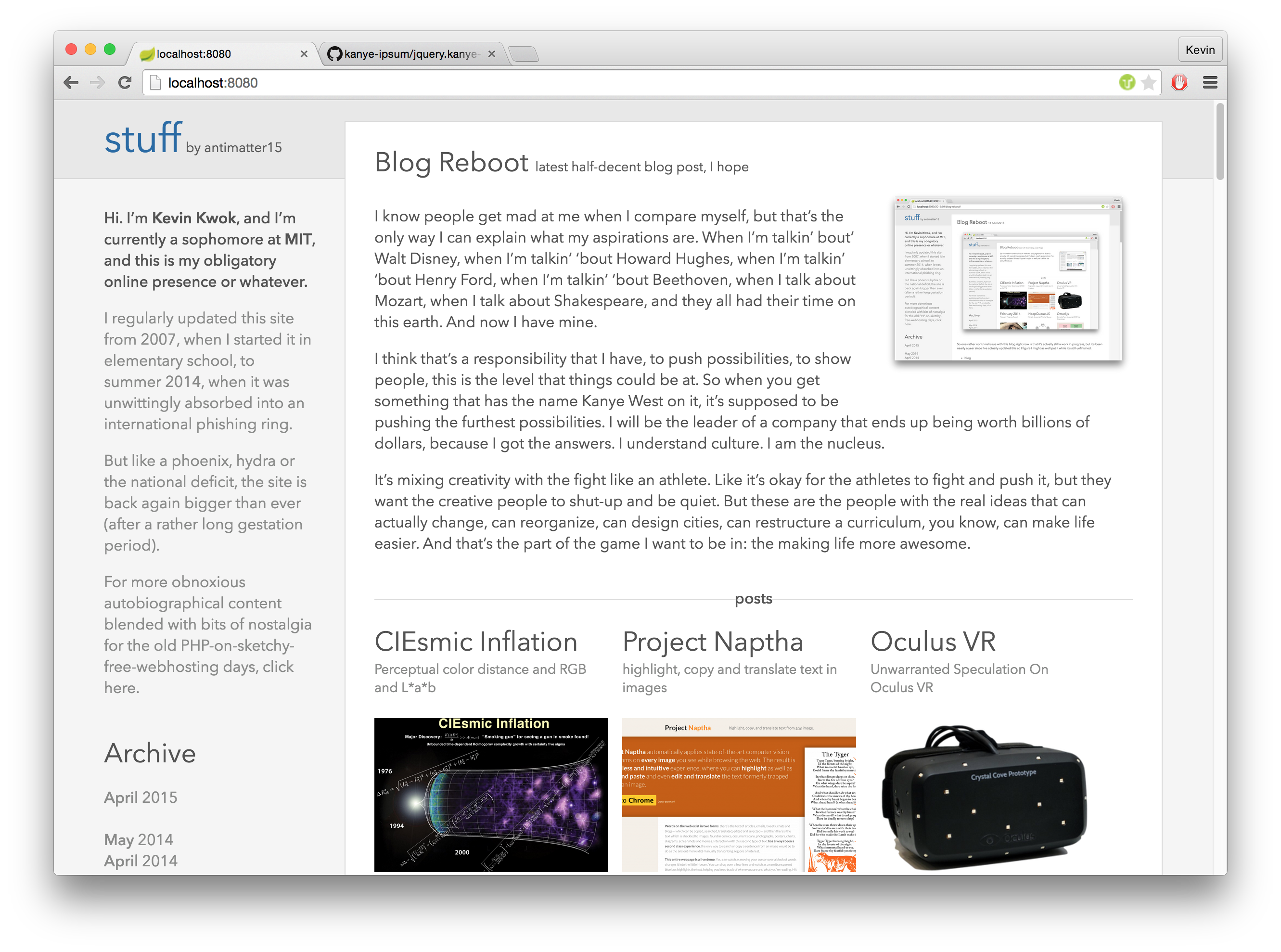
This is my submission to blogdom’s burgeoning class of eternally “work in progress” sites. I’ve been working on this blog reboot for nearly a year at this point (rest assured, I haven’t worked on it for any appreciable fraction of that time— but it’s nonetheless traumatizing for me as “blog posts written” is my primary metric for personal productivity).

There’s still a lot left to be done, but right now it should be in a more or less functional and navigable state. I’ve just added image thumbnailing (so this homepage shouldn’t take a triassic aeon to load anymore), which seems like an addition substantial-enough to warrant some new words adorning the featured post callout.

Most importantly though, it’s now a hip static site hosted on Github Pages (though I might move to S3), so the Turkish phishers last remaining venue for hijacking this site may be sending a pull request.

Getting Hacked

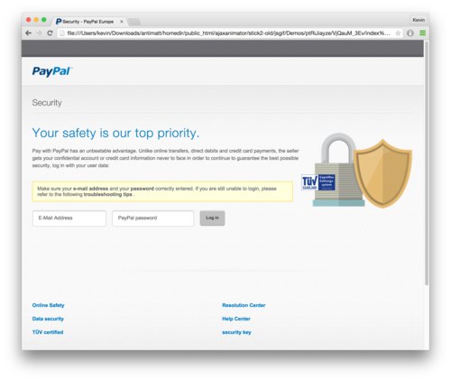
I don’t generally pay a lot of attention to this blog— especially during the beginning of every month. I used to generally hold myself to a rule that I would post something new at least once a month, but that policy kept slipping and then there was a mad dash to finish some blog post the first or second day of each new month to be retroactively timestamped.

Anyway, point is that I didn’t notice when the site got hacked for a few days. Unfortunately I don’t have any screenshots of what the site looked like when it was hacked. And at this point I can’t promise you that my mental model of what it looked like is anything more than a hallucination.

It’s a bit of an interesting chapter in my blog’s history, so I’ve spun off this section into its own post.

First Sketches

I guess it makes a reasonable amount of sense to write about how this site works. This is the first incarnation of the blog which is to any appreciable extent aesthetically original. It isn’t the default theme of JupiterCMS, PHPFusion, nor is it a free template for Wordpress.

It’s a pretty simple design, and it’s pretty nifty that in this day and age, a design which is sparse by ignorance is indestinguishable from a good design which is sparse by (uh) design. There isn’t much besides the simple arrangement of rectangles and lines and it relies pretty heavily on typography and whitespace to delimit sections.

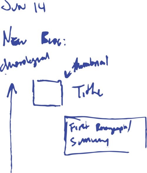
At around the same time my blog stopped working, I came into the posession of a Moleskine. On June 14th, apparently, I started my first sketch of what my blog might be like.

In retrospect, it didn’t really look very coherent and I have literally no idea what I was trying to do at the time. But one of the motivations behind the entire endeavor was to strike a sort of balance between a blog and a portfolio. I like the idea of documenting the process of things and writing some part of the though process a somewhat non-abbreviated form. But one thing that I noticed is that a blog is a terrible means of surfacing older content, and I think a lot of the interesting ideas I’ve explored are the ones which I played around with several years ago.

On the other spectrum, I didn’t want to go too far in the direction of summary. I didn’t quite want it to be simply a résumé where I condense every endeavor into two buzzword-packed sentences which summarize the little iota of cleverness imbued in the project.

And so the motivation of the design was finding some way to hybridize the two goals— summary and process.

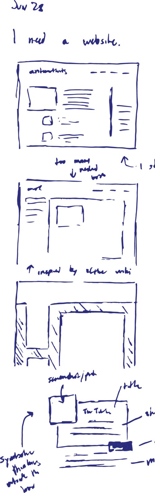
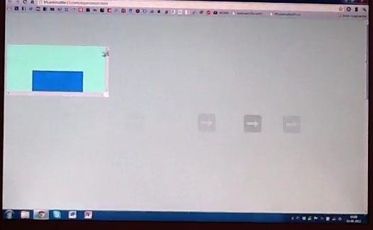
I found another sketch in my Moleskine dated June 24th, which seems to be a bit more coherent. On the right you can see some blocks and lines which, while not having much bearing on the current site design, at least seem like they might pass a Turing test criterion for sufficiently-websiteish website.

One thing that I noticed is that the sequence of my projects tends to be pretty structured. Over the years, I tend to explore little ideas which tend to culminate into singular projects— or alternatively, I build a larger project and spin off smaller components. All of this tends to happen over a relatively short time period (a few months to a year).

So in terms of a projects list, this means that I can introduce a bit of an aesthetic cadence where a series of minor projects are occasionally punctuated by larger projects. And because of this natural faux-hierarchy there’s a natural clustering which is generally both temporal and subjective. The short projects have single-sentence summaries, whereas the larger projects can have a paragraph worth of elaboration.

Naturally, all the project descriptions are hyperlinked and lead to a project page which includes all the blog posts documenting the process of creating that particular project.

New Tools

At some point I helped design a mobile app and ended up getting reasonably familiar with Adobe Illustrator.

It was also at this time that I started using tools that designers use— things like Adobe Illustrator and Bohemian Coding’s Sketch.


Brass Doge 10 April 2015

“We are stuck with technology when what we really want is just stuff that works.” — Douglas Adams

At MIT we get a class ring called the “brass rat”. It’s rather amusing that the ring is neither made of brass, nor features a rat. It’s actually Gold, and features our mascot— the beaver.


Swipe Gesture 2 Development 16 August 2012

So I’m trying something new, returning to quasi-daily somewhat short updates about the development of whatever I’m working on rather than withholding everything until something of somewhat acceptable release quality is achieved. I have a blog post about that transition, but I’m still working on it (as in, writing it is somewhat boring). It’s probably better given my development cycle is quite nonlinear, usually I get something somewhat promising made in the first few days or so and pause for long and possibly indefinite durations doing other stuff in the process. Probably, writing short blog posts about what I have yet to finish will remind me to, well, finish them. Just maybe. But I’m probably going to have to preface every post that I write with this kind of disclaimer until I actually get that post finished and published so I have something to reference rather than pointing crazily into the air and saying “oh yeah, it’s coming, now, someday, maybe.”.

Starting about yesterday, I started working on the successor to Swipe Gesture. The new version tries to mimic the actual behavior of Chrome on Lion, which I think is really quite cool. Here’s a video I found on YouTube which shows how it basically looks like if you aren’t familiar with it. The first thing to notice that it’s substantially less trivial, code-wise. No more is it a 30-line software lightweight, but it’s not _too _complex and arcane to forbid any kind of comprehension. Now, the simple prototype of its functionality is already nearing 300 lines of code.

Another big difference is now it’s no longer designed strictly for Chromebooks. In fact, one of the reasons for starting this was that I was informed that the kind of functionality might be useful on Macbooks running Windows via Bootcamp. In fact, it’s meant to be as general as possible, to work on pretty much any kind of platform. And it’s not even bound strictly to the horizontal axis: the code is meant to work with linear swipes in any direction including diagonally (although some experimentation on my chromebook seems to indicate that swiping at angles isn’t terribly useful).

The most significant conceptual change is the transition between a speed/acceleration metric to a distance metric. That is, in the old version, an action was triggered when there was a swipe in one direction vigorous enough to be considered. This was a fairly simple way to avoid the problem of distinguishing between a horizontal scroll action and a swipe by not making a distinction. In a sense, cheating. The new version instead does things “the right way™” by observing events carefully to determine if a swiping action actually results in scrolling. If that’s your kind of thing, the technical nitty gritty details have their own dedicated blog post, so feel free to click through if you’re interested.

Once it’s determined that that scroll thing is actually probably a swipe gesture, it renders a nice little arrow in canvas. I considered using a unicode arrow and setting the font to huge, but that didn’t turn out quite as well as I expected (plus, it makes rotations and interactions with the embedding page CSS a little less predictable).

Also another thing is that it turns out that it’s a bad idea to set a css transition on something which is meant to hook with mouse or scroll movements because, while this ends up smoothing things out (which is good for mouse wheels because they click to the nearest 120 magical click units) it ends up producing a significant amount of lag and just feels so awkward.

Another thing (since this post is written over the course of several days, and the actual update has already been published at time of writing) is the cool redesign of the Settings page. The first thing to notice is that the settings page for once actually has settings, which is quite an accomplishment by itself. Also, it has a visual refresh that makes it look somewhat bootstrap-esque. That’s because ever since using Bootstrap in the making of Protobowl (a rather big project that I have yet to blog about), I’ve pretty much fallen in love with the color whiteSmoke. Partly because it has a name, which means I don’t have to google it or tattoo it on my arm for a mnemonic’s sake, and also because it’s a pretty nice color.


Swipe Gesture for Chrome 13 August 2012

Here’s an extension which I actually released some time back, but never got around to writing a blog post for. Part of the reason was that the early reviews didn’t quite pan out, in large part due to not working. But I was using my Chromebook and I somehow felt a vague longing for some kind of multitouch gesture, and remembered that I had made this little extension (which I had disabled for some reason). Anyway, this is as appropriate a time as any to formally announce it to my probably remarkably small blog readership.

There is, however a tad bit of difficulty representing the function of it in pictures because really, it doesn’t have a big UI. It makes hardware more useful, and in its idealized form, should have no interface. But of course, we don’t live in a place where apps are perfectly idealized and either way, Apple has plenty of nice pretty pictures of people swiping fingers to the right.

I really fell in love with the Macbook multitouch gestures, almost at first sight. They just seemed so natural and so beautiful that I sort of felt that that was like the epitome of design or HCI perfection. And from that point, any time I used a laptop which wasn’t made by Apple (or even the ones which were made by Apple but were stuck in the barbaric ages preceding the inclusion of the glass multitouch pad, where its invention might have produced a scene like this), I felt thoroughly disgusted.

Flipping through the Chromium OS design papers, there is one page dedicated specifically to cool multitouch gestures which could be used. And as far as I’m aware the Samsung Series 5 550 (the new chromebook) is the only device which supports these gestures (thus far), and even then it’s only pinch to zoom and forward/back (three finger). All the other Chromebook users have been left out.

Another cool thing about the implementation is that it uses a certain webkitDirectionInvertedFromDevice property of the mousewheel events, which gives you a boolean value about whether or not the platform you’re on has some magical direction inversion like on OS X Lion or if you’ve enabled “simple scrolling” on Chrome OS. But this might not have been a good idea since swipe directions too are sort of inverted on those platforms naturally as well, so it might be better to _not _compensate for it.

Anyway, the implementation is actually quite simple. The current version doesn’t even break the 40 line mark, because all it does it it listens for mousewheel events on every page (via a content script), and it calculates the current acceleration. If that acceleration ever passes a certain threshold, it triggers a forward or back action. Right now, the threshold is preconfigured based on my own testing on a Samsung Series 5 (note, not 550) chromebook. But for people with other devices, I’m working on a second version which will be slightly more Apple-esque in its implementation.


Fluidizer fixed width → fluid width bookmarklet 14 July 2010

Yaay, fluid width!

I IZ NOM NOMMING ON HALF UR PIXELZ

This is another old one, something I made february fifteenth of this year.

One of the purely theoretical things that have always annoyed me, were fixed width themes. Because I love being a hypocrite, this blog right now is using a fixed width theme. Though I probably could make up an excuse, like to serve as a decent test case for Fluidizer in part of my grand scheme detailed via embedded steganographic messages inside all of my screenshots. Of course that’s all a lie (however much I would like otherwise).

It’s always bothered me how some web sites have these fixed-width layouts, sometimes with insanely thin boxes allocated to content. The vast majority of my screen becomes this orange blob of text. Chrome’s visual appearance motto is “Content not chrome”. That doesn’t help if the content is being obscured by the presentation of the content (gopher) might have solved that problem). Less chrome just means my eyes start to drown in +/- 1,732,405 pixels of orange. Even outside the extreme case, having a fixed-width layout isn’t efficient, and using something like Readability to only show the content removes the personality of the site or author, and only works on articles.

Fluidizer automatically resizes themes semi-pseudo-intelligently, and works with a lot of themes. It has several algorithms it uses, which are sort of alchemy-like and strange. I have no clue how it works, but there’s lots of strange stuff that goes on to magically do stuff. I think it even somehow has a CSS parser that uses CORS to load css through a server-side proxy.

Only tested in Chrome: [Fluidize]

javascript:(function(){function k(a){return(a||"").replace(/^\s+|\s+$/g,"")}function u(a,g){var b=new XMLHttpRequest;b.open("GET","http://anti15.chemicalservers.com/cssproxy.php?cssurl="+encodeURIComponent(a),true);b.onreadystatechange=function(){b.readyState==4&&b.status==200&&g(b.responseText)};b.send()}function o(){for(var a=0,g=0,b=false,h="*,div,p,body,span".split(",");!b&&g++<20;){if(document.body.scrollWidth>window.innerWidth){b=true;a-=100}else a+=100;for(var c=d.length;c--;){var f=d[c].text;try{for(var i=document.querySelectorAll(f),l=i.length;l--;){var n=i[l],p=parseFloat(d[c].width,10),q=d[c].width.replace(/^[\-\d\.]+/,"");if(q!="px")if(q=="em")p*=16;else console.warn("not used to handling non-px units");if(p>400&&h.indexOf(f)==-1){if(!n.a)n.a=p;n.style.width=n.a+a+"px"}}}catch(x){}}}try{c=d.length;a=0;for(var r;c--;)if(h.indexOf(d[c].text)==-1)try{var j=document.querySelectorAll(d[c].text);if(j.length==1&&j[0].getElementsByTagName("*").length>15&&(j[0]==document.body||j[0].parentNode==document.body||j[0].parentNode.parentNode==document.body))if(parseInt(d[c].width,10)>a){a=parseInt(d[c].width,10);r=j[0]}}catch(y){}if(a>500)r.style.width="100%"}catch(z){}}function v(a){function g(){var i=h.split(";").map(function(l){if(k(l.split(":")[0])=="width")return k(l.split(":")[1]);return""}).join("");b&&k(b)&&i&&k(i)&&d.push({text:k(b),width:i});h=b=""}for(var b="",h="",c=0,f=0;f<a.length;f++)if(a[f]=="{")c=1;else if(a[f]=="}"){g();c=0}else if(c==0)b+=a[f];else if(c==1)h+=a[f];g();o()}for(var d=[],s=document.styleSheets,t=s.length;t--;){var e=s[t];if(e.href&&!e.cssRules){console.log(e.href);u(e.href,v)}else{e=e.cssRules;for(var m=e.length;m--;){var w=e[m].selectorText;e[m].style&&e[m].style.width&&d.push({text:w,width:e[m].style.width})}}}window.addEventListener("resize",function(){setTimeout(function(){o()},100)});o()})();

Today's Updates III 26 May 2008

I added the beginnings of the Users system. There is an accordian panel for switching between Register and Login. The Login panel has the standard Username and Password (labeled User/Pass). The Registration panel is the same, with 2 instances of “Pass”. As every other panel in the app, there are nice little silk icons that accompany them.


Progress Report 22 October 2007

I’ve not been releasing anything for a while, for several reasons:

1. I’m converting everything to the Ext UI (from textareas, tables, etc. to Ext grids, form fields) 2. I’m completely rewriting the timeline. including a host of new features much for speed. (several TIMES faster) mainly becuase it generates only 300 frames per layer by default, instead of 500, but automatically adds new frames DYNAMICALLY when more is needed. But the rewrite is sorta unstable 3. Tons of UI upgrades. A short list of changes from the top of my head are, a new login stystem (lot’s of fading effects) My Animations; list, faster animation loading. The user animation browser is completely changed-with stuff like Rating animations and comments coming. 4. Sorta goes in UI upgrades, is a new loading splash screen. It has a progress bar, showing status. And CSS is dynamically added, and loads from either the local server, or google code’s subversion (faster). 5. Cross Domain Ajax. The current ajax implementation only allows you to generate flash animations if you are on a php server with all the libraries/files installed. And sometimes you go to it from a proxy or google code beta or something. If that happens, you will not have any access to creating flash animations. So, soon it will curcumvent this restriction, by using a script tag hack, to load the animations from the server. Though the current ajax implementation will still be used for larger animations. And i might revive animation compression for this purpose. 6. Upgrading to Ext 2.0, this is not really happening NOW, but is being actively thought of. It’s not really a “painless” upgrade, with lot’s of stuff to modify/rewrite. 7. Everything has two options. One is to load from subversion, or the local server. It’s better if you load it from subversion, if you are mirroring it, or if your server is slow. And in many cases it’s really fast, and automatically gzip encodes the stuff. Great isnt it? so it has an option of loading all* (okay, most…) images and CSS from google code.

8. And even more stuff……