1_vgexamples_F_k1pC2sJzEqEynh
Here’s an idea for fighting phishing that seems to be a good idea (at least to me). I’m no security expert, but from what I understand about MITM and other issues, this should provide a decent solution. It could probably even help fight tabnapping.
The identicon was first thought of by Don Park and he has envisioned something pretty interesting that uses identicons for a similar purpose, however it requires certain changes to user agents and no browsers have yet implemented it.
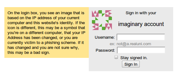
The basic idea is that on the login page, the server generates an Identicon based on the hash of the user’s IP address and a certain secret salted string). This will generate a unique, and extremely hard-to-fake image that is associated with whatever computer (or network under NAT) the user is at. The great thing is that it requires absolutely no changes to the existing user experience, isn’t too aesthetically jarring and completely ignorable. If the user’s under a proxy and is aware of it, this doesn’t detract from the user experience, it’s just a visual sign that the user might be on the wrong site and it’s up to the user to decide whether or not to go on.
The login identicon is a unique signature of the server you’re communicating to and the IP address of your computer, if either one is slightly different, the icon will be completely different.
As the tabnapping issue shows, the problem isn’t that users are too lazy to read the URL bar, it shouldn’t even really be necessary to read the URL bar. There are far too many funky unicode hacks that can make URLs look like other URLs, and people’s memory of exact textual strings isn’t that good. Plus, imagine how much of humanity’s time will be wasted having to break the usual eye movement and look at a small box on the top, thinking intensely for a few seconds before returning back to the usual login procedure. Expecting people to do that is just too much.
This solution, however should provide an image that can be embedded (ideally) on or immediately next to the login box, so the user just notices it instead of searching for it.
I’ll probably provide a proof of concept soon, it’s six in the morning and I’m about to go to school. And here it is.


