somewhere to talk about random ideas and projects like everyone else

stuff

#colors

Recoloring Planck Data 30 April 2013

Recolored and Merged OnWhite Thumbnail

The rationale behind this is actually pretty contrived, but one of my friends had an imminent birthday, and I had no idea what kind of present to get her. Incidentally she sent had been working on some project and sent me a copy to look over- a request that I honored by perpetually promising to get to it eventually. Sure, it was interesting enough, but several months elapsed and I was beginning to face the fact that I would in all likelihood never actually get to it (kind of like my bottomless Instapaper queue from three years ago)- but that resounding guilt instilled the notion that somehow she liked astrophysics (the paper was something on Perlmutter’s Nobel). So in the absence of any other good ideas, I decided to get her a giant printout of the classic WMAP CMBR.

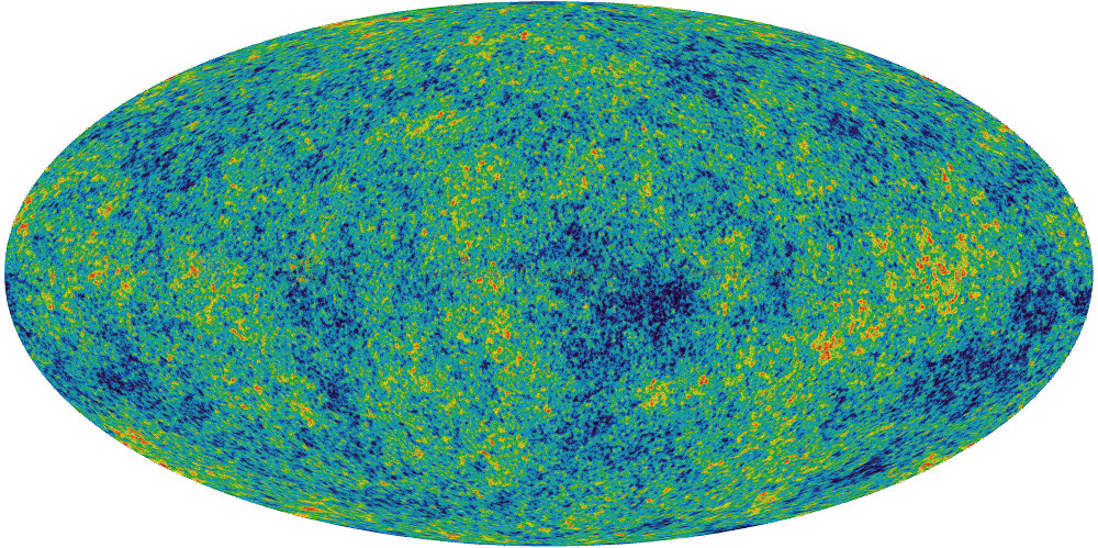
Soon after finding a poster for sale off Zazzle entitled the “Face of God“ (a particularly poetic pantheistic epithet), I found out that only a week earlier the European Space Agency had published the results of their Planck probe- a substantially higher quality rendition of the cosmic microwave background. So the solution would be simple, I’d just take that new, clearer image and upload it to that poster-printer under some clever title like “Face of God- Dove Real BeautyTM“, as if the NASA’s WMAP is some kind of odd gaussian girl trope.

Original OnWhite Thumbnail

ilc_9yr_moll720-300x150

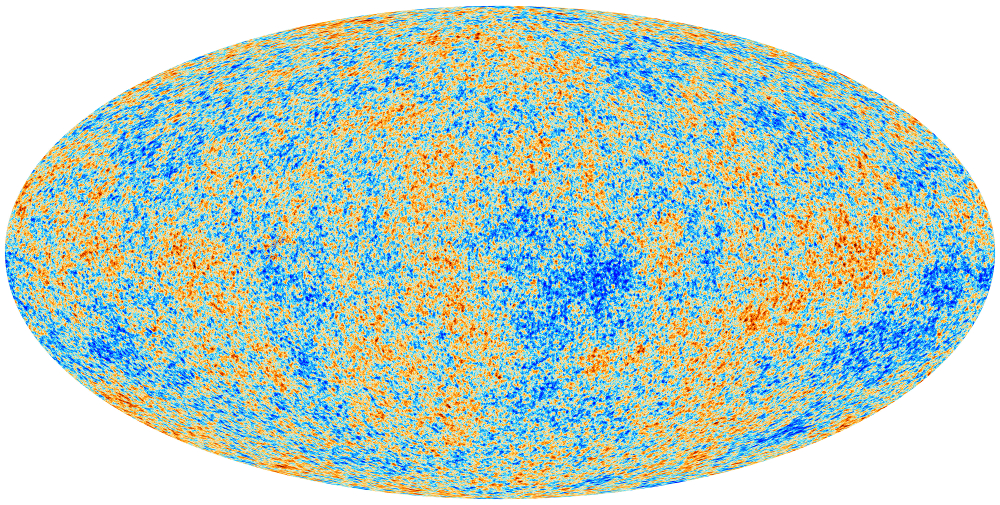
But the ESA’s Planck coloring is for some unfathomable reason particularly ugly. Sure it has a kind of crude appeal reminiscent of some kind of yellowed 14th century cartographic map with its tan speckled shades of color, but in general, it’s just kind of ugly. Maybe it’s five hundred million years of evolution that makes me particularly predisposed to the blue-green aesthetic of leafy flora and the azure sky. Also, for sake of recognizability, the WMAP data has made its fame with that particular coloring, it’s kind of unreasonable to expect someone to recognize it even after the color scheme has been changed.

The task of recoloring it was actually pretty simple, I just had to locate a legend for the respective graphs- a solid gradient which spans from the cool side to the warm side (the actual range of the data is only ±2mK so there isn’t in this case a massive difference between cool and warm). After crawling through a handful of scientific publications, it’s easy enough to find one and take a screenshot.

wmap
planck-small

The difference in width is actually a kind of useless distinction, an artifact of the resolution of the paper or image I extracted the gradient from. It’s kind of interesting because I don’t really have any idea what the mathematical basis of these gradients are. The WMAP one looks like a simple rainbow so it may just be the colors arranged in progressively increasing wavelength, while the ESA coloring appears to be some kind of linear interpolation between red, white and blue (if the nationalities were inverted, one might be tempted to say murrica).

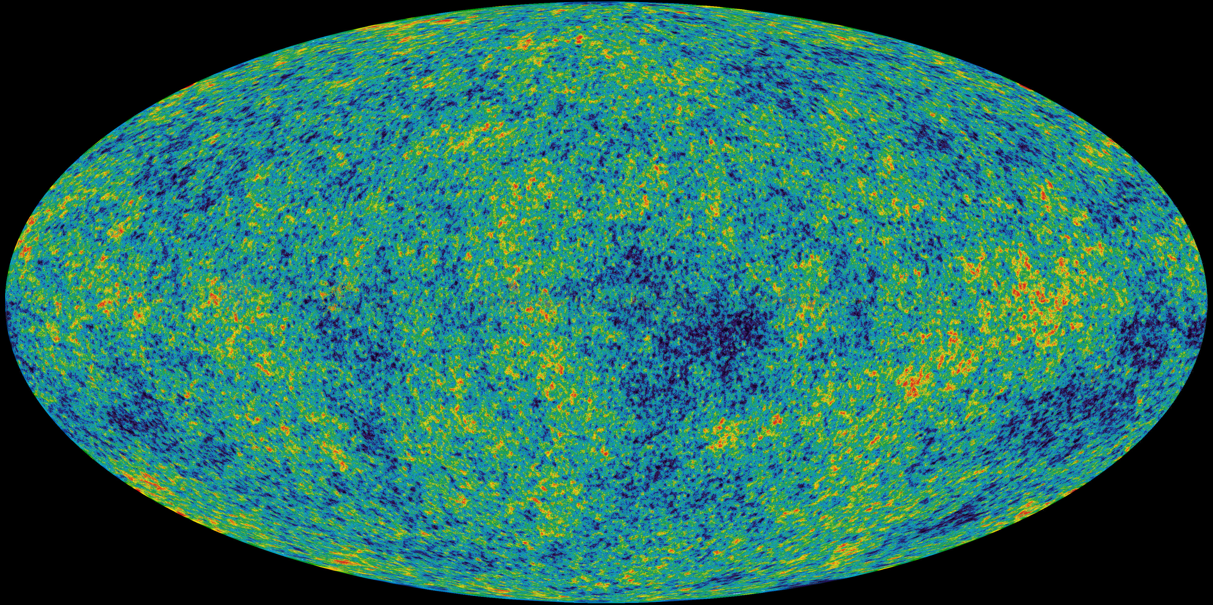
But once the gradient is established, it becomes the trivial task of mapping the colors of one image to another, something that I kind of hackedly accomplished with a Python script using PIL (It took a minute or so to process the 8 million pixels, but that’s not really too bad). And then, because the ultimate purpose of my project wasn’t so much to attain scientific accuracy as feigning it with some kind of better aesthetic, I went to GIMP and superimposed a translucent copy of the WMAP data so the image isn’t quite so speckled and the larger continental blobs more apparent.

Here is the poster if you want it. And the resulting 6.1MB jpeg.


Swipe Gesture 2 Development 16 August 2012

So I’m trying something new, returning to quasi-daily somewhat short updates about the development of whatever I’m working on rather than withholding everything until something of somewhat acceptable release quality is achieved. I have a blog post about that transition, but I’m still working on it (as in, writing it is somewhat boring). It’s probably better given my development cycle is quite nonlinear, usually I get something somewhat promising made in the first few days or so and pause for long and possibly indefinite durations doing other stuff in the process. Probably, writing short blog posts about what I have yet to finish will remind me to, well, finish them. Just maybe. But I’m probably going to have to preface every post that I write with this kind of disclaimer until I actually get that post finished and published so I have something to reference rather than pointing crazily into the air and saying “oh yeah, it’s coming, now, someday, maybe.”.

Starting about yesterday, I started working on the successor to Swipe Gesture. The new version tries to mimic the actual behavior of Chrome on Lion, which I think is really quite cool. Here’s a video I found on YouTube which shows how it basically looks like if you aren’t familiar with it. The first thing to notice that it’s substantially less trivial, code-wise. No more is it a 30-line software lightweight, but it’s not _too _complex and arcane to forbid any kind of comprehension. Now, the simple prototype of its functionality is already nearing 300 lines of code.

Another big difference is now it’s no longer designed strictly for Chromebooks. In fact, one of the reasons for starting this was that I was informed that the kind of functionality might be useful on Macbooks running Windows via Bootcamp. In fact, it’s meant to be as general as possible, to work on pretty much any kind of platform. And it’s not even bound strictly to the horizontal axis: the code is meant to work with linear swipes in any direction including diagonally (although some experimentation on my chromebook seems to indicate that swiping at angles isn’t terribly useful).

The most significant conceptual change is the transition between a speed/acceleration metric to a distance metric. That is, in the old version, an action was triggered when there was a swipe in one direction vigorous enough to be considered. This was a fairly simple way to avoid the problem of distinguishing between a horizontal scroll action and a swipe by not making a distinction. In a sense, cheating. The new version instead does things “the right way™” by observing events carefully to determine if a swiping action actually results in scrolling. If that’s your kind of thing, the technical nitty gritty details have their own dedicated blog post, so feel free to click through if you’re interested.

Once it’s determined that that scroll thing is actually probably a swipe gesture, it renders a nice little arrow in canvas. I considered using a unicode arrow and setting the font to huge, but that didn’t turn out quite as well as I expected (plus, it makes rotations and interactions with the embedding page CSS a little less predictable).

Also another thing is that it turns out that it’s a bad idea to set a css transition on something which is meant to hook with mouse or scroll movements because, while this ends up smoothing things out (which is good for mouse wheels because they click to the nearest 120 magical click units) it ends up producing a significant amount of lag and just feels so awkward.

Another thing (since this post is written over the course of several days, and the actual update has already been published at time of writing) is the cool redesign of the Settings page. The first thing to notice is that the settings page for once actually has settings, which is quite an accomplishment by itself. Also, it has a visual refresh that makes it look somewhat bootstrap-esque. That’s because ever since using Bootstrap in the making of Protobowl (a rather big project that I have yet to blog about), I’ve pretty much fallen in love with the color whiteSmoke. Partly because it has a name, which means I don’t have to google it or tattoo it on my arm for a mnemonic’s sake, and also because it’s a pretty nice color.


Resize Grid, Improved Select, Delete Selection/Clear All 07 June 2008

You can now resize the grid through the same GUI as the line width: A simple slider. Now when you select a shape, the draw-panel adjusts itself accordingly to the colors and other values. When you leave select mode, it automatically unselects the space. Special tools like Delete Selection and Clear All now work.