somewhere to talk about random ideas and projects like everyone else

stuff

#ipad

hqx.js - pixel art scaling in the browser 31 March 2013

Screenshot 2013-03-31 at 5.15.07 PM

Every once in a while some gadget has the misfortune of epitomizing the next first world problem. I guess right now, this is owning a Retina (or equivalent) laptop, tablet (arguably phone, but most web pages are scaled out so it’s not that big of a problem) and being irked at the prevalence of badly scaled graphics. So there’s a new buzzword “Retina Ready” for websites, layouts and designs which support higher resolution graphics for devices which support it, often meaning of lots of new files and new css rules. It’s this trend of high-pixel-density devices (with devices like the iPad 3, Retina Macbook Pro, Nexus 10 and Chromebook Pixel - though I for one don’t currently have any of them, just this old glitchy-albeit-functional first generation Chromebook) that is driving people to vector icon fonts.

But the problem of radical increases in terms of resolution isn’t a new one. Old arcade games rarely exceeded 260x315, and the Game Boy Color had a paltry 160x144. While a few people still nostalgically lug around game cabinets and dig out their dust-covered childhood handheld consoles for nostalgic sneezing fits, most of the old games are now played with emulators running on systems several orders of magnitude more sophisticated in every imaginable aspect. So that arcade monitor that once could engross a childhood (and maybe early manhood) now appears nothing more than a two inch square on a twenty inch monitor. But luckily there is a surprisingly good solution to all of this in the form of algorithms designed in particular for scaling pixel art.

The most basic form of image scaling that exists is called nearest-neighbor interpolation, which is extra simple for retina devices because it means simply growing the size of each pixel by a factor of two along each axis. That leads to things which are blocky, and unless you’re part of an 8-bit retro-art project with a chiptune soundtrack looks ugly.

The most common form of image scaling borrows a lot from the math and signal processing fields, with names like bilinear, bicubic, and lanzcos essentially they treat an image as some kind of composition of sinusoidal parts and try to ideally extrapolate and interpolate such that visible artifacts are marginalized. It’s all very mathy, but the result is kind of the opposite of nearest-neighbor because it has the tendency to make things blurry and fuzzy.

The thing is that the latter tries to reach some kind of mathematical ideal, because images taken by your friendly neighborhood DSLR-toting amateur (spider-powers optional) are actually samples of real world points of data— so this mathematical pursuit of purity works out very well. There’s still the factor-of-four information-theoretic gap that needs to be filled in with best-guesstimates, but there isn’t really any way to improve the way a photograph is scaled without using a higher-resolution version of said photograph. But most photographs that are taken already are sixteen-megapixel monsters and they usually still look acceptable when upscaled.

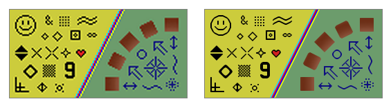
The problem arises with pixel art, little icons or buttons which someone painstakingly drew in Photoshop one lazy summer afternoon in the late 90s. They’re everywhere and each pixel isn’t captured and encoded by a sampling algorithm of some analog natural phenomona— each pixel was lovingly crafted and planted by some meticulous artist. There is no underlying analog signal to interpret, it’s a direct perceptual hookup to the mind of the creator— and that’s why bicubic sampling looks especially bad here.

Video games, before 3d graphics engines and math-aware anti-aliasing concerned with murdering jaggies, in the old civilized age of bit-blitting, were mostly constructed out of pixel art. Each color in that limited palette was placed there for a reason and could be exploited by specialized algorithms to construct higher-quality upscaled versions which remained sharp. These come with the names EPX, Scale2x, AdvMAME2x, Eagle, 2×Sal, Super 2×Sal, hqx, and most recently, Kopf-Lischinksi. These algorithms could be applied in real time to emulator windows to acceptably scale a game to new sizes while eschewing jagged corners and blurry edges.

Anyway the cool thing is that you can probably apply these algorithms in lieu of the nearest-neighbor or bilinear scaling algorithms used by browsers on retina platforms to effortlessly upgrade old sites to shiny and smooth. With a few rough heuristics (detect if an image appears to be a sprite by testing for a limited palette, see if the image is small or a perfect square, detect if it has transparent pixels) this could be packed into a simple script include that website makers could easily inject into their pages to automagically upconvert old graphics to new shiny high-resolution ones without having to go through the actual effort of drawing new high resolution graphics and uploading them online. And this could also be packaged as a browser extension so that, once and forever after, this first-world nuisance shall be no more.

Before setting out to port hqx-java to javascript, I actually did some cursory googling to see if it actually had been done before. Midway through writing this post, I found out that it actually had been done before, in a better way, so I won’t even bother linking to my inferior version. But either way the actual goal of this project was the part which was detailed in the last paragraph, that of an embeddable script or browser extension which could heuristically apply pixel-scaling algorithms— something I probably won’t bother trying to do until at least after I get my college laptop (which I anticipate will be a Retina Macbook Pro 15”). Nonetheless, I haven’t written an actual blog post in almost three months and it’s the last day of this month, and I guess it’s better than having you all (though nobody’s probably going to read this now that Google Reader has died) assume that I’ve died. Anyway, now I’m probably going to retroactively publish old blog posts in previous months to fraud continuity.


Offline Wiki Redux 30 December 2011

There’s just something incredibly alluring about the concept of holding the sum of human knowledge with you at all times. While near-ubiquitous connectivity alleviates this to a certain extent, the momentary lapses of networking are incredibly corrosive to an information dependent mentality. Wikipedia never ceases to amaze me and, while I’ve tried in the past to encapsulate part of its sheer awesomeness, this marks a much more significant attempt.

The differences start even before the data gets to the application. The preprocessing toolchain was entirely rewritten for a multitude of reasons. First of all, it compresses not the entireity, but rather the most popular subset of the English Wikipedia. Two dumps are distributed at time of writing, the top 1000 articles and the top 300,000 requiring approximately 10MB and 1GB, respectively. While ostensibly, the mere top 300k articles is far too narrow to delve deep into the long tail, the breadth of the meager 1/25th of articles consistently surprises me in its depth. The advantage is that at 1GB, it’s relatively easy to fit into any system. The algorithm which strips extraneous content has been made far more sophisticated than the original series of regular expressions. This enables greater compression and less accidentally omitted content.

On the application end, the application has switched from a GWT-compiled LZMA SDK to a speedy, pure javascript decoder. This makes page loads significantly speedier and allows greater compression ratios, for individual blocks can be made larger (256KB instead of 100KB). It also now uses WebGL Typed Arrays to further speed things up, such as sending data to and from the WebWorker thread.

The interface was redesigned with CSS media queries to dynamically transition between different modes in response to different viewing environments. The interface consists of two regions: the fixed position recessed left panel which holds the page title, a search bar, controls and the page outline. This collapses down to a toolbar header automatically when the screen estate is limited. It uses an Apple-esque noise texture background.

Downloads happen in little units called chunks (they’re half a megabyte for the dump file and about four kilobytes for the index). The local file can be built up out of order. While online, all storage operations check the virtual file, indexed db, or web sql database. If it’s not there, it transparently uses an XMLHttpRequest in order to fulfill the request and caches it to disk in the respective persistence mechanism. A bitset is used to keep track of which chunks are already downloaded and which need to be downloaded.

http://offline-wiki.googlecode.com/git/app.html


microwave on app store 23 August 2010

http://itunes.apple.com/us/app/microwave-google-wave-client/id386081118?mt=8

So microwave is now on the app store. Though wave was just announced to be shut down, I had the app done already (though I was waiting for a wave server update so thread continuation and attachment uploading would work), and I just published it anyway. So here it is. Grab it while wave still works :). It supports offline, so you can cache some waves and read them on-the-go.


stick figure animator 22 June 2010

One thing the ajax animator’s pretty bad at is stick figures. Sure it’s not impossible, but it can’t really compare with the ol-fashioned frame-by-frame joint-manipulation likeness of Pivot. It’s called stick2 because the original experiment with stickfigures was named stick.html, and when I went to extend it and didn’t feel like setting up a git/svn repo, I copied the file and named it stick2.html, and with no good project-naming skills, it stayed that way.

Anyway, this was a project that got pretty close to completion in early march, but I never bothered to blog about it until now. It should work pretty not-bad on an iPad J(except the color picker), though honestly, I’ve never tried it.

The interface is pure jQuery/html/css. The graphics are done with Raphael, but the player actually uses <canvas> for no particular reason.

Basically, it’s organized into two panels, the left-side figures-box and the bottom timeline. The figures-box contains figures (amazing!) and clicking on them adds them to your canvas. The two defaults are the pivot-style stickman, and something called “blank” which is a root node with no additional nodes. Though it shows up as a orange dot, unless you add something to it, it doesn’t have any actual look when viewed in the player.

On top is the context-sensitive buttons. Well the buttons in my screenshot aren’t context sensitive, they’re permanent. But when you click on a node, a new set of buttons (and words too!) appears. One is a line and the other is a circle. Click them to add a new segment or circle to the currently selected node. Then are various settings for the current segment (each node other than the root one is associated with a segment). Clicking those allows you to modify them. Also, a red X appears on the right, and that basically means remove the node and the child nodes.

So, now you have some extra nodes, how do you change them? Simply hold it down and drag, and the the segments move as well. But note that the length of the segment doesn’t change as you move it. That’s because by default, it locks the length of the segments. There are two ways to get around it. The first is to hold shift while dragging. The second is to tap the little lock icon on the top left.

On the bottom, is the timeline with live-previews of your frames with a semitransparent gray backdrop of numbers. Switch between each one by clicking on them and add one at the end by hitting the green “Add new frame” button.

On the canvas, there are two yellow squares, those allow you to resize the canvas.

On the very left of the top toolbar, is the play button. Hit it and the figures toolbox minimizes and it plays out your animation. Click it again to get back. Then is a little upload button. Hit it and then a little box pops up with a link to where you can find your animation in a way that you can share and to edit (not actually edit, but more like fork, as each save is given a unique id). Next is the download button which you hit, and get prompted by a big prompt-box which you use to paste in the ID of the animation you (or someone else) has saved, so you can edit it. Most of the time that’s useless as when you send a link with the player, it has a button which says “Edit”.

Sample animation: http://antimatter15.com/ajaxanimator/stick2/player.html?rlsm4lx14c

Try the application out: http://antimatter15.com/ajaxanimator/stick2/stick2.html

Code: http://github.com/antimatter15/stick2


Ajax Animator for iPad Updates 17 June 2010

This isn’t really new, but I just remembered to write a post about it. Ajax Animator for iPad got a relatively minor, but certainly pretty important update.

The new update incorporates the TouchScroll javascript library to have nice flick-to-scroll-ness throughout native iPad apps.

The VectorEditor core had a few bug fixes, rotation now works and so does resizing (though it’s still susceptible to the always-existent resizing of rotated objects awkwardness - I would love it for someone to fix it). However, resizing doesn’t change the size of the bounding box, which is a somewhat awkward aesthetic but it’s still functional.


Ajax Animator iPad Support 11 April 2010

Today I went to the magical Apple Store and tried out the iPad for the first time. I really have to say that it’s quite magical, though it doesn’t fulfill the criterion for Arthur C. Clarke’s Third Law despite what Jonathan Ive says. Though I really haven’t tried any large area multitouch interface before (sadly), and I would expect it to be a somewhat similar if not exact replica of the experience. Keynote and Numbers were pretty neat (I suck at typing on the iPad in any orientation, so I don’t like Pages). That’s enough to show that iPad is not just a content consumption tool as the iPod and iPhone primarily are, but also content creation.

Anyway, in a few minutes I just swapped the mousedown, mousemove, mouseup events with touchstart, touchmove, touchend events respectively in the core of VectorEditor, while adding a new MobileSafari detection script (var mobilesafari = /AppleWebKit.*Mobile/.test(navigator.userAgent);) and in a quite analogous “magical” way, VectorEditor works in iPhone/iPod Touch and theoretically iPad, Just dragging the vectoreditor files over to the Ajax Animator folder and recompiling should bring iPad support to Ajax Animator with virtually no work.

I haven’t tested it. Downloading XCode 3.2.2 right now so hopefully I can test it soon. Stupid how it’s what? 2.31 gigabytes?!

And possibly, I could use PhoneGap to hack together a App Store app which does the same thing (and maybe charge for it, which might be a bit cruel as this application is open source and works equivalently online - but I guess that’s okay for those people who don’t read my blog >:) ). Maybe get enough to buy an iPad :P

Anyway, though I’m pretty late to this and my opinion probably doesn’t matter at all, here’s a mini iPad review: It’s really really cool, feels sort of heavy, really expensive, hard to type on in any orientation (interestingly it has that little linke on the f and j keys with the keyboard which feels useless since I always thought the point of that was so you can tactile-ily or haptically or tactically or whatever the right word is, find the home row, but since there’s no physical dimension to an iPad, it just strikes me as weird and wanting of that tactile keyboard). Otherwise, browsing really really feels great. Only thing I miss is the Macbook Pro style 3 finger forward/backward gestures (@AAPL plz add this before iPad2.0, and also, get iPhoneOS 4.0 to work on my iPhone 2g or at least @DevTeam plz hack 4.0 for the 2g!).

Oh, and for those lucky enough to have a magical iPad, the URL is http://antimatter15.com/ajaxanimator/ipad/ at least until there’s enough testing to make sure that I didn’t screw up everything with my MobileSafari hacks.


Idea: Lego Mindstorms IDE for iPad 08 April 2010

I don’t have an iPad, nor is it #1 on my wish list (It mostly means any tablet platform but since none of the other ones are really recognizable, I’m jumping on the 4-letter apple product bandwagon). But I am fascinated by touchscreens.

I started programming when I was 7 when I got my first Lego Mindstorms RIS/RCX 2.0 kit (and I loved the 13+ sticker on the box back then :P). So I’ve always had a fondness for the platform, it’s really great for getting kids into robotics and engineering. Kudos to Lego.

Recently, I’ve played around with the current rendition of the Mindstorms platform, the NXT. It’s an evolutionary advancement for the platform and maintains the original intuition of the system while catering to those who don’t really grow out of the original system.

The interface is, a very kid-friendly drag-and-drop block layout. I actually sort of like it, though it’s not something which a desktop application could easily be made in. It’s very procedural, and that’s well suited for telling a car to explode and magically arrange red and blue balls into designated corners.

But really, where drag and drop really shines, the place where it really is meant to be, is on a multitouch tablet. It just makes sense. On a large multitouch surface, coding using simple finger gestures and dragging just makes sense. Lego’s own Labview interface, called NXT-G has large icons and is built entirely on the dragging and dropping. Its something that just feels right on a touchscreen.

The gestures need to be tailored to the specific platform, I propose that two fingers, like on a Macbook, should be used to pan around the canvas of the code. Blocks are dragged from a list on the side onto an execution path. On a block already on the canvas, touching and dragging does the logical thing: it moves the position. Touching a block on the canvas without dragging makes a pie menu type display ooze out from the block. The list would be a bunch of output “pipes” which another finger can be used to drag and link onto other blocks which display another pie menu (though only showing inputs rather than outputs) where letting go would create the connection.

Implementation-wise, one could try porting NBC/NXC (which is written in Pascal and already has the makefiles for WinCE/ARM and FreePascal does seem to be able to compile to iPhone/iPod Touch and the iPad should be a virtually equivalent platform). Probably something made in SVG and/or <canvas> could be used to create the interface which can be loaded with a UIWebView or using the PhoneGap platform. Then it would convert the graphical representation into some NXC code, compile it, and use the built in Bluetooth 2.1 + EDR support in an iPad to send it to the Lego NXT brick and do magic.