somewhere to talk about random ideas and projects like everyone else

stuff

#css

Fluidizer fixed width → fluid width bookmarklet 14 July 2010
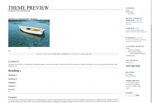

Yaay, fluid width!

I IZ NOM NOMMING ON HALF UR PIXELZ

This is another old one, something I made february fifteenth of this year.

One of the purely theoretical things that have always annoyed me, were fixed width themes. Because I love being a hypocrite, this blog right now is using a fixed width theme. Though I probably could make up an excuse, like to serve as a decent test case for Fluidizer in part of my grand scheme detailed via embedded steganographic messages inside all of my screenshots. Of course that’s all a lie (however much I would like otherwise).

It’s always bothered me how some web sites have these fixed-width layouts, sometimes with insanely thin boxes allocated to content. The vast majority of my screen becomes this orange blob of text. Chrome’s visual appearance motto is “Content not chrome”. That doesn’t help if the content is being obscured by the presentation of the content (gopher) might have solved that problem). Less chrome just means my eyes start to drown in +/- 1,732,405 pixels of orange. Even outside the extreme case, having a fixed-width layout isn’t efficient, and using something like Readability to only show the content removes the personality of the site or author, and only works on articles.

Fluidizer automatically resizes themes semi-pseudo-intelligently, and works with a lot of themes. It has several algorithms it uses, which are sort of alchemy-like and strange. I have no clue how it works, but there’s lots of strange stuff that goes on to magically do stuff. I think it even somehow has a CSS parser that uses CORS to load css through a server-side proxy.

Only tested in Chrome: [Fluidize]

javascript:(function(){function k(a){return(a||"").replace(/^\s+|\s+$/g,"")}function u(a,g){var b=new XMLHttpRequest;b.open("GET","http://anti15.chemicalservers.com/cssproxy.php?cssurl="+encodeURIComponent(a),true);b.onreadystatechange=function(){b.readyState==4&&b.status==200&&g(b.responseText)};b.send()}function o(){for(var a=0,g=0,b=false,h="*,div,p,body,span".split(",");!b&&g++<20;){if(document.body.scrollWidth>window.innerWidth){b=true;a-=100}else a+=100;for(var c=d.length;c--;){var f=d[c].text;try{for(var i=document.querySelectorAll(f),l=i.length;l--;){var n=i[l],p=parseFloat(d[c].width,10),q=d[c].width.replace(/^[\-\d\.]+/,"");if(q!="px")if(q=="em")p*=16;else console.warn("not used to handling non-px units");if(p>400&&h.indexOf(f)==-1){if(!n.a)n.a=p;n.style.width=n.a+a+"px"}}}catch(x){}}}try{c=d.length;a=0;for(var r;c--;)if(h.indexOf(d[c].text)==-1)try{var j=document.querySelectorAll(d[c].text);if(j.length==1&&j[0].getElementsByTagName("*").length>15&&(j[0]==document.body||j[0].parentNode==document.body||j[0].parentNode.parentNode==document.body))if(parseInt(d[c].width,10)>a){a=parseInt(d[c].width,10);r=j[0]}}catch(y){}if(a>500)r.style.width="100%"}catch(z){}}function v(a){function g(){var i=h.split(";").map(function(l){if(k(l.split(":")[0])=="width")return k(l.split(":")[1]);return""}).join("");b&&k(b)&&i&&k(i)&&d.push({text:k(b),width:i});h=b=""}for(var b="",h="",c=0,f=0;f<a.length;f++)if(a[f]=="{")c=1;else if(a[f]=="}"){g();c=0}else if(c==0)b+=a[f];else if(c==1)h+=a[f];g();o()}for(var d=[],s=document.styleSheets,t=s.length;t--;){var e=s[t];if(e.href&&!e.cssRules){console.log(e.href);u(e.href,v)}else{e=e.cssRules;for(var m=e.length;m--;){var w=e[m].selectorText;e[m].style&&e[m].style.width&&d.push({text:w,width:e[m].style.width})}}}window.addEventListener("resize",function(){setTimeout(function(){o()},100)});o()})();

CSS3 Sideways Google 08 December 2009

I was surprised to find that one of the main referrers to my site recently has been Twitter. Looking into it, it seems to all be for my quickly hacked together CSS3 Sideways Google. Which uses the new CSS3 transforms supported by Webkit and Gecko (Firefox, Chrome and Safari) as well as the freaky DirectX stuff Microsoft has (Only major browser that isn’t supported is Opera, who is lagging a bit).

And in the spirit of CSS3 Sideways Google, I present CSS3 elgooG

It also appears that the awesome rotateme.org website was built entirely off of the original CSS3 Sideways Google and actually got 1500 diggs :)


Today's Updates II 26 May 2008

As I mentioned earlier, more would happen today. I’ve just made an update. I updated the Update system to also compile (it doesn’t compress anything yet, it really doesn’t need to) CSS files. This should speed up the application a bit, and should also make it easier when updating some smaller things. As with that, it will also starting from build 83, create release archives of the CSS files. The compiler mechanism has changed a bit too, but that’s not really important.

The most visible additions, is the embedded Color Dialog. If you look at the title, you’ll find a Steve Jobs reference. Right below the huge drawing tools list (what? is it like 2 times that of the old version?) there is a Line Width slider (this is indirectly inspired by OnlyPath’s Mondrian-style color picker). it also embeds the Color Field plugin, so if you press the little button on the side, a little color palette shows up. Ideally, this will enhance user’s efficiency and be less confusing than the old one.

I don’t know if I can make a “Today’s Updates III” :P

[EDIT] BTW, the page is located at

http://antimatter15.110mb.com/animator/Animator2/build/ajaxanimator.htm


New Features coming in Ajax Animator 0.15 (aka 1.5, read to find out why) 02 December 2007

Okay, so one day i felt crazy and changed everything by 1 decimal place because i don’t want this to seem misleadingly good. I mean, if it hits a 1.0 release, then some people would think it’s almost as good as Flash 1 (futuresplash animator) which it it isn’t even near yet.

So it should be 1.5 but now it’s 0.15 :D

Read more to find out the whole list, a summary of it would be axml2, UI polishing, save space, nicer code (but still hideous), css, users, tweening, finish partially completed ideas etc.

What’s done so far

  • Redesigned Register UI
  • Save Lots of code
  • New Save/Open file format (around 5x faster, and 10 times smaller)
  • Relocating stuff
  • interactive tutorials
  • Backwards Compat Mode
  • for the first time it’s gonna be a legitimate GPLv2 project (I’m gonna include the gpl.txt file for once)
  • replaced wz_tooltips with native ext.js ones
  • Change save file to computer architecture
  • change organization of Save/Open buttons in file menu (submenus)
  • optimized stuff
  • fixed bugs
  • No more save/open window (now, single-purpose dialog alerts, much better)
  • Progress bars
  • User friendly upload error message (yay!)
  • relocate css
  • delete lot’s of stuff from user-management
  • REAL SUPPORT FOR LINES/ELLIPSES, lines didn’t work for tweening, ellipses didn’t work for tweening or flash, and ALL suffered from a programming error causing line-widths to be messed up.
  • FastMode …and more to come