somewhere to talk about random ideas and projects like everyone else

stuff

#apple

Swipe Gesture 2 08 February 2013

I’ve actually had this post fermenting in my blog’s draft folder since at least September, but I never actually got around to finishing the post. And now that Google’s enabling the new swipe-to-go-back by default on the dev channel versions of Chrome OS, it finally feels like the right time to post. As in, I feel like posting things right when they’re soon to be absolutely useless (Which, you might recall, was the case with my Google Wave client, which started selling on the App Store the day Google announced that Wave would be phased out and eventually shut down).

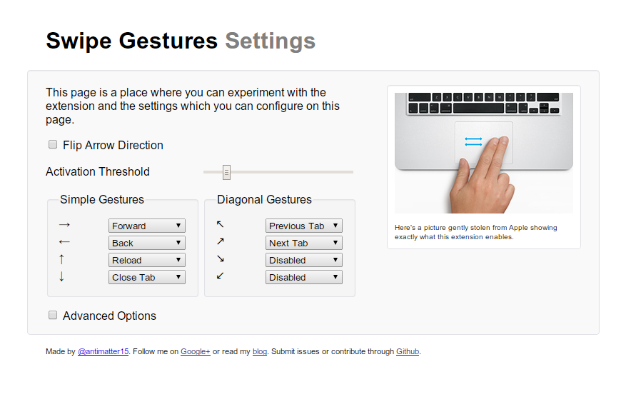
So, a few months ago, I finished my update to the Swipe Gesture extension, which featured a rather significant redesign. It supported multiple gesture directions and a fancy animated element to indicate the direction of the gesture.


Swipe Gesture for Chrome 13 August 2012

Here’s an extension which I actually released some time back, but never got around to writing a blog post for. Part of the reason was that the early reviews didn’t quite pan out, in large part due to not working. But I was using my Chromebook and I somehow felt a vague longing for some kind of multitouch gesture, and remembered that I had made this little extension (which I had disabled for some reason). Anyway, this is as appropriate a time as any to formally announce it to my probably remarkably small blog readership.

There is, however a tad bit of difficulty representing the function of it in pictures because really, it doesn’t have a big UI. It makes hardware more useful, and in its idealized form, should have no interface. But of course, we don’t live in a place where apps are perfectly idealized and either way, Apple has plenty of nice pretty pictures of people swiping fingers to the right.

I really fell in love with the Macbook multitouch gestures, almost at first sight. They just seemed so natural and so beautiful that I sort of felt that that was like the epitome of design or HCI perfection. And from that point, any time I used a laptop which wasn’t made by Apple (or even the ones which were made by Apple but were stuck in the barbaric ages preceding the inclusion of the glass multitouch pad, where its invention might have produced a scene like this), I felt thoroughly disgusted.

Flipping through the Chromium OS design papers, there is one page dedicated specifically to cool multitouch gestures which could be used. And as far as I’m aware the Samsung Series 5 550 (the new chromebook) is the only device which supports these gestures (thus far), and even then it’s only pinch to zoom and forward/back (three finger). All the other Chromebook users have been left out.

Another cool thing about the implementation is that it uses a certain webkitDirectionInvertedFromDevice property of the mousewheel events, which gives you a boolean value about whether or not the platform you’re on has some magical direction inversion like on OS X Lion or if you’ve enabled “simple scrolling” on Chrome OS. But this might not have been a good idea since swipe directions too are sort of inverted on those platforms naturally as well, so it might be better to _not _compensate for it.

Anyway, the implementation is actually quite simple. The current version doesn’t even break the 40 line mark, because all it does it it listens for mousewheel events on every page (via a content script), and it calculates the current acceleration. If that acceleration ever passes a certain threshold, it triggers a forward or back action. Right now, the threshold is preconfigured based on my own testing on a Samsung Series 5 (note, not 550) chromebook. But for people with other devices, I’m working on a second version which will be slightly more Apple-esque in its implementation.


Generating the iOS 5 Linen texture with Canvas 19 August 2011

noise
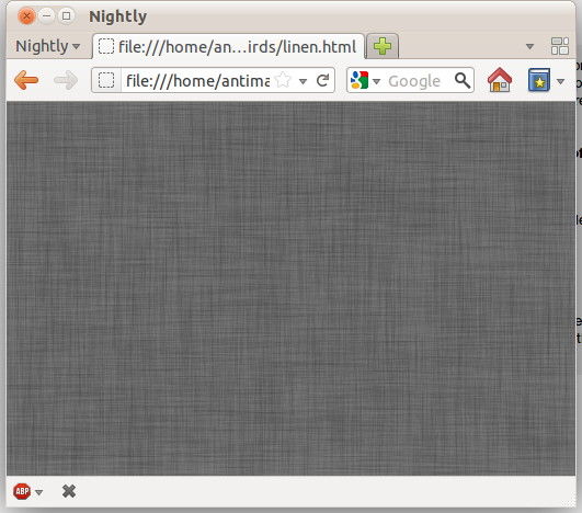
I guess the linen texture which is way too prevalent in Lion and iOS 5 looked pretty cool so I tried replicating the effect in canvas. It’s not instant but the texture is generated fairly quickly. It’s all done in around 20 lines of code. The basic idea is to first create a bunch of semi-transparent noise such as the stuff on the right (Though in the real one the opacity is only 3% and in the one on the right it’s been increased to 70%). To do that, we createImageData and set every fourth pixel to 6 if Math.random() < 0.1. That means approximately 10% of the canvas will be semi-transparent with the rest being totally transparent. I’m not clever enough to embed some steganographic message in the ostensible noise pattern, because I’m just way too lazy for that sort of stuff. But if you think that that last sentence was actually a decoy for my master plan, feel free to waste time decoding a message which probably isn’t there.

After that, the canvas is converted to a DataURL so it can be loaded as an image. After loading the image, we iterate 40 times and call drawImage on the original canvas with an offset to make every single point into a cross-shape. Demo.


Why the Chrome Web Store is Bad for the Web. 02 June 2011

Note: I’ve changed a few things that will hopefully make my point a bit more clear

Apple got it right in 2007.

If you’ve read any of the other posts in this blog, you will probably come under the assumption that I’m a devout follower of the Church of Google. Thus it will probably be quite a surprise to read the headline, something which appears downright sacrilegious: it questions the infallibility of the great Google. But I try very hard to maintain some semblance of objectivity and rationality, and this post will be about why I think the Chrome Web Store is bad for the web.

The Chrome Web Store is the applications and extensions gallery for Chrome. It’s Google’s centralized repository and directory for discovering Chrome-related things. Just hearing the name of it, you can probably tell, it’s likely quite inspired by the iOS/iTunes/Mac App Store. It’s not because they aren’t able to innovate (or it might, but I won’t take that view), but it’s probably the result of the huge App Store boom. It’s not that even what Apple did was particularly innovative, but somehow it managed to secure billions of dollars for the company, and all it’s competitors quite rationally want a chunk of it. This however, isn’t about improving the state and future of the web, but rather the indulgence of buzzwords. This post isn’t only about the Web Store, but rather the entire Chrome Applications and Extensions systems. From distribution to installation and the user experience afterwards.

Introduction.

There are two types of installable web applications that exist in the Chrome Web Store: hosted apps, in other words “glorified bookmarks”, and packaged apps. Glorified bookmarks are relatively hard to create, expensive and have no real additional functionality. Packaged applications evade the standardized mechanisms for offline web properties and eliminates many of the advantages of web apps in the first place.

Chrome’s developer overview for creating installable web apps describes the system as a solution to one, rather insignificant, problem. It’s the problem of permissions escalation: some technical detail that hardly seems important. Put simply, it’s that users get annoyed when they’re asked to hit “Okay” to annoying permissions prompts. And so Google’s solution is to invent a certain class of web site which has different security properties, where all the permissions are put into a single prompt.

To users, however, the existence of a web app is a solution to a much different user experience problem: they want to hit nice large pretty icons to go to sites which they frequently visit. But somehow, the solution they opted for creating these large clickable bookmarks is quite terrible. The only user-facing purpose of installable applications is the ability to bookmark with a large icon, something that Apple got right with iPhone OS in 2007.

Apple got it right.

I love those four words in that order, it feels so sensationalist and rebellious. But before the Cult of Apple leaps on that statement, notice the wording “Apple got it right”. It doesn’t strictly mean that whatever Apple’s doing now is right, just that what it did is right. In fact, that’s exactly what happened. Apple got it right, then made it different, and Google made it wrong.

First, we need to recall the distant year of 2007. It was quite a while ago, and I won’t pretend that my memory is that great. But it was a long time ago, a full year before the first beta release of Google Chrome. The iPhone was released with it’s plethora of eight apps and no ability to install more. The App Store didn’t exist, and the closest semblance was the Installer.app for jailbroken devices (Cydia came later). A few months later, Apple released a series of updates, and Steve Jobs signaled what he believed to be the future of iPhone applications: The Web. It doesn’t come surprising that Apple’s Mobile Safari was and likely still is (more or less) the best browser for any mobile device.

The important aspect is the way these web applications were installed. You went to Mobile Safari, and browsed around. You found a web app, and you used the web app the way the web was intended. No installations, you just navigate to a URL and start using it. You find the app useful and/or awesome, and you “bookmark” it. But, instead of actually doing the browser “bookmark”, you hit the button right below: “Add to Home Screen”. It asks you for a name for that application, automatically prepopulated with the document page title. You hit “Add”, and you now have a nice, shiny icon on your home screen. You can hide the browser chrome and it becomes indistinguishable from the normal native application experience.

That app icon is just an image URL specified with a single meta tag. It’s totally decentralized in every way, and represents the openness and simplicity that simply makes sense for this platform. All a developer needs to do to enable their web site to turn into a fully fledged web application is to add a <link rel="apple-touch-icon" href="/customIcon.png"/> in the head section of the page.

Contrast that with what Google requires: creating a Google checkout account, entering credit card information, navigating to the Chrome Web Store page and clicking several links in the footer in order to navigate to the page where you have to pay $5 for creating an app, create several icons, copy the manifest.json template and editing some values pointing to the icon locations, going to chrome://extensions, enabling developer mode, adding the unpacked app to make sure that it works, then going back to the original directory, zipping it up, and uploading it to the Chrome Web store, where you have to write a description, add screenshots, reupload an icon, publish, wait ten minutes, and then spam the internet with that link and edit your site’s code to point to that page. It’s an awful much to go through in order to just create a bookmark.

Apple turns evil.

This subtitle is intentionally misleading. I don’t really think Apple’s evil, but that loaded four letter word is much more concise than the more appropriate phrase “Apple adopts a new platform and shifts ideologically to favor a system which is ultimately in conflict with and entirely inapplicable to the web in its current state or in the foreseeable future”.

Apple’s prescience of the power of the web was sadly a bit anachronistic. The web technologies that would enable their vision were not yet ready. The second browser wars haven’t really even begun, and the jailbreakers, despite handicaps, still managed to develop that platform more than the officially sanctioned web developers could. Browsers were too slow, hardware was to slow, there weren’t enough features, not enough could be done, and the paradigm was not well understood.

Apple followed the lead set by the jailbreak community and launched their own native application development and distribution system: The App Store. It was a hit, and soon became a super huge buzzword. It an all that it represented: centralized one click micropayment driven mobile advertising funded indie developer weekend novelty apps.

Google gets it wrong.

So there was an App Store craze, and everyone wanted one. So it logically follows that Google built an App Store. But the web had no notion of apps. There were web applications, but they weren’t rigidly defined as apps. This is where Google got it wrong. The Chrome Web Store needed to sell apps, and had to create a dichotomy out of the web in order to do so. It created a distinction between web apps and websites where none had existed and shouldn’t have ever existed.

The false dichotomy.

Steve Jobs said that on Mobile, people want Apps, not websites. Before blindly mimicking the concept of apps on another platform, one should probably explore why users like apps over websites. It’s because the mobile app offers a _better mobile-optimized _interface to whatever they’re doing.

Websites aren’t generally designed for mobile, they are often slower, and can’t make use of persistent user interface elements like a tab bar. Apps aren’t popular because of the existence of the App Store. It’s because there’s additional value provided in having those apps, that users use the App Store to get them.

However, web apps, just like websites are optimized for normal computers. Web apps are no better than web sites, and when web apps really have nothing to provide, their respective web stores are useless.

One purported reason for creating the distinction between apps and websites is to give developers the opportunity to charge for the application in the web store. But why should the ability for an author to receive money for his or her respective works be exclusive to web apps? Why not all web sites?

While it’s quite clear that if anything meant to supplant a desktop application and is built for the web can be considered a “web app”, nearly everything else exists in a sort of gray area. Facebook, Twitter and the other social networking are predominately content focused, but have some app-like characteristics, and so they could be considered “web apps” too, despite how there aren’t really desktop equivalents. But what about sites like the New York Times? Pure content sites would logically seem to be the farthest one can go from the concept of an “application”. It’s clear that any web site can be considered a web app.

Since anything can be considered a web app, the Web Store is a mere directory of a certain number of websites. It’s a limited subset of the internet with terrible discoverability properties restricted only to sites where the owner (or a particularly devout fan) is willing to pay $5 in order to allow a subset of users to bookmark the site. It’s proprietary, no other site can have quite the same properties as the web store because Google has the Web Store URLs hard coded into chrome somewhere. Searching in the web store really isn’t that great either, with no ability to search reviews, no pagerank, no search operators, no ability to search within the content of apps. You would figure that if Google were to clone a subset of the internet, at least they would get search right.

This closed, exclusive and excessively tedious process for creating mere bookmarks attacks some of the web’s traditional benefits and ideals.

Packaged applications.

The above sections dealt with how the “glorified bookmarks” are useless and downright harmful. There is a second class of applications which are similar to the former in that they also get a pretty large prominent and clickable icon, but different in that they actually provide functionality that is different from mere ordinary websites. Its virtues include that they tend to work offline and have the ability to do certain things that normal web apps can not do. However, it pretty much stops there.

Packaged apps work offline, but their mechanism evades the standardized system of HTML5. Rather than promoting the use of standards, they promote the use of a proprietary and nonstandard signed zip package.

As they’re “packaged”, they aren’t really “true” web apps, because they don’t actually operate in the scope of the web. They are much closer to desktop apps, practically. They have no URLs, and thus can’t be linked to, evading the very first two letters in HTML and HTTP: “HyperText”. One of the greatest things about web sites is that they can be linked to, and they almost always share that universal identifier to share with people. It’s universally accessible and one of the few things that actually enables intra-site interoperability.

Conclusion.

While the “glorified bookmark” class of applications, which make up the vast majority of the Chrome Web Store, can be quite easily fixed by implementing something akin to the iPhone OS home screen web apps, the “packaged applications” are a bit more interesting. They are the source of that problem which the applications system was meant to resolve: permissions. In the current state, there is no system for handling multiple permissions on the web, aside from flooding the screen with infobars, when even that only partially works. What the web needs is a user friendly, informative, and useful system for giving additional permissions to web sites.

Along with that, the Web Store handles the selling of applications. Accepting money is a two part process, consisting of authentication and payment. Browsers should handle user identity, since they have the resources to do it right, in a nuanced, secure, efficient and user friendly way. Once that’s done, payment would be a logical extension to that. A developer could drop in a Google Checkout widget to have one-click in-app-purchases by tying into the secure browser identity system.

The Chrome Web Store should be reduced to a community maintained directory of useful web applications, something like a wiki, and there shouldn’t be a $5 fee to add applications.

Some people have expressed the idea that the Chrome Web Store is useful because it allows Google, a trusted party, to take down dangerous or malicious applications quickly. And while this is true, note that the Web Store is not actually the sole means to install chrome applications, and a malicious party would most likely exploit those alternate channels, and the only way to combat those is to institute a sort of Kill Switch, much like the kind that iOS, Kindle, and Android already implement.

Offline Wiki Chrome Webstore App 23 April 2011

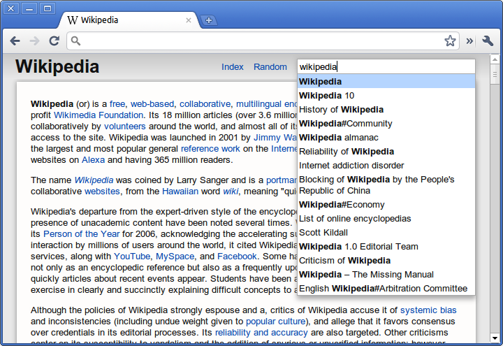
Offline Wiki for Chrome is now on the Web Store. The app that started a few months ago and took forms as Offline Dictionary. The chrome app version is much more refined, aesthetically and functionally. The search bar and autocomplete are much less obtrusive, and there’s gradients and box shadows, a sure indication of progress :)

Description

The most significant difference, is that it includes the entire English Wikipedia, a pretty close approximation of the sum of all human knowledge. Uncompressed, it’s something like 30 gigabytes of raw text, and the compressed version that I’ve compiled for this app clocks in at around 3.7 gigabytes (3.4GB for the actual compressed dump and 0.3 for the search index file). Hosting and serving up all those gigabytes does cost money, so that’s why the app isn’t free. But it’s still a pretty good value considering the equivalent apps for iOS are twice the price.

It includes an index which lists every single article in Wikipedia, paginated and navigable through a scroll bar. There are something like 50,000 pages of the index (the exact number depends on the size of your screen), and articles are divided into columns. There’s a button which sends you to a random article, and a search bar.

However the notion of this app is pretty strange: A webapp which only serves its function when offline. However, the ease of installation and use of this app is somewhat unparalleled on the desktop space. This app allows the browsing of the database instantly after the download has begun, rather than nearly all other such apps which require the entire dump to be downloaded first. There’s no conversion process. Everything pretty much hopefully just works.

HTML5 is awesome.

The interface is done entirely with CSS and HTML, no images except the obligatory xkcd reference. The toolbar is a css3 gradient and enclosed with HTML5 tags like <article>, <header> and <footer>. The download progress is indicated by a native <progress> bar element. The index is navigable through a slider bar created using <input type=range> and all the page titles are put automatically into columns by the css3 column layout properties.

The really cool stuff is what’s in the javascript. Probably the most significant development which has enabled this app is an awesome thing called the FileSystem API which exposes a special persistent sandboxed read/write directory which can be modified through the File API. When the page is first loaded, the process of downloading begins, and it uses the responseType attribute of the XMLHttpRequest to get the downloaded chunk (it just sets the request header to specify a range of one megabyte) as an array buffer. Array Buffers are a part of the WebGL specification which enables the storage and manipulation of binary data. It then uses BlobBuilder to convert that array buffer into Blob which can then be written using the File API to the hard disk.

To search, it reads a small portion of the index file by using a particular slice of the file, which is the equivalent of seeking on a disk. It implements binary search to quickly locate a certain article on the disk and then reads a chunk from the dump in much the same way. Then it uses a javascript implementation of the LZMA compression algorithm to decode a certain hundred-kilobyte block into raw WikiText which is then parsed into HTML.

Finally, the pushState and replaceState methods from the History API are used to handle the navigation of pages without reloading,.

Get it now

Offline Wiki for Chrome


microwave on app store 23 August 2010

http://itunes.apple.com/us/app/microwave-google-wave-client/id386081118?mt=8

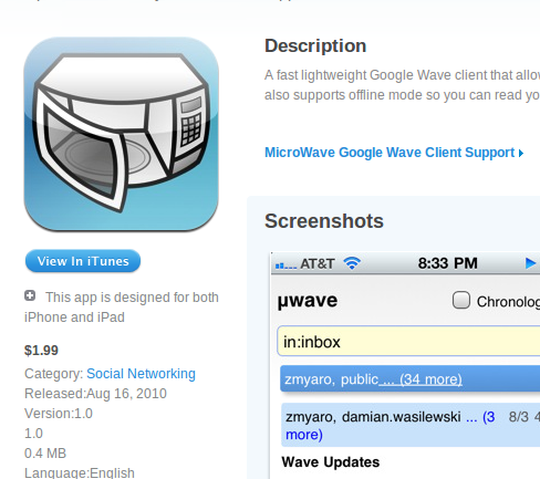
So microwave is now on the app store. Though wave was just announced to be shut down, I had the app done already (though I was waiting for a wave server update so thread continuation and attachment uploading would work), and I just published it anyway. So here it is. Grab it while wave still works :). It supports offline, so you can cache some waves and read them on-the-go.


jailbreakme.com 01 August 2010

I couldn’t resist looking into the source of it. It is obfuscated a bit, but there are some interesting parts. Example: How it detects device models.

For iPad, well there’s just one iPad so they just search the UA string for iPad and it’s totally iPad1,1. iPhone 4 is detected by the global devicePixelRatio property, because the pixel is dying. Differentiating between iPhone models (not just firmware versions) is pretty awesome. They do a speed test. Specifically, SunSpider. It’s pretty much the de-facto standard web benchmark nowadays, and it was also started by Apple for the Webkit project.

Apart from that, the exploit itself is PDF based. Which is interesting as Adobe Reader accounted for 80% of exploits in 2009. However, iOS’s implementation is probably totally independent, but it’s neat seeing this happen. The exploit is located at http://jailbreakme.com/_/device_model/device_firmware.pdf. For example, the iPhone 4’s URL would be http://jailbreakme.com/_/iPhone3,1/4.0.pdf. The resulting file is 12.9KB. I assume it’s some pretty standard attack code because I’m not a hacker and I know absolutely nothing about that.


Ajax Animator iPad Support 11 April 2010

Today I went to the magical Apple Store and tried out the iPad for the first time. I really have to say that it’s quite magical, though it doesn’t fulfill the criterion for Arthur C. Clarke’s Third Law despite what Jonathan Ive says. Though I really haven’t tried any large area multitouch interface before (sadly), and I would expect it to be a somewhat similar if not exact replica of the experience. Keynote and Numbers were pretty neat (I suck at typing on the iPad in any orientation, so I don’t like Pages). That’s enough to show that iPad is not just a content consumption tool as the iPod and iPhone primarily are, but also content creation.

Anyway, in a few minutes I just swapped the mousedown, mousemove, mouseup events with touchstart, touchmove, touchend events respectively in the core of VectorEditor, while adding a new MobileSafari detection script (var mobilesafari = /AppleWebKit.*Mobile/.test(navigator.userAgent);) and in a quite analogous “magical” way, VectorEditor works in iPhone/iPod Touch and theoretically iPad, Just dragging the vectoreditor files over to the Ajax Animator folder and recompiling should bring iPad support to Ajax Animator with virtually no work.

I haven’t tested it. Downloading XCode 3.2.2 right now so hopefully I can test it soon. Stupid how it’s what? 2.31 gigabytes?!

And possibly, I could use PhoneGap to hack together a App Store app which does the same thing (and maybe charge for it, which might be a bit cruel as this application is open source and works equivalently online - but I guess that’s okay for those people who don’t read my blog >:) ). Maybe get enough to buy an iPad :P

Anyway, though I’m pretty late to this and my opinion probably doesn’t matter at all, here’s a mini iPad review: It’s really really cool, feels sort of heavy, really expensive, hard to type on in any orientation (interestingly it has that little linke on the f and j keys with the keyboard which feels useless since I always thought the point of that was so you can tactile-ily or haptically or tactically or whatever the right word is, find the home row, but since there’s no physical dimension to an iPad, it just strikes me as weird and wanting of that tactile keyboard). Otherwise, browsing really really feels great. Only thing I miss is the Macbook Pro style 3 finger forward/backward gestures (@AAPL plz add this before iPad2.0, and also, get iPhoneOS 4.0 to work on my iPhone 2g or at least @DevTeam plz hack 4.0 for the 2g!).

Oh, and for those lucky enough to have a magical iPad, the URL is http://antimatter15.com/ajaxanimator/ipad/ at least until there’s enough testing to make sure that I didn’t screw up everything with my MobileSafari hacks.


Idea: Lego Mindstorms IDE for iPad 08 April 2010

I don’t have an iPad, nor is it #1 on my wish list (It mostly means any tablet platform but since none of the other ones are really recognizable, I’m jumping on the 4-letter apple product bandwagon). But I am fascinated by touchscreens.

I started programming when I was 7 when I got my first Lego Mindstorms RIS/RCX 2.0 kit (and I loved the 13+ sticker on the box back then :P). So I’ve always had a fondness for the platform, it’s really great for getting kids into robotics and engineering. Kudos to Lego.

Recently, I’ve played around with the current rendition of the Mindstorms platform, the NXT. It’s an evolutionary advancement for the platform and maintains the original intuition of the system while catering to those who don’t really grow out of the original system.

The interface is, a very kid-friendly drag-and-drop block layout. I actually sort of like it, though it’s not something which a desktop application could easily be made in. It’s very procedural, and that’s well suited for telling a car to explode and magically arrange red and blue balls into designated corners.

But really, where drag and drop really shines, the place where it really is meant to be, is on a multitouch tablet. It just makes sense. On a large multitouch surface, coding using simple finger gestures and dragging just makes sense. Lego’s own Labview interface, called NXT-G has large icons and is built entirely on the dragging and dropping. Its something that just feels right on a touchscreen.

The gestures need to be tailored to the specific platform, I propose that two fingers, like on a Macbook, should be used to pan around the canvas of the code. Blocks are dragged from a list on the side onto an execution path. On a block already on the canvas, touching and dragging does the logical thing: it moves the position. Touching a block on the canvas without dragging makes a pie menu type display ooze out from the block. The list would be a bunch of output “pipes” which another finger can be used to drag and link onto other blocks which display another pie menu (though only showing inputs rather than outputs) where letting go would create the connection.

Implementation-wise, one could try porting NBC/NXC (which is written in Pascal and already has the makefiles for WinCE/ARM and FreePascal does seem to be able to compile to iPhone/iPod Touch and the iPad should be a virtually equivalent platform). Probably something made in SVG and/or <canvas> could be used to create the interface which can be loaded with a UIWebView or using the PhoneGap platform. Then it would convert the graphical representation into some NXC code, compile it, and use the built in Bluetooth 2.1 + EDR support in an iPad to send it to the Lego NXT brick and do magic.