somewhere to talk about random ideas and projects like everyone else

stuff

#browser


Determining if a Mousewheel Event Results in Scroll 14 August 2012

So here’s a somewhat technical post, actually it’s pretty technical. But either way the premise is sort of simple to understand, and probably so is the context. I’m working on Swipe Gesture 2.0, which basically tries to take Chrome and Safari on OS X Lion’s awesome back-forward transitions and make them work on other operating systems. See, the thing is that multitouch isn’t _strictly _a requirement for it to work, a lot of computers just have the little bars on the bottom and right of the track bar (often with a little somewhat abrasive textured surface so you don’t accidentally tread upon it). Regardless, the title is a bit of a misnomer, because even though the event is called the “mousewheel”, it’s hardly meant to be observed from an actual mouse (or a wheel), instead it means the scrolling gesture on some kind of trackpad, either multitouch or not.

Well, first, I guess I’ll talk about the difference between how Lion and Leopard do it. The way Leopard did it was pretty cool but not particularly applicable to other platforms since it relied on the existence of a three-finger gesture. As in, you needed some kind of touchpad which was cool enough to support three-finger multiouch, reliably. It also behaved completely independent of the current zoom or scroll position, which makes implementation in software entirely trivial given access to some drivers which can recognize three fingers on a touchpad.

Lion did it a completely different way. Instead of creating an entirely new gesture which was entirely dedicated to the singular task of navigating through history, it conflated the notions of scrolling with navigating, which sort of makes sense. Apple’s quite dedicated to skeuomorphic metaphors, and they want to treat the web more like literal pages. A user can move it around to better keep certain things in view, and the physical movement to slide a sheet out of view is just an extension of that panning gesture.

However, technically this poses a completely different challenge, because this requires you to distinguish between scrolls and navigation requests. Scrolling is always the default behavior, but the navigation swipe gesture happens when scrolling wouldn’t actually result in anything. However, many implementations of scrolling are at least somewhat kinetic, often it’s emphasized in software (in the form of smooth-scrolling) or hardware (scroll wheels that don’t click but instead move basically freely) or because your arm has to obey the laws of kinematics (unless it doesn’t, in which case that’s certainly fascinating). So not only does the software have to determine when a mouse wheel action results manifests as a scroll, it has to see if it was the user’s intent to do the extraneous scrolling.

This is done by clustering the mouse wheel movements together temporally. Scroll events flow in in discrete chunks, and you can split events off into little buckets (in a sense), where if there isn’t any event sent within some arbitrary threshold (say, 500msecs or half a second), you stick stuff in a new bucket. This way, lets say you scroll from the top of the page to the bottom and you’re sort of excited, and spin the wheel as fast as possible, you hit the bottom of the page but it’s not some instant stop. You continue scrolling (because you’re just that excited, and just can’t stop) for a little bit more. Ignoring the fact that you probably won’t have a vertical/horizontal event handler (though there are some sort of intriguing possibilities for this, one idea is to have the upper threshold trigger full screen). Without segmenting them into certain buckets, it doesn’t recognize that the time when you’re ramming into the top of the page is part of the same general gesture as when you were scrolling, and it may interpret that as an intentional gesture. So that’s one part which makes it a bit more complex.

So now, you have these series of mousewheel events conveniently delimited into little gesture-chunks. The next part is determining whether or not the gesture-chunks are part of a scroll action or not.

Thankfully that’s a really simple thing to do. Just look at the document’s scrollTop and check if it’s zero (or scrollLeft for horizontal stuff) or whatever value is the width of the element. If it can’t scroll no more, then you have a winner and you can start the falling balloons and confetti.

Except it’s not that easy, because the document isn’t the only thing which can scroll. Thanks to the glory of overflow:scroll, there are lots of things which can scroll. Things which aren’t necessarily documents may be in arbitrary scroll positions to wreak havoc on your well-meaning heuristics.

So back to the drawing board, I guess. Actually, to think of it, maybe it’s simpler to listen for the scroll event, which fires when a scroll happens, and quite intuitively doesn’t fire when a scroll doesn’t happen. And mouse wheel actions always precede scroll ones (because the wheel events bubble and are cancelable, so you can prevent a scroll from happening). The only problem is that scroll events don’t bubble. As in, when a scroll event happens on some element, it’s not going to show up on the document, it’s only going to show up if you’re listening on that specific element at the right point in time.

The naive approach to this dilemma is just to attach a scroll listener to every single event on the document, and to reattach to some other elements whenever the DOM tree is modified in some way. This means the overhead grows rather significantly when pages are larger, in a way which could be likened to O(n) time where n represents the number of nodes in the document. If you want, you could lazily do it by attaching the scroll listener only once the wheel event has fired, but that would cause a significant delay when attempting to legitimately scroll.

Another thing you could do, is to make another assumption: that the element which gets scrolled has to be some parent of the element which the mouse is currently over. Making that assumption, we can add a mousewheel listener to the root of the document, as those kinds of events actually do bubble. And since they’re mouse events, once you capture it, you can get a clientX and clientY, comprising the current coordinates of the mouse. And with that, you can get the element immediately below the cursor with document.elementFromPoint. And since the scroll might fire on any one of the elements which are parents of the current element, you ascend up the tree and add a listener on all of those (until, of course you hit the document element, at which point you can’t go any further up). This yields performance which could essentially be modeled with O(log n), quite a bit better than O(n).

So now the finished process is fairly simple, you listen for a mousewheel event, and when it happens we determine the element, and ascend the tree, yada yada. That scroll listener, when fired, sets a global variable lastDetectedScroll to the current timestamp. We set a little temporary variable set to the before time and then we set a little timer, 150 milliseconds. It usually only takes like four to see if a scroll thingy happened, but let’s be safe by having an order-of-magnitude threshold. The Cuckoo clock rings, and we check if the lastDetectedScroll is the same thing, and if it is, it’s a swipe, and otherwise, it’s a scroll.

Here’s a little demo: http://antimatter15.com/misc/experiments/swipe-gesture/minimal.html

Swipe Gesture for Chrome 13 August 2012

Here’s an extension which I actually released some time back, but never got around to writing a blog post for. Part of the reason was that the early reviews didn’t quite pan out, in large part due to not working. But I was using my Chromebook and I somehow felt a vague longing for some kind of multitouch gesture, and remembered that I had made this little extension (which I had disabled for some reason). Anyway, this is as appropriate a time as any to formally announce it to my probably remarkably small blog readership.

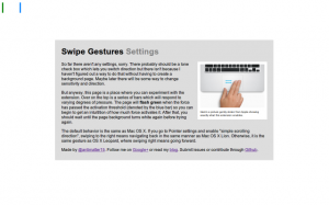
There is, however a tad bit of difficulty representing the function of it in pictures because really, it doesn’t have a big UI. It makes hardware more useful, and in its idealized form, should have no interface. But of course, we don’t live in a place where apps are perfectly idealized and either way, Apple has plenty of nice pretty pictures of people swiping fingers to the right.

I really fell in love with the Macbook multitouch gestures, almost at first sight. They just seemed so natural and so beautiful that I sort of felt that that was like the epitome of design or HCI perfection. And from that point, any time I used a laptop which wasn’t made by Apple (or even the ones which were made by Apple but were stuck in the barbaric ages preceding the inclusion of the glass multitouch pad, where its invention might have produced a scene like this), I felt thoroughly disgusted.

Flipping through the Chromium OS design papers, there is one page dedicated specifically to cool multitouch gestures which could be used. And as far as I’m aware the Samsung Series 5 550 (the new chromebook) is the only device which supports these gestures (thus far), and even then it’s only pinch to zoom and forward/back (three finger). All the other Chromebook users have been left out.

Another cool thing about the implementation is that it uses a certain webkitDirectionInvertedFromDevice property of the mousewheel events, which gives you a boolean value about whether or not the platform you’re on has some magical direction inversion like on OS X Lion or if you’ve enabled “simple scrolling” on Chrome OS. But this might not have been a good idea since swipe directions too are sort of inverted on those platforms naturally as well, so it might be better to _not _compensate for it.

Anyway, the implementation is actually quite simple. The current version doesn’t even break the 40 line mark, because all it does it it listens for mousewheel events on every page (via a content script), and it calculates the current acceleration. If that acceleration ever passes a certain threshold, it triggers a forward or back action. Right now, the threshold is preconfigured based on my own testing on a Samsung Series 5 (note, not 550) chromebook. But for people with other devices, I’m working on a second version which will be slightly more Apple-esque in its implementation.


Surplus 19 August 2011

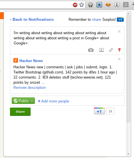
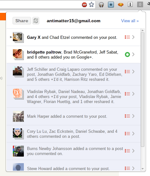
In a continuation of my rather unhelpful habit of documenting my activities on this blog long after you probably already know about it, I guess it’s time for me to discuss Surplus, my wildly popular (at time of writing) chrome extension which integrates Google+ notifications into Chrome.

Even more impressive, the name, which is a fairly common word is actually on the first page of a Google search for the word (around eighth result). It peaked at around 53,000 users and at one point made me the 329th most followed person on Google+.


Cloud Save 07 March 2011


I didn’t really want to write a post about yet another chrome extension, as the last five posts have somehow or another related to Google Chrome. Actually, the post I was planning to write before this was “Why the Chrome Webstore is broken”, which would be sort of less fanboy-ish. Anyway, this extension is rather simple, so I’ll probably go into the reasoning as to why I made it, where it might be headed and how I made it. There probably won’t be too much interesting information here.

I wanted a Cr-48. Why? I’m not sure, partially because I don’t actually have a laptop of my own, though my brother’s Macbook Pro (which I’m typing this post on) is pretty awesome. Plus, the platform is new, non-intimidating, more or less open, and there’s such a lack of the most basic tools, that I could probably get a few twitter followers by creating web apps which did things that are really basic yet somehow the web is lacking with. Things like an offline dictionary or wikipedia dump reader. So, Chrome OS seemed cool, and probably guaranteed bragging rights, at least more so than a Google TV probably would. Due partially to my age, I’m pretty scared of using money and have this feeling that I shouldn’t spend anything on anything more than a can of soda. I guess I’ve gotten off-topic enough, and so, I wanted a Cr-48 (for free, of course).

In my opinion, Google’s pretty good at copying Apple. I don’t mean that in a bad way. I wouldn’t say it’s the intention, but at least they can recognize a good feature and can copy the essence of it in a pretty functional way while for the most part, distancing from the less good parts. Unlike my feelings of what Microsoft would do, which would be to copy most of the bad parts wholesale and add some pretty fascinating and novel parts. So, if any company were to give me a free laptop, that would be awesome, but Apple certainly isn’t going to give things away, and Google’s the only company I think can properly copy the trackpad (though it appears they can’t even do that, from what I’ve read).

So, that’s probably random enough, and you’re wondering how this relates to anything at all. Well, part of my quest to attain a Cr-48 involved building some pretty interesting pieces of software targeted at chrome os (but not by any means exclusive to chrome os). This included the offline dictionary and wikipedia reader. That way, if I didn’t get a Cr-48, I could have an excuse to hate Google and I might be less frequently arguing in their support. But this backup plan failed (fortunately), and I won the LucidChart Cr-48 competition by drawing a picture of a Cr48 out of flow chart components.

I started using Google Groups because I could. I wasn’t spammed by google in the great spamming of some time in february, which means Google hadn’t magically picked for me to have one of those devices (I think this was before I won the LucidChart competition). So I later joined the non-involuntary group for chrome notebook pilots so I could eagerly await the knock on my door from UPS and be prepared for what to do when that happened.

I skimmed through tons of random posts and eventually I noticed a pattern. People hated the file system and wanted a way to basically get rid of it. The irony is that this new Cloud that is being created, is a static collection of walled gardens. So much for progress. There’s no standard for interoperability and it hasn’t really been too important, but somehow, because of Chrome OS’s probably bad file system, people are recognizing that that this isn’t right to have an intermediary step to get data from one application to another.

I’ve always held that Browsers are to improve the user experience as much as possible while keeping all of the internet on a balanced and equal platform. I felt that Extensions were the means to trigger change to a specific group of websites or a general heuristic in order to make a more perfect experience. I thought of that while making drag2up, which creates a novel and useful feature which should be used by everybody. As part of building it, I ended up with a sort of OCD toward creating an implementation of every imaginable file host.

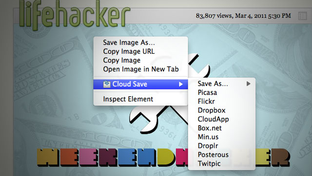
Cloud Save’s heritage is probably as much owed to drag2up as it is to Clip It Good, the latter of which I’ve never actually used, but found it inspiring nonetheless (and I ripped the Picasa implementation out of it too). Clip It Good was the general idea for Cloud Save, except that Cloud Save had more hosts. I made Cloud Save in thirty one minutes and thirty nine seconds, give or take a minute or so. The fact it was made in a mere half hour shows how the idea isn’t novel at all. In fact, most of those minutes were spent setting up the directory structure, manifest, installing inkscape, downloading the tango icon set and unzipping the icons to steal the save action icon (much like how I stole the up arrow icon used as drag2up’s logo). Nearly all of Cloud Save was the code needed to create the context menu. The downloading from URL, authentication and upload stuff was already in drag2up (I myself was pretty impressed about this. Evidently, I forgot how many features I had put into drag2up.).

Cloud Save wasn’t meant as a sort of glorified bookmark system. Or as a means to politely reshare images without hotlinking. I thought the need was to bypass the physical filesystem. That’s why the application is target primarily toward services which provide a virtual file system: a directory structure, files, privacy, etc. It wasn’t ever really intended as a means to share files, but I guess this is what people want it to do, so I’ll probably make the extension more sharing oriented in the future.

I realized I just forgot the rest of what I was about to write about, so I guess I’ll end it rather abruptly here. This morning, at 11 AM (though I don’t know if this date has been adjusted for my time zone) when I was still probably in school, Lifehacker posted about it and now people are using it. Awesome. I didn’t expect this to be that significant.


How I Would Design The Browser 2 Addons 21 August 2009

So I was watching Aza Raskin’s TechTalk on Jetpack, and I was thinking on how I would design an extension system. I would have to say to not have one, it’s just too complex, and why restrict the sound recording functionality to a taskbar. Even worse, why fragment the API and require someone to use Flash or <audio> in the page space and have a nice jetpack.future.import(“audio”) for a taskbar?

I think a good idea would to expose the power to web pages. The page could request special capabilities through a magical button dropdown or bouncy annoying notifier on a corner of the page saying permissions, populated by checkboxes of whatever features that the page wants to be able to use.

I think bookmarklets are almost perfect. Adding some more greasemonkey-like features would make it just about perfect. Scripts can run with the same permissions as the page, and the page’s permissions can be granted easily by the user (and the permissions persist through refreshes and browser restarts). Again, if functionality is not supported, things can gracefully degrade with partial functionality.

After that, is the idea of background tabs or alternatively, merging the statusbar type widgets into the tab bar. This is logical with everything merged into the page, and allows things to gracefully degrade if they don’t support the feature. You also get the benefits of being able to reorder remove, get info (which would be the contents of an extension page), etc. I think the interface for a plugin that operates in the background (like a gmail notifier) would be just a small tab that only has an icon, with special flag that makes it run on browser start (I think this could be one of the things for the permissions panel).

So one problem I see in the way Jetpack works, is that it doesn’t easily allow you to make a jetpack that hacks another running jetpack. Sure you can “fork” it, but that defeats the purpose of extensions, rather than having extensions only 1-level deep, make it work all the way down. The easy way I see is just to use the bookmarklet philosophy, and everything can mess around with anything within the page. So if you have a GMail notifier, that came out before the tab persist feature existed, you could just add a simple bookmarklet-type-greasemonkey thing that adds something to the permissions box that says “Persist Page” and then the user could check that in order to make a background GMail Notifier that runs on browser startup.

Malware is easy to fight now. Imagine if every application was forced to have a icon in the taskbar of windows at all times. Finding malware is as easy as looking for things you dont want running and closing it. And if some tab-bar autohide is to be implemented on the system, only people who are quite experienced would use 10+ extension/notifier pages and it would still be easier to recognize than finding some other strange wcultns.exe or whatever when half of the system things look like that.

With these features, Browser as an OS would really make sense. I wouldn’t be suprised if Google Chrome OS implements some stuff that are similar to what I’ve listed here.


How I would design a touchscreen browser 24 July 2009

This is again, an old idea of mine, I drew it on a sheet of paper maybe a year ago, but I just remembered it.

A common theme with modern browser is maximizing screen estate (which I don’t actually care about, becasue I have 2 huge monitors). But if I were to have a netbook or some otherwise technically restrained device, I would think that screen estate is important.

My Idea is pretty cool. The idea is that there is only a tab bar on top. It’s as usual, allocated to the tabs, and there is on the side, a new tab button. But for this, the new tab button occupies the entire rest of the space of the tab bar, because space is precious. Sort of like the Mozilla Fennec browser.

forward and backwards navigation is achieved by throwing (not just gentle pushing, throwing, it should be kinetic, if you don’t thow hard enough, it just shows some text saying the equivalent of “throw harder!”).

At least in the way I browse, I don’t enter URLs often unless I’m on about:blank. So there is no URL bar. To find what URL you’re on, or to enter a new one, simply double tap on the current tab. It expands and fills the tab bar with a text box and the other tabs are condensed to icons.

Swiping down shows a drop-down for a tab with options to do things like bookmark or view source.

Thowing a tab down (which is a more violent swipe) removes the tab. Something partly inspired by the Mac OS X dock.

The new tab button could also be a menu, swiping down to reveal a menu of bookmarks to select from.

And the new tab page could be almost like a desktop. with widgets, gadgets and whatever (Google wave? If only I got my dev invite :’(). Well, in my idea, the top portion of the new tab page could be the URL bar and the rest could be whatever other browsers are doing + maybe some widgets/gadgets Dashboard or Plasma style.


Google Chrome 02 September 2008

It’s awesome btw. The tab bar location is like opera, the new tab button is like IE, the password manager is like firefox, and buttons are like IE 8. I’m actually posting from IE 8, and it (being based on Webkit) works with the Ajax Animator.


Ajax Animator 0.20 Browser Support 05 August 2008

It supports Firefox 1.5 to Firefox 3.0, Opera 9+ (hopefully), Safari 3+, and it was supposed to support IE, but for some reason, the compilier makes IE fail.


Build 99 27 May 2008

Its now at Build 99. I feel that not much more can be done without the critical OnlyPaths component. I don’t have anything ready yet. An Ext port of OnlyPaths is underway, but it is not necessarily very stable, and some critical features (cross-platform drawing API) is not completed yet.

I rolled back one thing yesterday: the Advanced Color-Picker tool. They will be added again later, but I don’t want to aim too high for the initial 0.20 release, or else it may never get released. The standard (albeit small) color picking system is fine for now. It also is quite big, so not yet.

IE and Opera should work flawlessly now (Aside from browser-limitations). Most problems in the app are caused by those annoying commas in JSON errors (IE/Opera don’t like it when its {blah:stuff,super:happy,})


Updates Today 06 May 2008

http://antimatter15.110mb.com/animator/Animator2/build/ajaxanimator.htm

Now, its at Ajax Animator Build 48. It has an improved “Properties” menu. The Drawing icons have been updated (to give you a taste of features of OnlyPaths that will be added). Notice that there are some features left out. Zoom will be done via the zoom button on the canvas toolbar, and panning won’t be necessary. I’m curious of whether I should or should not include the z-index ordering. Simply, the whole purpose of layers is that. and Layers seem much more managable, visible, and such.

Speaking of layers, the Layer browser part of the timeline has been added. It is currently just a simple Editor Grid (so you can inline edit the label!). I’m going to add http://cellactions.extjs.eu/ for the ability to remove/edit layers via a nice icon.

I have also almost sucessfully ported OnlyPaths to ExtJS. it turns out, that all prototype code is in richdraw.js, and it is as simple as replacing prototype code with Extjs counterparts.

such as this.blahlistener = this.blah.bindAsListener(this) Event.observe(this.explosion, “mouseexplode”, this.blahlistener)

becomes Ext.get(this.explosion).on(“mouseexplode”,this.blah,this);

Often, Ext code is simpler, and more consise, but other times it is not so.