On 5:04pm EST June 21st, 2011, I got an email inviting me to the super exclusive cool club: the Chromebook guru program. Today, June 23rd, 2011 8:05am I woke up to the sound of my iPhone 3G ringing to a certain 800 number. I have this paranoid tendency to ignore most calls, and my half awake zombie state didn’t exactly help my judgement. Fast forward two minutes, I checked my inbox and there was a terrifying Google Voice transcription sitting there in my inbox. That took two minutes because of how glacially slow it is to get anywhere on an iPhone 3G after the deadly error of updating to iOS 4.
Billable to sign for the shipment. You can go to Fedex dot com To track your package is Status, and determine if it is elligible to be held for pick up at a convenient FedEx location yo repeat this information, press any key yank you from Fedex goodbye.
It felt oddly incomplete, because it turns out, it was. I listened to the (less disjointed) real message, and it was clear that the first forty minutes of the message was probably omitted, and Google Voice only picked up the small section after the beep. Apparently robots aren’t very good at talking to other robots.
I ran downstairs and checked the door. Nothing was there. I opened the blinds and waited. A few hours later (I managed to build a <canvas> pinball game in the time in between), I heard a sharp knock on the door. I’m not exactly sure of the time because I recorded it all on my iPad and apparently Apple feels that nobody ever cares about when the picture/video was taken and makes it virtually impossible to get that information.
Delivery
So here it was, a brown box. Delivered by FedEx (Which is what’s called a “syllabic abbreviation” of Federal Express as opposed to the boring initialism UPS which stands for United Parcel Services, Inc.). Just because I can, I’ll tell you that the box was about 16.25x16.25x5.5 inches (my portable tape measure is only customary, no metric love). Inside is yet another box (boxes inside boxes are awesome!), but unlike the Cr-48, it’s not a nice friendly brown box with a jetpack-wearing labrat diagram. It’s a gray box with a picture of what’s supposed to be inside the box. The outer box’s packaging was just crumpled paper, which doesn’t look nearly as nice as the other stuff (I think the Cr-48 came with awesome little packaging peanuts).
So here’s the unboxing. Wait, the box was already opened. And what’s with the small empty green speech bubble sticker on the side? Anyway, the lack of tape probably means that some time travelling ninjas hijacked the FedEx plane in an attempt to rip out the TPM module chip in my Chromebook in order to infect the kernel with a keylogger/filter which replaces all references to time travelling ninjas with time travelling ninjas.
Inside is some nice white packaging foam. It’s neatly packed, and pretty cool. Sadly, there’s only one component wrapped in bubble wrap, the rather useless VGA adapter. Random side note: I think it’s rather interesting that the Chrome OS people decided that somehow a VGA adapter was somehow more important than an ethernet port. I’ve never plugged in a laptop to a larger display, and I don’t imagine that being a primary use case. But it would make sense to enable a web-oriented device to have faster web access.
Setup
So I turn it on, and it opens to something about reformatting the stateful partition because of those time travelling ninjas. It doesn’t really bother me, it reboots, I ignore some legalese and click buttons. It updates (which, by the way, took forever), I login the first time and it asks me to take a picture. The camera’s actually a bit nicer and the video isn’t laggy for some reason. This device is noticably faster than the Cr-48. I decide against taking a picture and just select the little erlenmyer flask with bubbling green liquid (presumably this is what gives the time travelling ninjas super powers).
Once again, it reboots. I login, it says wrong password, I try again, realize that somehow it forgot my wifi password, login, and it still says it’s wrong because it’s not done connecting to the router literally three feet from me, and I type my google acounts password again and press enter where it still fails yet again because I’m way too fast at typing, or at least I’ll say that because truthfully I’m not really fast at typing but it wouldn’t do any harm pretending I am because I really feel stupid not thinking about waiting for the wifi network to connect first, and so I stare at that little icon on the top right and then it clicks solid. I login.
I’m greeted a page that tells me how to use a trackpad. I go through the exercises to test my ability to do some rather advanced and intellectually challenging tasks such as “Click the circle” and “Move the circle”. I realized that it was probably just a distraction so that Chrome has some time to load all my apps and extensions by the time I’m done with these challenges.
Testing out the speed of this thing, I clicked Angry Birds, which to my surprise actually worked. Though I have to admit that trackpads aren’t great for these kinds of pointer-driven games. I would much rather play Angry Birds on my iPad.
But I guess as a product reviewer, I should probably focus on the hardware first in order to provide a vague semblance of structure and order to this review.
Hardware
At a glance, the Chromebook is thin (But I lied, it’s not really that thin). Still, it’s quite heavy. It feels heavy and has a really solid build. And it comes with tons and tons of stickers, and that’s pretty spammy, but I guess it has this partially glossy finish that needs protection from ninja fingerprints (oh wait, that’s an oxymoron).
Oddly enough, among the first few things I noticed was that the hinge is a bit weaker than the Cr-48’s. Or at least, when you hold up the device, the lid will sort of collapse on itself under the force of gravity. I think this also happens with Macbooks as well, but it’s a little weird.
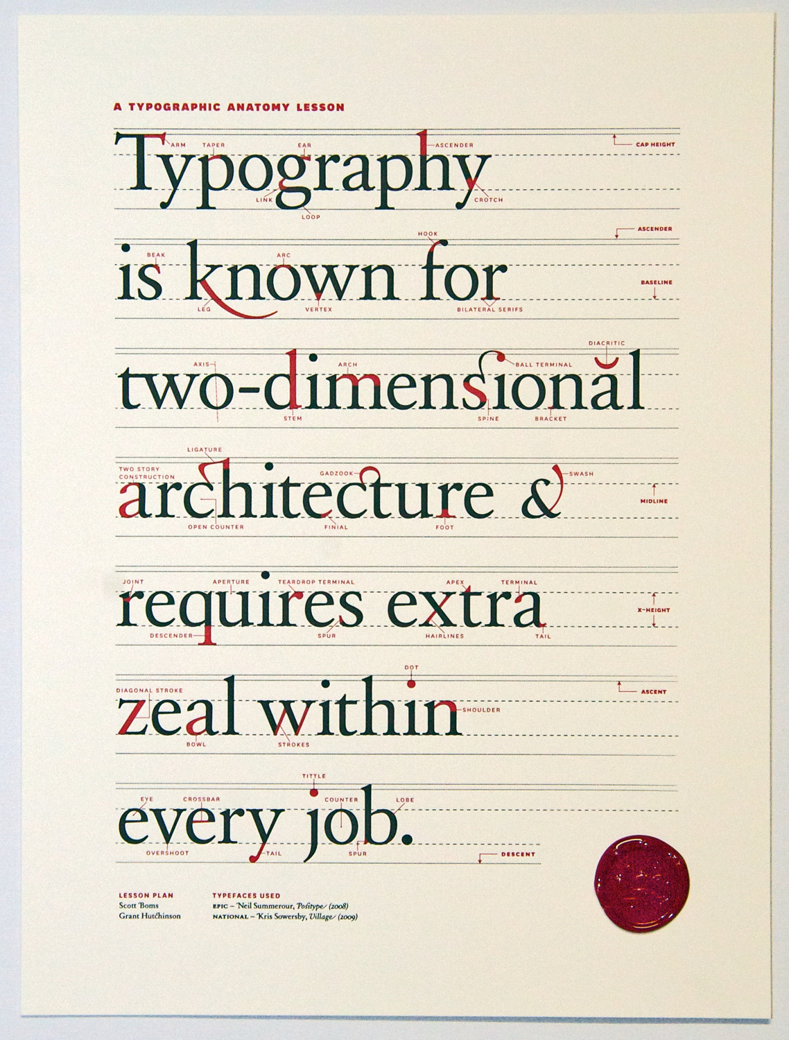
Second, is the little chrome logo on the surface has a sort of texture which feels pretty cool. The chrome logo also really bothers me because the colors just feel slightly off. Also, speaking of weird logos, the Samsung logo doesn’t have a (looks up typography terms diagram) crossbar on the “A”, which looks really weird. So it’s more like schevronsung or S^msung or something.
The display doesn’t go as far back as I would like, and with the absence of a protracter, I’ll use my powers of eighth grade geometry (oh wait, no I mean the eighth grade launch of Wolfram Alpha, the last time I ever needed to do math) to determine that the maximum angle is 127.5 degrees (approximately, or 2.226 radians or 4.452 tau-ians if tau day is your kind of thing).
The body of the Chromebook is nice plastic, it’s smooth and pretty hand friendly. The lid is a little weird though, the rim is actually slightly sharp. Not sharp enough to function as a type of improvised knife for murdering people nearby, which a Macbook would suffice at (Anecdote: My leg once started bleeding a lot because it rubbed a little against the sharp part of a macbook pro). But it’s still sharp enough that it feels inconsistent with the rest of the device and to make it feel weird opening and closing the lid. Also, on the lid is this huge terrible shiny bezel. It’s sort of cool for a while when you think it’s sort of cool that you can look at the movement of your fingers while you’re typing a blog post. But it very quickly starts getting annoying and makes the device look cheap. It simply doesn’t feel right in combination with the matte display and the soft diffuse black plastic body.
Sticking cables like USB and the power adapters makes a somewhat loud click, and rather annoyingly it’s nigh impossible to yank the cable out. Unlike the Cr-48 or any Mac, whose cables pop out fairly easily, this device seems to grab hold of the cables and never wants to let go.
I like how the new Chromebook is sleeker and looks more solid. It’s less bland (Once I actually mistook a random black paper folder/portfolio for a chromebook). But it also is less of a total Macbook clone. And when making something less of a Macbook clone basically means adding a glarey bezel and a cheap looking lid, sometimes the blatant clone is better.
Keyboard/Touchpad
I’ve actually never noticed the special browser function keys on the chromebook aside from the volume, brightness and power buttons. I’ve basically never used the full screen button, which I just pressed a second ago and I think this is actually pretty cool. Now I see why OS X Lion has that full screen emphasis. Though for some reason, I can’t leave one page full screened and Alt+Tab over to another non-fullscreen window.
The window switching button, which is more like workspace switching since you only ever have one window open at a time, is more accurately referred to as the “window jiggly button”. Because that’s exactly what it does when you’re on one window, as I’m always on. I guess it’s main purpose is to facilitate those politically incorrect image macros with bad taste about holding F11 in order to make a picture of Haiti (or Japan) shake. It would be a lot more useful if it was a tab switching button instead.
I’ve never used the refresh button, because it’s always easier to hit Ctrl+R and likewise for forward and back, it’s easier to hit Alt+Left or Alt+Right. Same with the search button, I just hit Ctrl+T.
Another weird thing is the placement of the Alt and Control keys. I generally never use the alt keys on my desktop computer, but I happen to use it a lot more often here (mainly for forward/back). But it’s also annoying because it still has a mac feel so I want to pretend that Alt is the same thing as the Command button, and then everything’s weird. I liked the Mac Home/End buttons, which I think were Cmd+Option or something. Anyway, I would really want Ctrl+Alt+Left/Ctrl+Alt+Right to work as Home/End.
Just on looks, the Series 5 keyboard looks a bit weird. The letters on the keys feel slightly off center and the words are printed in a much lighter shade of white/gray. I guess this would help the problems I sometimes have with finding the right keys at night (but I haven’t had this long enough to encounter nightime, in fact, it’s still just past noon). I’ve never noticed that the shift key has a sort of connected “ft” arm (I sure hope I’m using these typographic terms properly, and yes, I did just set the word typographic in comic sans ms).
The touchpad is better than the Cr-48’s but it’s still really quite lacking in comparsion to the ones on all the Macbooks. Maybe it’s just software, because I’m so used to three finger swipe for navigating forward/back, and Chrome on Mac’s Tabpose feature is genuinely magical. Also, two finger scrolling should be kinetic, it’s just that much more natural of an experience and makes the device more intimate.
Tablets
The idea of a Chromebook is very similar to that of a tablet (such as the iPad or a future Chromepad). Tablets are very web, or at least web information-oriented, much like how the Chromebook intends to.
Google has included a rather nice physical keyboard in the device, which shows that they view the keyboard as a superior (and necessary) system for interacting with the web. It’s pretty obvious that the keyboard is great for writing long blog posts, but that’s really not that common of an exercise. Google has to demonstrate that not only is the keyboard useful in certain fringe circumstances, but an everyday useful component.
Google needs to show that the keyboard isn’t just something that gets in the way of interacting with the web, but a useful aid. An emphasis on search; tab search, page search, or web search could do that (and it would be a great use for that Search key). Firefox has a great feature called Type Ahead Find (There’s a chrome extension that tries to do the same thing, but it’s buggy, and sadly Chrome doesn’t sync localStorage state) where you can just type to navigate and click items.
And I don’t think they’ve properly done that. The web is currently still very much a pointer driven world, and the Chromebook touchpad is quite lacking.
Offline
Chrome OS is actually surprisingly useless in situations where the user is offline. You might find the adverb “surprisingly” a little confusing, because almost all the other reviewers seem to bring the notion that being useless while offline is somehow intrinsic to the concept of the platform. Like that it’s obvious that anything built on internet connectivity will always be useless offline.
Every Chromebook out there, to my knowledge has a sixteen gigabyte SSD. Sure a gigabyte or two is necessary for the operating system’s function, the kernel, and the other kernel for that fast background feature. Fourteen gigabytes is plenty of space for a cache. Absolutely plenty.
Chrome has the opportunity to basically cache everything it encounters (and the cache itself is already sufficient for offline browsing if it were accessible), and you can load everything from the cache when the user’s offline. Firefox does this, and I have no idea why Chrome doesn’t.
As for Google’s own applications, it’s rather disappointing how long it’s taking them to add offline. The Gears API isn’t too much different from AppCache, and it’s unreasonable to take over a year (basically centuries in chrometime) to port that feature over. But at least there’s an expected date (summer, which, come to think of it is actually pretty soon).
Software
I don’t know why I’m even writing this section. But since I am, let me first write a disclaimer. Chrome progresses fast. A major release every six weeks. Things get fixed quickly. I remember (half a century ago in chrometime) either Larry or Sergey said something about how Chrome/OS is really about a radical shift that rather than having your software get slower (due to bloat, etc) over time, it actually gets faster. Everything here will probably be irrelevant very soon.
The bundled version, which I’m not using since I almost immediately switched to the always-better unstable ones, had some weird properties. Hovering over the wrench icon would give this horribly hideous black-gray gradient background (and really, that’s all I noticed). Unstable doesn’t have any of that.
Also, I was disconnected from my Wifi network three times in the process of writing this. It may be my wifi network’s problem, but it’s never happened to me before. Music Beta is acting buggy and sometimes stops after opening and closing the lid.
Conclusion
The very first impression is always from the hardware. When it’s covered with layers of stickers, that really does sort of subtract from it’s beauty. I don’t want to spend time peeling off six layers of stickers on a laptop already in a bag inside a foam cover inside a box inside packaging inside another box. The hardware underneath all those stickers is pretty nice, with exception to the lid which has a somewhat sharp edge.
The second impression comes from the setup of the software. I guess legalese is fairly standard, so I can’t take points off for that. Updating right then and there hurts the user experience. You can do that in the background. That’s the point. There’s probably some security rationale, but that initial feeling has a big impact on what users feel.
Once that’s done, the user learns that the device is practically useless offline.
Chrome OS feels incomplete. It’s probably deliberate.
Chrome OS is visionary, and part of the idea is that software can improve over time, rather than getting worse over time. Starting with a flawless experience means that there’s only one way to go: down (That’s why if you’ve owned a Mac for any amount of time, the weakest Macbook Air at the Apple Store feels so much blazingly faster). Starting with a terrible experience gives profound opportunity for a great anagnorisis, which wikipedia defines as
a moment in a play or other work when a character makes a critical discovery. Anagnorisis originally meant recognition in its Greek context, not only of a person but also of what that person stood for.
This first batch of Chrome OS devices represents the beginning of Google’s great plan, that of instituting the new paradigm of progressive enhancement rather than regression. The deliberately sour experience gradually and noticably improves every six weeks. It’s the equivalent of waking up one day and seeing that your toaster now makes coffee.
This is what Chrome OS represents. It’s not the web as a platform, because any platform can run applications. It’s about what the web represents, a continuous online system where things improve every day, without notice. Change just happens. Updates are silent and computing becomes alive.
Or at least, I want more free hardware.
