somewhere to talk about random ideas and projects like everyone else

stuff

#idea

my ideas for a browser os are coming true. 08 October 2009

Yes, I know that the title is lowercase with a period in the end. It’s totally strange and inconsistent but it feels right.

Google’s working on a notification API for Chrome. Chrome has a Pin Tab feature. Firefox has Faviconize Tab. Gears has a basic privledge escalation (not very fine grained yet). Firefox shows UAC-type privledge escalation for storing data and Geolocation.

To review the old post, this is how I think Chrome OS might work. All user facing applications (all apps other than the window manager, kernel, browser, should be user facing) should operate in Tabs. There are two types of tabs, “pinned” tabs and normal browsing tabs. Pinned tabs are automatically loaded when the user is logged in, are only a tiny icon, but are still always visible.

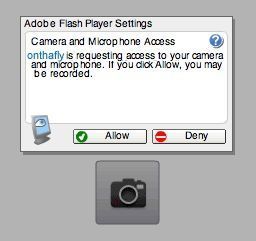
There will be a unified and consistent way for the user to voluntarily grant privledges to a web site that requests it. It won’t be a catch-all i-totally-trust-this-app-to-every-bit-of-data-on-my-HDD sort of system that most operating systems use. It will be very fine grained, you can grant access to XHRs to a certain domain and huge warnings if the site requires access to the wildcard . The privledges can extend from just accessing the notification API, cross domain XHR, geolocation, and communicating with other tabs. Communication with other tabs should be dome something like cross domain XHR, by allowing the user to grant a tab access to a certain domain/url. I would prefer the permissions dialog to be something less of a modal window that is employed by Gears or the little thing that pops up on the top for Firefox, and more of a icon that subtly appears somewhere that the user can click voluntarily. I think a UAC type stop-what-youre-doing-to-show-a-scary-message dialog is horrible and makes the user incapable of deciding intelligently. If there were a button which would make a box filled with checkboxes and a green/red gradient safety bar with messages, and educating the user that he or she really *does not have to give the site permissions).

A typical application such as a mail notifier would be as follows

<!doctype html>
<html>
    <head>
        <script src="jquery.js"></script>
    </head>
    <body>
        <script>
            if(navigator.requestPermission){
                navigator.requestPermission("xhr","http://site.com/api.json")
                navigator.requestPermission("notify")
            }
            setInterval(function(){
                if(navigator.hasPermission && navigator.hasPermission("xhr","http://site.com/api.json" && navigator.hasPermission("notify")){
                    $("#status").html("YAYNESS! You granted Awesomeness!").css("background-color","green")
                    $.ajax("http://site.com/api.json", {user: $("#userid").val(), pass: $("#pass").val()}, function(data){
                        $.each(data,function(message){
                            notify(message.summary)
                        })
                    })
                }else{
                    $("#status").html("no permissions!")
                }
            },1000);
        </script>
        <div id="status" style="background-color: red">No Permissions, please give me some super-powers?</div>
        <input id="userid" type="text" value="USERNAME" />
        <input id="pass" type="password" value="PASSWORD" />

        # Super Insanely Awesome Notifier!

        This is a super awesome notifier, if this doesnt work then you are an idiot or
        the internet isnt in the future yet. Here is where the about stuff and other stuff
        and stuffs that are stuffs can be put in! And if its not in the future, we all know
        the easiest way out is to blame microsoft for all our problems and say that at
        least google tried fixing our problems but it was all microsoft's fault.

    </body>
<html>

The great thing about the thing above is that it gracefully degrades into a functionless web page if its not running in my imaginary super browser OS of the future. It’s quite easy to make and requrires no API documentation (or at least for me since there’s only 2 API calls and I just totally made them up). It’s similar to the Jetpack and Chrome extensions idea in which the developer has little to learn for making an extension, but lowers the barrier even more: There’s nothing to learn. Whats above is just a standard html5 web page with jQuery. The only thing different is the hasPermission and requestPermission functions which don’t exist so I made them up. It’s not that it has anythign different, its just that the developer is thinking of the web page as a background process instead of thinking of it as static content.

It’s the same idea is Google Wave, it could be a Wiki, IM, or Email, all depending on how you think about it.

For the permissions system, it really doesn’t matter how it’s implemented but it really has to eventually be done. The web is getting new abilities, and things like Geolocation, Local Storage, Offline SQL DB, Saving to disk, Reading files, and such all require special permissions (You wouldn’t want any random site uploading your SAM file from your hard disk). Each of them have their own modal type dialog which queries the user if they want to grant the permission. Eventually, things like Audio from microphone, Video from webcam, cross-domain XHR, and other peripherals like toasters get their own implementation, requiring special user granted permissions, an application may want 3 or more permissions simultaneously, it becomes very obvious a more consistent UI is needed for delegating these abilities.

For the interface, its easier for both users and developers. Developers dont need to do something like write complex xml manifests showing which location the file which shows the about text is and which one is the help. Here, you just have a web page that you put stuff in. Since the interface is the page. The tab/web page is a unified Install Page, Help Page, About Dialog, Credits, Donation Box, everything, but unified (sure you could split it into multiple pages if you wanted like with any other web page). Installing is just right-clicking on the tab and selecting the menu button that says “Pin Tab”. If the application requires special privledges, the user can click the icon which show you what the site wants, and you just check off whatever you feel the site deserves.

How I Would Design The Browser 2 Addons 21 August 2009

So I was watching Aza Raskin’s TechTalk on Jetpack, and I was thinking on how I would design an extension system. I would have to say to not have one, it’s just too complex, and why restrict the sound recording functionality to a taskbar. Even worse, why fragment the API and require someone to use Flash or <audio> in the page space and have a nice jetpack.future.import(“audio”) for a taskbar?

I think a good idea would to expose the power to web pages. The page could request special capabilities through a magical button dropdown or bouncy annoying notifier on a corner of the page saying permissions, populated by checkboxes of whatever features that the page wants to be able to use.

I think bookmarklets are almost perfect. Adding some more greasemonkey-like features would make it just about perfect. Scripts can run with the same permissions as the page, and the page’s permissions can be granted easily by the user (and the permissions persist through refreshes and browser restarts). Again, if functionality is not supported, things can gracefully degrade with partial functionality.

After that, is the idea of background tabs or alternatively, merging the statusbar type widgets into the tab bar. This is logical with everything merged into the page, and allows things to gracefully degrade if they don’t support the feature. You also get the benefits of being able to reorder remove, get info (which would be the contents of an extension page), etc. I think the interface for a plugin that operates in the background (like a gmail notifier) would be just a small tab that only has an icon, with special flag that makes it run on browser start (I think this could be one of the things for the permissions panel).

So one problem I see in the way Jetpack works, is that it doesn’t easily allow you to make a jetpack that hacks another running jetpack. Sure you can “fork” it, but that defeats the purpose of extensions, rather than having extensions only 1-level deep, make it work all the way down. The easy way I see is just to use the bookmarklet philosophy, and everything can mess around with anything within the page. So if you have a GMail notifier, that came out before the tab persist feature existed, you could just add a simple bookmarklet-type-greasemonkey thing that adds something to the permissions box that says “Persist Page” and then the user could check that in order to make a background GMail Notifier that runs on browser startup.

Malware is easy to fight now. Imagine if every application was forced to have a icon in the taskbar of windows at all times. Finding malware is as easy as looking for things you dont want running and closing it. And if some tab-bar autohide is to be implemented on the system, only people who are quite experienced would use 10+ extension/notifier pages and it would still be easier to recognize than finding some other strange wcultns.exe or whatever when half of the system things look like that.

With these features, Browser as an OS would really make sense. I wouldn’t be suprised if Google Chrome OS implements some stuff that are similar to what I’ve listed here.


How I would design a touchscreen browser 24 July 2009

This is again, an old idea of mine, I drew it on a sheet of paper maybe a year ago, but I just remembered it.

A common theme with modern browser is maximizing screen estate (which I don’t actually care about, becasue I have 2 huge monitors). But if I were to have a netbook or some otherwise technically restrained device, I would think that screen estate is important.

My Idea is pretty cool. The idea is that there is only a tab bar on top. It’s as usual, allocated to the tabs, and there is on the side, a new tab button. But for this, the new tab button occupies the entire rest of the space of the tab bar, because space is precious. Sort of like the Mozilla Fennec browser.

forward and backwards navigation is achieved by throwing (not just gentle pushing, throwing, it should be kinetic, if you don’t thow hard enough, it just shows some text saying the equivalent of “throw harder!”).

At least in the way I browse, I don’t enter URLs often unless I’m on about:blank. So there is no URL bar. To find what URL you’re on, or to enter a new one, simply double tap on the current tab. It expands and fills the tab bar with a text box and the other tabs are condensed to icons.

Swiping down shows a drop-down for a tab with options to do things like bookmark or view source.

Thowing a tab down (which is a more violent swipe) removes the tab. Something partly inspired by the Mac OS X dock.

The new tab button could also be a menu, swiping down to reveal a menu of bookmarks to select from.

And the new tab page could be almost like a desktop. with widgets, gadgets and whatever (Google wave? If only I got my dev invite :’(). Well, in my idea, the top portion of the new tab page could be the URL bar and the rest could be whatever other browsers are doing + maybe some widgets/gadgets Dashboard or Plasma style.


ShinyTouch ideas 13 July 2009

One potential I see for shinytouch is the ability for it to be embedded in a flash application which can be embedded into a web page. Then there could be a web 2.0 style JS API for awesome canvas tag based creations. Or it could just be used to interact with another flash application or game. The reason why this is more likely able to be used as such is because setup for this is so easy that this could actually convince people to do it. With other systems you really have to convince people really well to be dedicated enough to set up the hardware whatever it is. At that point, the software is the easy part and the audience is more than glad to go through the hassle of downloading, running, configuring, and maybe even compiling. But with shinytouch aiming at a different, larger and overall lazier (myself included in this group) audience. This means that it is really important to lower the entry barrier to the lowest possible level. I think being able to just move the webcam a little bit, go to a website and follow simple directions to use their own touchscreen is a very potentially attractive concept. It could even spawn more interest in the touchscreen, natural user interface communities. This is really what I want he project to end up like. It seems quite practical to me. How do you feel about this?

(note that this is my second post entirely from my iPhone)


New MirrorTouch Algorithm 27 June 2009

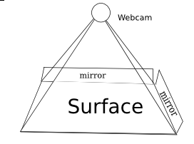
MirrorTouch Diagram
MirrorTouch Diagram

MirrorTouch (the new name for my mirror-based multitouch system). For those who don’t remember, it is a project to create a retrofittable cheap new technology for touch detection. It can be made of mostly off-the-counter or even household items. The software has the potential to be VERY fast, many orders of magnitude faster than the current technology. It is less seceptable to occlusion than many other technologies.

It began well over 2 months ago. It started out with IDEALISTIC paint sketches and then a VB.NET application to parse it. Then it was ported to Python and could handle the same sketches. After discovering that in real life the positioning of the points varies due to some very strange and illogical factor, the project had a several-month hiatus.

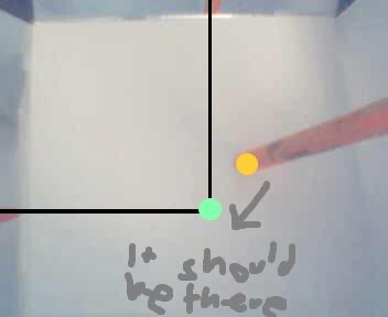
The issue is clearly demonstrated here:

noooo!! why doesnt it work?!?!?!?!?!
Oh Noes!

Last week, I considered the project a failure. I was playing around with a flashlight and tried looking into the strange behavior of the light. And something began to dawn on me. The shape as on diagram 1, can be flattened out as a visualization for what it behaves like. So from the pyramid shape, it looks more like a little 4-pointed star. Since the mirror is only on two sides, you can simplify it to half a star emerging from a square.

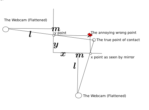
The diagram
Flattened Diagram

To the side is a geometicalified sketch of it from my notebook. Here you can see the relation between the point and where it shows up on the mirror.

From that, you can use the distance between m and the y point (y-m) and divide it all over the distance from the mirror to the webcam (l) and plug it into y=mx+c form. Repeat that over the x axis and you can use basic algebra to find the interesction.

From that is the new magical formula that powers the application:

Yay! Purtyful!
Yay! Purtyful!

The new formula is so magical that it actually works. Yes, it’s amazing, it has survived the most strictest of tests of mathematical consistency. It works.…. At least in theory. Now what about scientific tests? Oh no! it actually has to work in the physical world? Oh no!

With these 2 magical equations. I have (theoretically) in an idealistic model of the system, solved the issue with distortion. It should theoretically resolve all issues with the system. It should work.

So i set up the model again, attaching my webcam to a ruler and taping it to a speaker. Taping mirrors down on a piece of paper, and this time, Scribbling down measurements on the side. I got it to work. Workign without resetting configuration every time it ran. It works. It truly actually works. Multi-Touch too.

Since I cant get the webcam to feed directly to the python script, I have to use Cheese (it’s a linux app for taking pics from a webcam) to save screenies of the webcam mounted percariously from a ruler using only a bit of transparent Scotch tape. I copy the images over to the mirrortouch directory and go in the commandline and type in python process.py and watch as lines of logging output fly past as the windows autoscrolls down filled with coordinates and color hashes.

I watch as it generates a .png file.

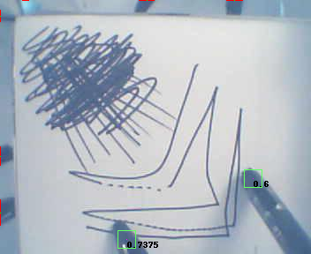
It works in the _real_ world!

Yes it works! AMAZING!

Note: The random scribbles in the back aren’t for any contstructive purpose. No, actually they just stop my stupid webcam from adjusting the contrast and making everything all ugly and ewwie. If my webcam sucked less than maybe it would work but my webcam really does really really really suck.

Now if it could get ported over to somethign like C++, and actually parse a live video feed from the webcam then it may become an actual working implementable multitouch technology. As it stands, it’s just a multitouch proof of concept, and I don’t know C++ so it probably won’t work.

Anyone dying for the source code can find it in the SVN repository at : http://code.google.com/p/mirrortouch/ Just beware that it may take lots of scary and tedious configuring in current stages (Configuring color range of background in the band, configuring color range of target, setting distances and middle length and other horrors, but from the SVN you can also do the insanely boring act of running various images that are already there through the script, and most of the images just wont work even with replacing huge blocks of code).